Why the Best Free Fonts for Pinterest Matter
Looking for the best free fonts for Pinterest? Pinterest is a visual search engine, so clear, stylish type helps your pin title stay legible on mobile and desktop while the right vibe drives saves and clicks.
- Rule #1: Contrast > Decoration. Dark text on a light background (or vice versa) wins.
- Rule #2: Two fonts max: one expressive display face + one neutral for support.
- Rule #3: Zoom-test at 60% — that’s how it will feel in the mobile feed.
Text Tools for Creators
Quick helpers: style preview, webfont manager, and converters.
Browse More Pin-Ready Fonts by Season
10 Best Free Fonts for Pinterest
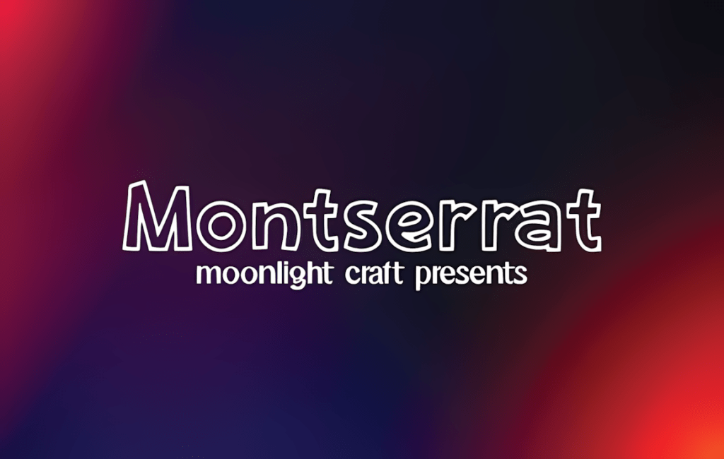
1. Montserrat
- Vibe: Clean geometric sans (inspired by Buenos Aires signage).
- Best for: Bold headlines like “DIY Cricut Hacks You Need”.
- Why we love it: Many weights keep your pin hierarchy tight.
- Download: Montserrat on CF
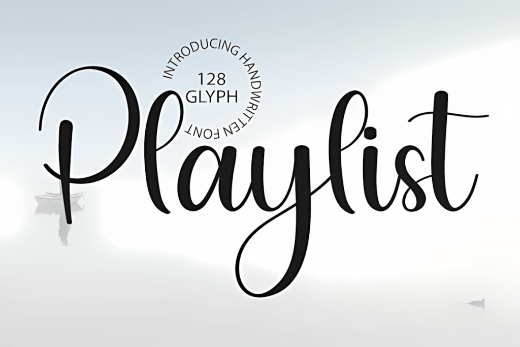
2. Playlist Script
- Vibe: Hand-lettered casual script.
- Best for: Fashion and recipe pins that need a personal touch.
- Tip: Pair Regular + Caps for instant headline/subhead contrast.
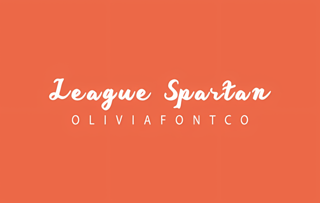
3. League Spartan
- Vibe: Ultra-bold, modern display sans.
- Best for: Numbered lists — “10 Ways to …” really pops.
- Get: League Spartan
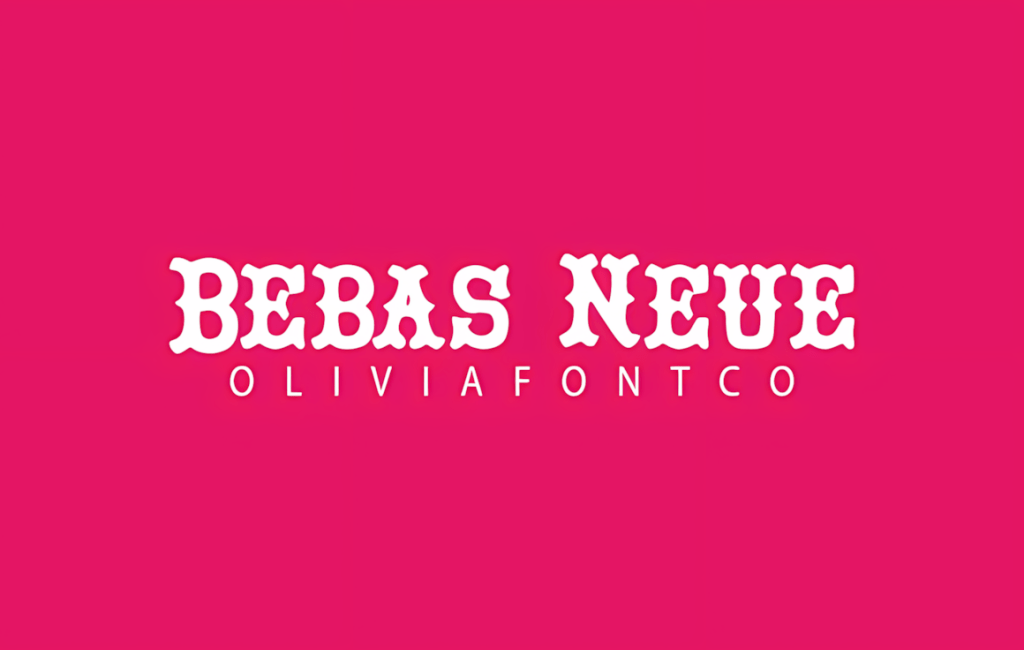
4. Bebas Neue
- Vibe: The classic uppercase display.
- Best for: Minimal layouts where type is the hero.
- Pro move: Add letter-spacing around +20 for mobile.
- Get: Bebas Neue
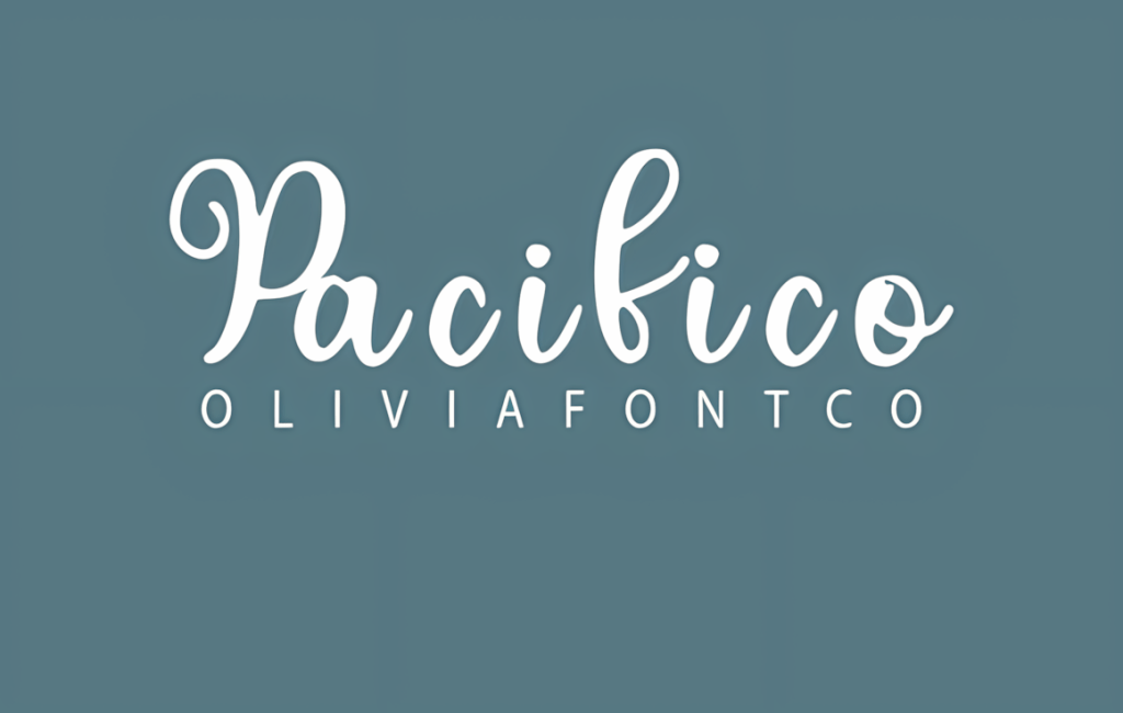
5. Pacifico
- Vibe: Retro surf script (1950s).
- Best for: Summer DIY, travel, and dessert ideas.
- Pairing: Works nicely with Montserrat Light for body text.
- Get: Pacifico
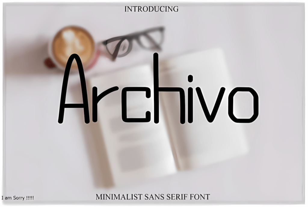
6. Archivo Black
- Vibe: Industrial sans with soft corners.
- Best for: High-contrast pins (dark text on pale backgrounds).
- Why it works: Heavy weight survives Pinterest compression.
- Get: Archivo Black
7. Dosis
- Vibe: Soft, friendly rounded sans.
- Best for: Tech and productivity — approachable without looking childish.
- Get: Dosis
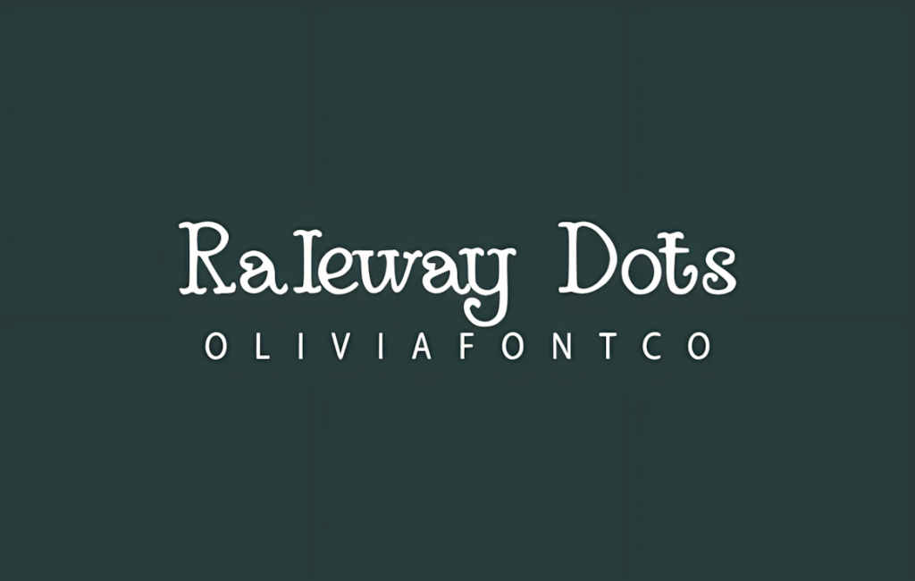
8. Raleway Dots
- Vibe: Playful dotted variant of Raleway.
- Best for: Accent words used sparingly (e.g., “FREE”).
- Get: Raleway Dots
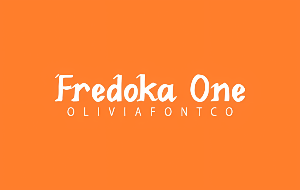
9. Fredoka One
- Vibe: Friendly bubble display.
- Best for: Kids’ crafts, party printables, bake-sale promos.
- Get: Fredoka One
10. Poppins
- Vibe: Versatile geometric sans (Latin + Devanagari).
- Best for: Universal templates — available in Canva, Figma, Google Slides.
- Get: Poppins
Pin Typography Cheatsheet
- Sizes: Headline 110–150 pt, subhead 60–80 pt (Canva). Must read without zoom on a phone.
- Contrast: Aim for 90–100% light/dark split; add an 8–16% translucent panel under text if needed.
- Padding: 24–36 px inner padding; keep long headings to ~45–75 characters per line.
- Pairing: Display (Bebas / Pacifico / League Spartan) + neutral grotesk (Montserrat / Poppins / Dosis).
- Numbers: Fonts with strong numerals boost CTR for “10… / 25…” pins.
Helpful Resources
Want to push your pins even further?
- Thinking with Type — modern typography essentials for pairing Google Fonts.
- Logo Design Love — practical rules for combining type and icons.
- Pinterest Marketing For Dummies — data-driven CTR tips using the fonts above.
- Wacom Intuos S — budget tablet for precise kerning and hand-drawn overlays.
Related Guides
Upgrade Your Fonts to Physical Products
Love these lettering styles? With a compact desktop laser you can engrave quotes, cut layered word signs, and make Christmas ornaments — all from the same SVG/OTF fonts.