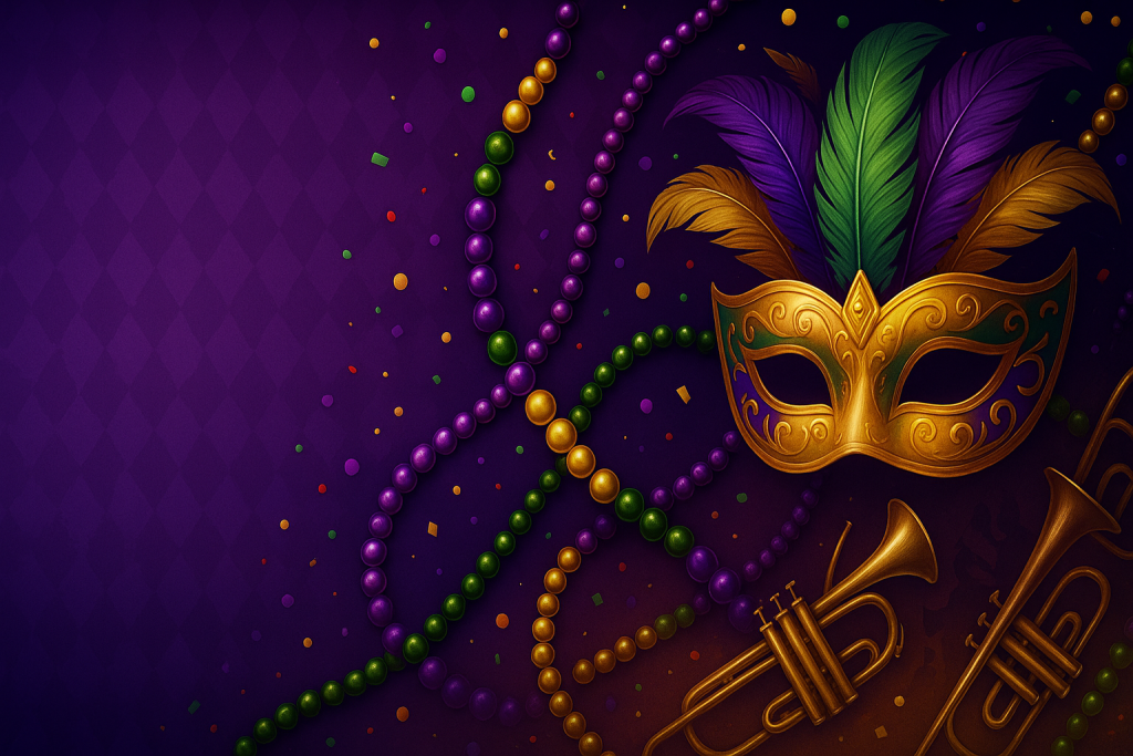
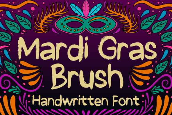
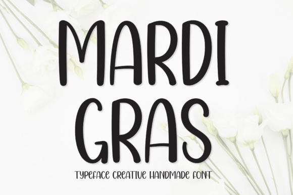
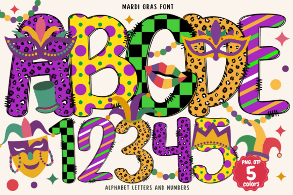
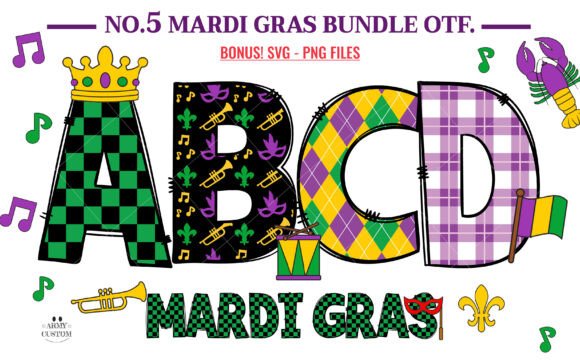
Mardi Gras Fonts bring New Orleans energy to your designs – from bold, harlequin displays to jazzy serifs and swashy scripts. Below you’ll find pairing recipes, color tips, cut-friendly picks and quick searches for invitations, posters, banners and Cricut/Silhouette projects.
Text Tools for Faster Workflow
Preview fonts, style text and convert to webfonts in one place.
What Makes a “Mardi Gras” Font?
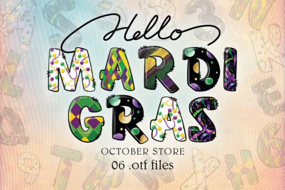
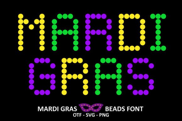
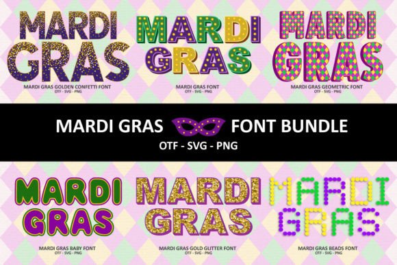
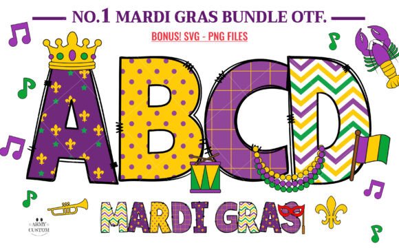
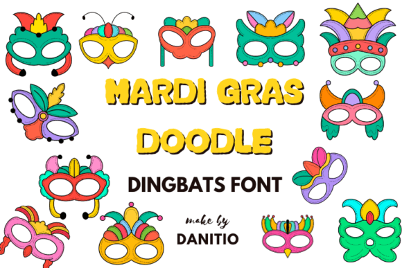
- Playful display energy: chunky, high-contrast letterforms, jester-style curves, diamond/harlequin cues, bead-like dots.
- Jazz club heritage: slab or wedge serifs, vintage wood-type textures, brass-band poster feels.
- Parade flourish: swashy scripts and hand-lettered brush styles that feel celebratory and loud.
- Pattern-friendly glyphs: alternates with stars, confetti, masks, crowns, or split-color inlines.
- Cutting-machine friendly options: clean paths, solid fills, layered/outline variants for easy vinyl or cardstock cutting.
Try Searches (fast shortcuts)
- Harlequin diamond display → graphic, carnival-style block faces with diamond inlines and theatrical personality – perfect for big parade headlines.
- Jester & circus fonts → whimsical, bouncy letters with playful terminals for tickets, bunting, and kid-friendly printables.
- Jazz poster serifs → vintage concert-poster vibes with chunky serifs and rhythm – great for menus, flyers, and NOLA-themed signs.
- Festive brush scripts → energetic, swashy handwriting to balance bold displays on invitations and RSVPs.
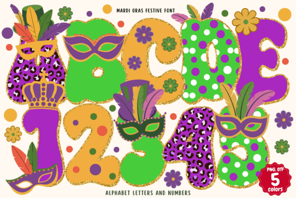
- Layered & shadow fonts → 2–4 layer stacks (base, inline, shadow, highlight) for depth and easy color mixing in purple/green/gold.
- Stencil parade fonts → bold, readable letters for signage, foam boards, and outdoor posters that need quick weeding.
- Retro New Orleans → heritage-inspired typography with French Quarter charm for programs, maps, and décor cards.
Font Pairing Recipes
Parade Poster
Headline: Harlequin/diamond display
Subhead: Jazz poster serif (small caps)
Body: Grotesque sans (tight leading)
Why it works: Strong geometric headline + heritage serif rhythm reads loud from a distance.
Invitation Suite
Names: Swashy brush script
Details: Clean humanist serif
Accents: Thin inline caps for time/place
Why it works: Script adds celebration; serif keeps it legible and elegant.
Banner & Garlands
Main: Layered 3D display (base + shadow + highlight)
Secondary: Stencil sans for dates
Why it works: Layering amplifies color play; stencil weeds fast on vinyl.
Menu & Table Cards
Section titles: Jazz serif (small caps)
Items: Neutral serif/sans
Price dots: Period leaders •••
Why it works: Nostalgic vibe with crisp readability at small sizes.
Project Ideas (Cricut, Silhouette & Print)
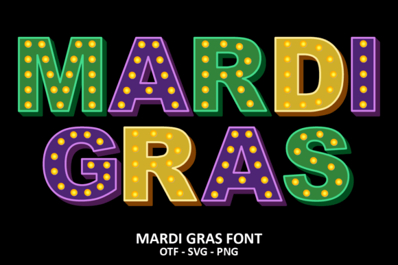
- Parade banners: layered display fonts with offset shadows for depth; use heavy cardstock or glitter vinyl.
- King cake toppers: glitter SVG alphabets; reinforce with acetate for rigid shapes.
- Mask party invites: brush script names + jazz serif details; add foil highlight to crowns or beads.
- Drink tickets & wristbands: stencil fonts for quick cutting and clear scanning points.
- Street-style posters: halftone textures behind bold diamonds; keep contrast high for legibility.
Color & Layout Tips
- Classic palette:
#6A0DAD(purple),#1E7F25(green),#D4AF37(gold). Use purple for type, green for accents, gold for highlights. - Layered type loves contrast: pick one dark base + one mid shadow + one metallic/bright highlight.
- Spacing: for chunky displays, tighten tracking (-10% to -2%) and add generous line-height for stacked titles.
- Texture carefully: harlequin patterns or bead borders can frame the layout – keep the inner content clean.
- Cut-friendly settings: avoid hairline inlines below 1.5–2 mm; prefer solid fills or stacked layers for vinyl.
Licensing Quick Notes
Always review the license for each font or alphabet set you use. Common points to check:
- Commercial usage: invitations for sale, printable bundles, and physical merchandise may require a commercial license.
- End products: some licenses allow unlimited physical end products but restrict digital redistribution of letter assets.
- Server/apps/embedding: webfont, app, and ePub licenses are typically separate from desktop use.
- Attribution & seats: confirm whether multiple team members can install the font or if extra seats are required.
Need Something Truly Unique?
For brand-specific wordmarks (parade teams, krewes, venues) or fully custom alphabets, hiring a lettering artist can save time and ensure originality.
FAQ: Mardi Gras Fonts
Chunky display faces with harlequin or circus flavor, jazz-inspired serifs, and layered 3D styles work great for big, high-impact titles.
Solid, bold displays, stencils, and layered fonts with clean paths. Avoid hairline inlines and super-thin scripts for small sizes.
Yes – use a swashy script for names and a sturdy serif/sans for details to balance celebration with readability.
Purple base type, green accents, and gold highlights. Add subtle white inlines for sparkle and legibility on dark backgrounds.
Use the shortcuts above or start here: Mardi Gras font search.
Explore More Resources
- Seasonal Fonts – Spring, Summer, Autumn & Winter
- Christmas Fonts – Festive, Elegant & Crafty Picks
- Halloween Fonts – Spooky, Cute & Retro Picks (Plus Bundles & Custom Lettering)
- Wedding Fonts – Elegant Scripts, Signature Looks & Modern Minimal
- Birthday Fonts – Fun, Script & Playful Picks
- Valentine’s Fonts – Romantic, Script & Stylish Picks