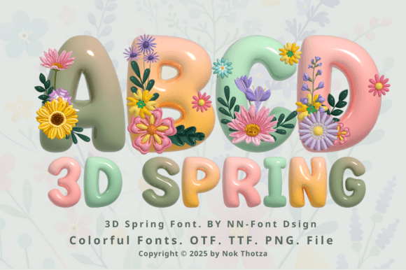
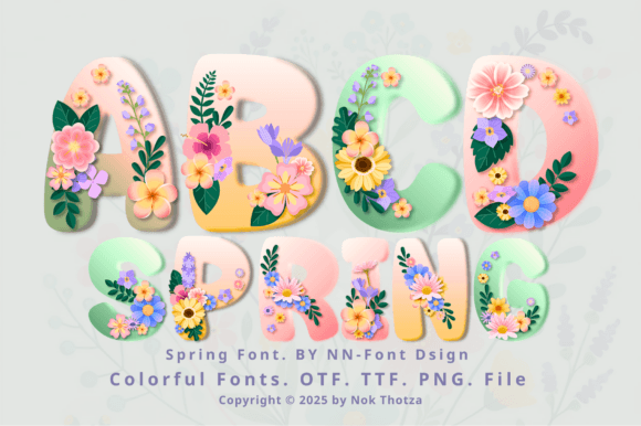
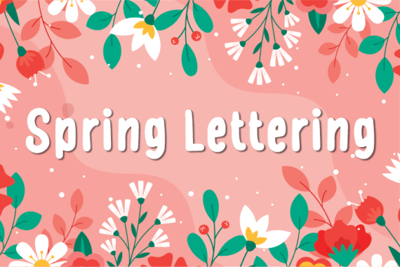
Spring Fonts set a light, optimistic tone for garden weddings, baby showers, Easter printables and fresh social posts. Below you’ll find pairing ideas, pastel color tips, cutting-friendly picks and quick searches to find exactly what you need for invitations, posters and Cricut/Silhouette projects.
What Makes a Great Spring Font?
- Fresh forms: rounded terminals, soft contrast, friendly curves.
- Floral energy: subtle swashes, botanical alternates, light inlines.
- Readable at small sizes: clean scripts/serifs that stay crisp on tags and place cards.
- Cutting-machine friendly: solid fills, tidy paths, layered/offset options for cardstock and vinyl.
Try Searches (fast shortcuts)
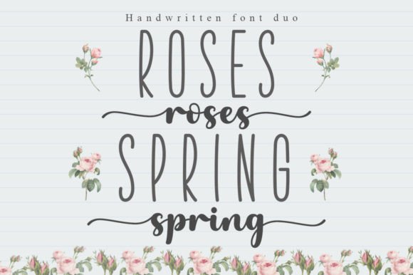
- Pastel script fonts → gentle, swashy handwriting that pairs well with minimal serifs on invites.
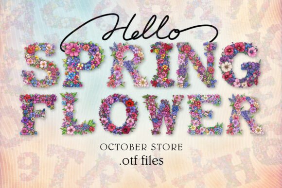
- Floral serif fonts → elegant titles with botanical flair for menus and programs.
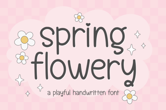
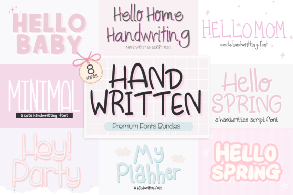
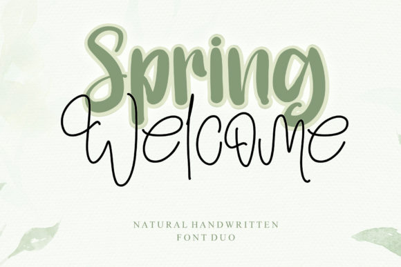
- Handwritten spring → casual, friendly lettering for tags, favor labels and RSVP cards.
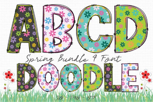
- Butterfly display → playful display faces with nature motifs for banners and kid crafts.
- Garden wedding scripts → refined calligraphy suitable for names and headings.
- Wildflower displays → quirky, hand-drawn titles that feel organic and fresh.
- Rounded sans → soft, clean body text to balance decorative scripts.
- Layered spring fonts → easy color-mix stacks (base/inline/shadow) for posters and garlands.
Font Pairing Recipes
Garden Wedding Suite
Names: Elegant calligraphy script
Details: Humanist serif (small caps for dates)
Accents: Thin inline caps for venues
Why: Script adds romance; serif holds legibility for long lines.
Farmer’s Market Poster
Headline: Wildflower display
Subhead: Rounded sans
Body: Grotesque sans (tight tracking)
Why: Hand-drawn personality + clean info hierarchy.
Baby Shower Invite
Names: Pastel brush script
Details: Soft serif
Extras: Simple monoline icons
Why: Friendly curves keep it warm and airy.
Instagram Quote Cards
Quote: Floral serif (all caps)
Author: Rounded sans
Tagline: Small monospaced
Why: High contrast headline with neat, modern support text.
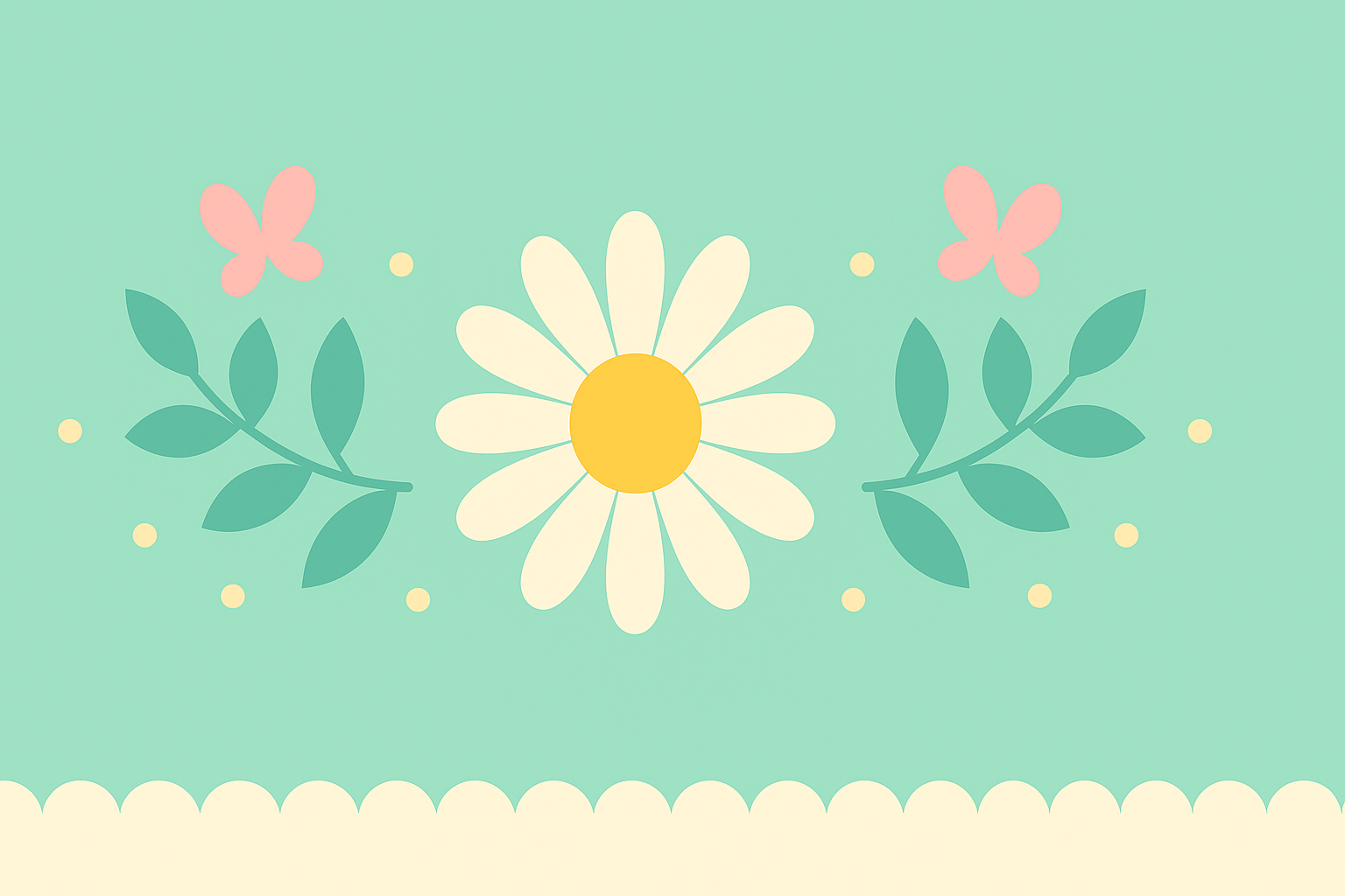
Spring Color & Layout Tips
- Pastels that pop:
#A7F3D0mint,#FDE68Abutter,#FBCFE8pink,#86B4C5sky. Use one dark neutral for contrast:#374151. - Whitespace wins: airy margins and generous line-height for light, fresh compositions.
- Layered titles: base + subtle inline + soft shadow; avoid hairline inlines under 1.5–2 mm for cutting.
- Texture carefully: botanical frames or dotted borders; keep the center clean for readability.
Project Ideas (Print & Cutting)
- Invitation suites: script names + serif details; add foil or emboss for headings.
- Banner garlands: layered display letters on pastel cardstock, offset shadow 2–3 mm.
- Favor tags & stickers: monoline icons + rounded sans; test at 18–22 pt minimum.
- Menu & place cards: floral serif titles; keep body 10.5–12 pt for legibility.
- Easter printables: playful displays with gentle inlines; avoid ultra-thin swashes for small cuts.
Cutting-Friendly Settings
- Prefer solid fills and clean paths; expand appearance before exporting SVG.
- For scripts under 30 mm height, reduce swash complexity; simplify nodes to speed weeding.
- Use offset/outline (0.8–1.6 mm) to strengthen delicate strokes.
Related Guides
See also: Easter Fonts · Mother’s Day Fonts · Graduation Fonts · Seasonal Fonts (hub)
Spring Fonts – FAQ
Pastel brush scripts, floral or soft serifs, rounded sans and light, hand-drawn displays.
Use the script for names or short headlines and pair with a neutral serif/sans for details at 10.5–12 pt.
Mint #A7F3D0 + Butter #FDE68A + Charcoal #374151; or Pink #FBCFE8 + Sky #86B4C5 + White.
Solid fills, simple swashes, layered/offset versions; avoid hairline inlines below ~1.5–2 mm.
Check each license for commercial use rules, end-product limits and multi-seat installations.
Explore More Resources
- Seasonal Fonts – Spring, Summer, Autumn & Winter
- Christmas Fonts – Festive, Elegant & Crafty Picks
- Halloween Fonts – Spooky, Cute & Retro Picks (Plus Bundles & Custom Lettering)
- Wedding Fonts – Elegant Scripts, Signature Looks & Modern Minimal
- Birthday Fonts – Fun, Script & Playful Picks
- Valentine’s Fonts – Romantic, Script & Stylish Picks