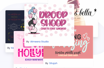
Autumn Fonts bring warm, nostalgic character to fall posters, farmers’ market signs, Thanksgiving menus and cozy invitation suites. Below you’ll find pairing ideas, warm color recipes, cutting-friendly picks and quick searches to grab the exact look you need for printables and Cricut/Silhouette projects. (Also called Fall Fonts.)
What Makes a Great Autumn (Fall) Font?
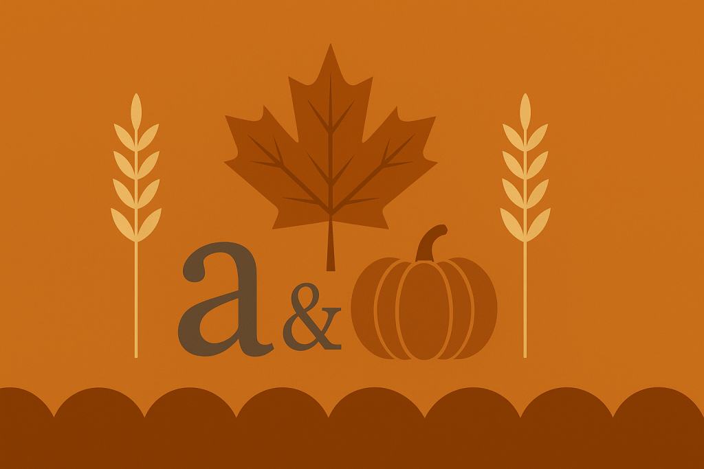
- Rustic warmth: slab or wood-type serifs, hand-drawn displays, soft ink-bleed textures.
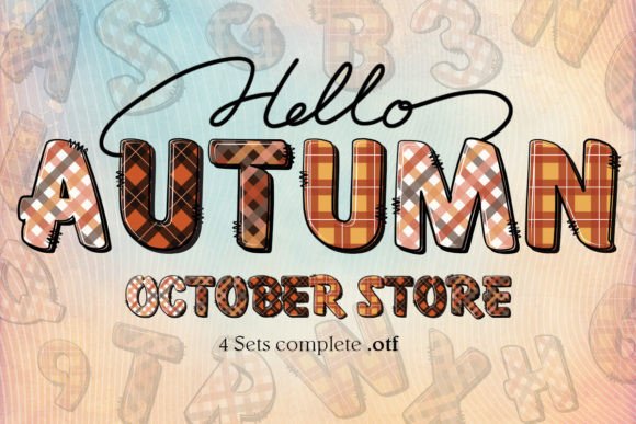
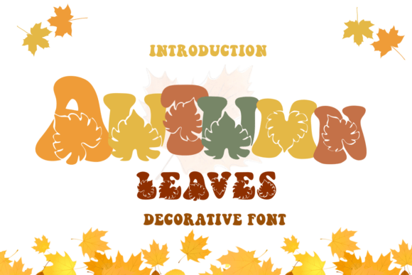
- Harvest motifs: pumpkin/leaf accents, ribbon swashes, simple ornaments for headings.
- Down-to-earth forms: moderate contrast, rounded corners, generous counters for legibility.
- Cutting-machine friendly: solid fills and layered/offset options that weed quickly.
Try Searches (fast shortcuts)
- Rustic serif fonts → sturdy titles for menus, posters and signage.
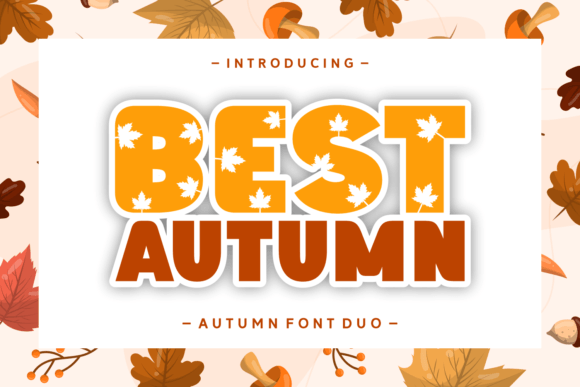
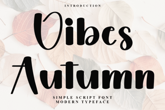
- Pumpkin display → playful fall headlines for banners and party printables.
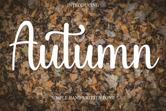
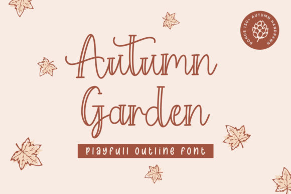
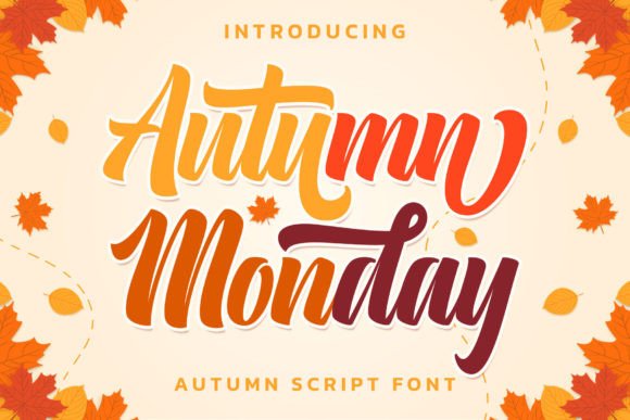
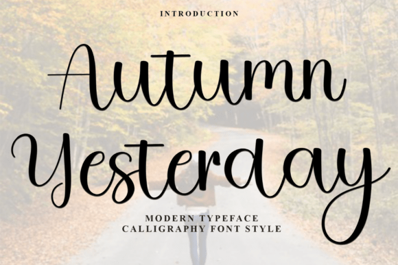
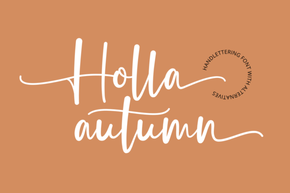
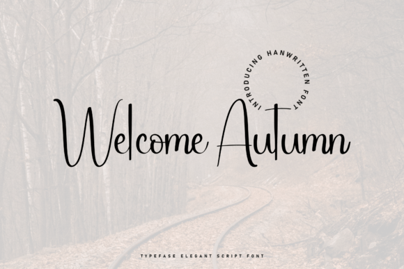
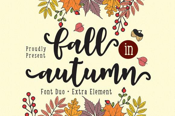
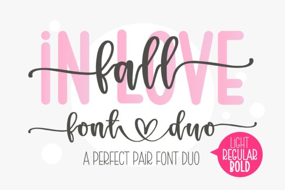
- Harvest scripts → friendly brush/calligraphy for names and short phrases.
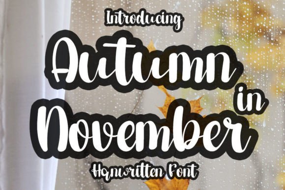
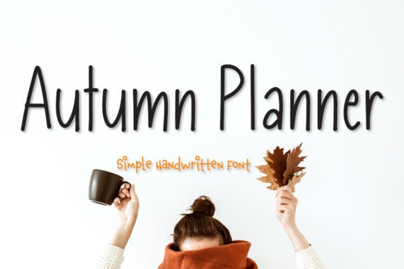
- Handwritten fall → casual lettering for tags, labels and rustic décor.
- Plaid display → blocky, cozy titles that pair well with warm textures.
- Wood-type fonts → vintage poster vibes for markets and festivals.
- Stencil fall fonts → bold, readable letters that cut and weed fast.
Prefer “Fall”? Try this search: Fall fonts →
Font Pairing Recipes
Farmers’ Market Poster
Headline: Wood-type display
Subhead: Slab serif (small caps)
Body: Grotesque sans (tight leading)
Why: Heritage impact + clear details for times and locations.
Thanksgiving Menu
Section titles: Rustic serif
Items: Humanist serif/sans
Price dots: Period leaders •••
Why: Cozy hierarchy with excellent small-size legibility.
Fall Party Invite
Names: Harvest brush script
Details: Clean serif
Accents: Leaf icon/ornament
Why: Expressive names balanced by tidy details.
Pumpkin Patch Signage
Main: Stencil display
Secondary: Rounded sans
Why: High visibility from afar and easy weeding on vinyl.
Autumn Color & Layout Tips
- Warm palette:
#D97706pumpkin,#92400Ebrown,#D4A373wheat,#6B7280slate. Neutral anchor:#1F2937. - Texture with care: subtle grain, kraft paper or plaid bars; keep body text on clean backgrounds.
- Layered titles: base + inline + soft shadow; avoid hairline inlines below ~1.5–2 mm for cutting.
- Spacing: tighten chunky displays (-2% to -8% tracking), add generous line-height for stacked headlines.
Project Ideas (Print & Cutting)
- Invitations & place cards: harvest scripts + clean serif; test body at 10.5–12 pt.
- Market banners & yard signs: stencil/wood-type displays on high-contrast panels.
- Recipe cards & menus: rustic serif titles with simple dividers and period leaders.
- Gift tags & stickers: handwritten fall fonts; minimum height 20–24 mm for easy weeding.
- Photo overlays: pumpkin display with soft shadow over warm gradient photos.
Cutting-Friendly Settings
- Prefer solid fills and clean paths; expand appearance before exporting SVGs.
- For small scripts, simplify swashes and join nodes; add offset/outline 0.8–1.6 mm for strength.
- Stencil letters: verify bridges ≥1.6 mm so counters don’t fall out.
Related Guides
See also: Halloween Fonts · Thanksgiving Fonts · Winter Fonts · Seasonal Fonts (hub)
Autumn (Fall) Fonts FAQ
Rustic slab/wood-type serifs, pumpkin/leaf displays, harvest brush scripts and casual handwritten styles.
Use the decorative face for headlines and a neutral serif/sans for details; body 10.5–12 pt with comfortable line-height.
Pumpkin #D97706 + Wheat #D4A373 + Slate #6B7280; or Brown #92400E + Cream + Charcoal #1F2937.
Solid, layered displays and simple scripts with clean paths; avoid ultra-thin inlines at small sizes.
Check each license for commercial permissions, end-product limits and multi-seat terms before selling.
Explore More Resources
- Seasonal Fonts – Spring, Summer, Autumn & Winter
- Christmas Fonts – Festive, Elegant & Crafty Picks
- Halloween Fonts – Spooky, Cute & Retro Picks (Plus Bundles & Custom Lettering)
- Wedding Fonts – Elegant Scripts, Signature Looks & Modern Minimal
- Birthday Fonts – Fun, Script & Playful Picks
- Valentine’s Fonts – Romantic, Script & Stylish Picks