Winter Fonts set a crisp, festive tone for holiday invitations, New Year posters, menus, gift tags and cool-toned social posts. Below you’ll find pairing ideas, icy color palettes, cutting-friendly picks and quick searches to grab exactly what you need for print and Cricut/Silhouette projects.

What Makes a Great Winter Font?
- Frost & sparkle: inline/engraved details, snowflake accents, subtle texture used sparingly.
- Elegant structure: high-contrast serifs, refined scripts, geometric sans for small text.
- High contrast palettes: cool blues with navy/charcoal and metallic gold/silver highlights.
- Cutting-machine friendly: solid fills, clean paths and layered/offset options for cardstock/vinyl.
Try Searches (fast shortcuts)
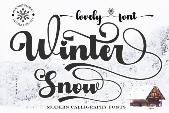
- Frosted display fonts → crisp titles with icy edges for posters and headers.
- Snow scripts → graceful, wintry scripts for names and short phrases.
- Elegant winter serifs → high-contrast classics for menus, programs and captions.
- Ice inline fonts → layered bases with fine inlines for shimmer effects.
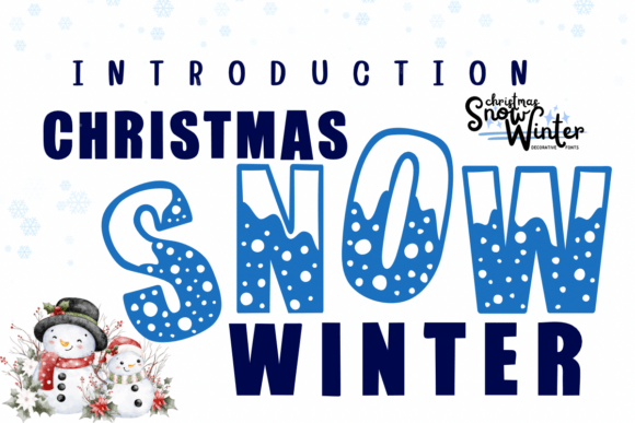
- Nordic displays → geometric, cozy titles for labels and décor.
- Retro ski poster → condensed, mountain-vibe display for event graphics.
- Stencil winter fonts → bold signage that weeds fast on vinyl.
Font Pairing Recipes
Holiday Invitation
Names: Elegant calligraphy script
Details: High-contrast serif (small caps for date/time)
Accent: Thin inline caps or small snowflake icon
Why: Poised, celebratory headline with legible details.
Winter Market Poster
Title: Frosted display (with shadow layer)
Subhead: Grotesque sans
Body: Neutral sans/serif 10.5–12 pt
Why: Icy character up top; simple info blocks underneath.
New Year Menu
Section titles: Elegant serif (all caps)
Items: Humanist serif/sans
Price dots: Period leaders •••
Why: Sophisticated hierarchy that prints cleanly.
Gift Tags & Stickers
Main: Nordic display or monoline script
Secondary: Rounded sans
Why: Friendly shapes that stay readable at small sizes.
Winter Color & Layout Tips
- Cool palette:
#0EA5E9ice,#1E293Bnavy,#E2E8F0frost,#CBD5E1silver. Festive accent:#D4AF37gold. - Keep contrast high: dark titles on light panels (or vice versa) for snowy scenes.
- Layered shimmer: base + subtle inline + soft shadow; avoid hairline inlines below ~1.5–2 mm for cutting.
- Spacing: tighten chunky displays a touch (-2% to -6%); add generous line-height for stacked headings.
Project Ideas (Print & Cutting)
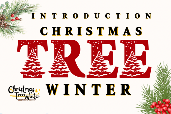
- Holiday cards & invitations: script names + serif details; foil or metallic ink for headings.
- Event posters: retro ski or frosted display with bold color blocks.
- Gift tags, labels & stickers: nordic displays; minimum 20–24 mm height for easy weeding.
- Menus & programs: elegant serif titles; keep body at 11–12 pt for legibility.
- Window decals: stencil winter fonts in white vinyl; check bridges ≥1.6 mm.
Cutting-Friendly Settings
- Prefer solid fills and clean paths; expand appearance before exporting SVGs.
- Scripts under 30 mm: simplify swashes; add offset/outline 0.8–1.6 mm for strength.
- Snowflake ornaments: keep minimum gaps ≥1.6–2 mm to prevent tearing.
Related Guides
See also: Christmas Fonts · New Year Fonts · Autumn (Fall) Fonts · Seasonal Fonts (hub)
Winter Fonts FAQ
Frosted displays, elegant high-contrast serifs, refined calligraphy scripts and cozy Nordic displays.
Use decorative faces for headlines; keep details in a neutral serif/sans at 10.5–12 pt with comfortable line-height.
Ice #0EA5E9 + Navy #1E293B + Frost #E2E8F0; or Silver #CBD5E1 + Gold #D4AF37 accents on charcoal.
Solid, layered displays and simple scripts with clean paths; avoid ultra-thin inlines or distressed textures at small sizes.
Check each license for commercial permissions, end-product limits and multi-seat terms before selling.
Explore More Resources
- Seasonal Fonts – Spring, Summer, Autumn & Winter
- Christmas Fonts – Festive, Elegant & Crafty Picks
- Halloween Fonts – Spooky, Cute & Retro Picks (Plus Bundles & Custom Lettering)
- Wedding Fonts – Elegant Scripts, Signature Looks & Modern Minimal
- Birthday Fonts – Fun, Script & Playful Picks
- Valentine’s Fonts – Romantic, Script & Stylish Picks