A strong color palette is one of the fastest ways to make a brand look more polished, more consistent, and easier to recognize. In this guide, you’ll learn how to use a color palette picker to build a practical branding system for logos, social posts, website sections, Canva templates, and everyday visual content without turning color decisions into a weekly headache.
This page is for creators, small business owners, Etsy sellers, coaches, Pinterest users, and personal brands that want faster design decisions and a cleaner repeatable visual style.
Last reviewed: March 2026
What a Color Palette Picker Actually Helps You Do
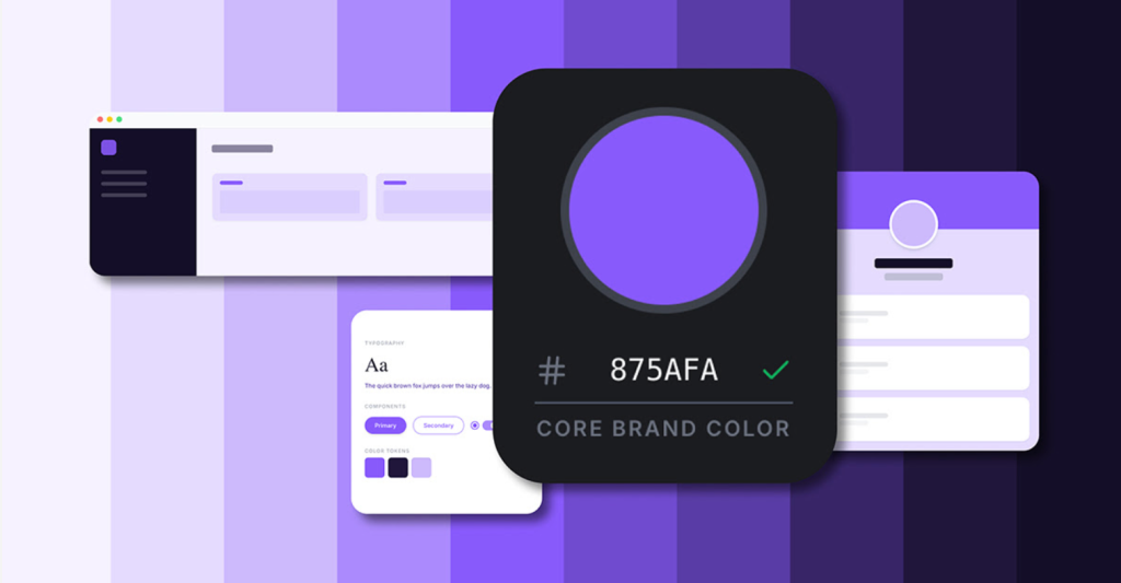
A color palette picker helps you build a set of colors that work together instead of choosing random shades every time you design something. That means less second-guessing, more consistency, and a much easier time keeping your logo, site, social graphics, and templates visually connected.
For many small brands, the problem is not “I have no colors.” The problem is “I keep using slightly different colors everywhere, and nothing looks like it belongs together.” That is exactly where a palette tool becomes useful.
Create a usable brand color system
- Choose one primary color that people start associating with your brand
- Add secondary colors so layouts do not feel repetitive
- Reserve accent colors for buttons, highlights, and calls to action
- Keep neutrals for clean backgrounds, readable text, and spacing balance
Keep visual consistency across channels
Once your palette is set, you can reuse it across Pinterest pins, website sections, lead magnets, Canva templates, product thumbnails, and social graphics. That consistency helps your brand feel more reliable, even before people read the actual content.
How to Use It Step by Step
- Define your brand mood: choose a few direction words like modern, elegant, soft, playful, minimal, earthy, or bold.
- Generate and compare palettes: do not judge them in isolation — test them on headings, buttons, cards, and real layouts.
- Assign color roles: decide what is primary, secondary, accent, and neutral.
- Apply the palette in Canva and site assets: reuse the same hex codes instead of improvising every time.
- Check readability before publishing: especially on mobile, where weak contrast becomes obvious fast.
Who This Is Best For
- Small business owners who want faster branding decisions
- Creators and coaches building simple repeatable visual systems
- Etsy and Pinterest sellers who need thumbnails and posts to feel more cohesive
- Canva users who want cleaner templates without hiring a full designer
- Personal brands trying to stop the “every post looks different” problem
For many small brands, this kind of tool is not about “becoming a designer.” It is about removing unnecessary friction from everyday content creation.
Who Should Skip It
If your company already has a fully documented brand system with strict enterprise guidelines, locked usage rules, and a complete design team, a lightweight palette tool may not change much for you. It is far more useful for people who are still building consistency, not for teams that already have every color token and usage rule finalized.
Use Cases for Small Business and Personal Brands
Instagram feed consistency
A fixed palette turns mixed posts into a more coherent visual stream, even when your content changes from tips to offers to testimonials to lifestyle content.
Logo and website alignment
When your logo, page sections, buttons, and featured graphics all pull from the same palette, the brand feels more intentional and more premium.
Seasonal campaigns without losing your identity
You can keep your main colors stable and only rotate a few accents for holidays, launches, or promotions. That gives you flexibility without turning every campaign into a completely different brand.
Color Palette Picker vs Canva Color Tools
| Criteria | Color Palette Picker | Canva Color Tools |
|---|---|---|
| Speed for first setup | Fast for structured palette creation | Good, but often more manual |
| Brand system consistency | Strong when roles are predefined | Strong if you maintain brand discipline |
| Beginner friendliness | Very easy for non-designers | Easy, but more layout-dependent |
| Best use case | Building repeatable color foundations | Applying colors directly in design layouts |
Simple advice: use both together. Build a clean palette first, then apply it consistently in Canva. That workflow is faster than trying to invent a color system inside every design file from scratch.
10-Minute Brand Palette Checklist
Before you publish a new design, check these basics:
- Your primary color is still clearly identifiable
- Your accent color is reserved for CTAs and highlights
- Text contrast is readable on both mobile and desktop
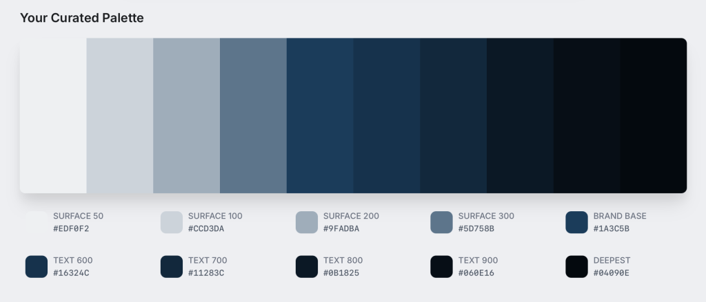
- You are not using more than 3–5 core colors at once
- Buttons, headings, and cards follow consistent roles
- The palette still works on both light and dark backgrounds
- Your thumbnails still look like the same brand at a glance
Pros and Cons
Pros
- Faster design decisions for everyday content
- Cleaner visual identity across platforms
- Beginner-friendly for solo brands and small teams
- Easy to scale across templates, launches, and campaigns
Cons
- Can feel generic if you skip brand mood and positioning first
- Too many accent colors quickly make everything look messy
- Weak contrast choices still hurt readability, even with a nice palette
- The tool helps with setup, but consistency still depends on how you use it
Try Color Palette Tools
Build a cleaner, repeatable color system for logos, social content, website elements, and Canva templates without overthinking every design decision.
Final Verdict
If your visuals feel inconsistent, or if you waste too much time choosing colors every time you open Canva, a color palette picker is one of the simplest practical upgrades you can make. Start with a clean 3–5 color system, define what each color does, and repeat it long enough for your audience to actually recognize it.
FAQ
What is a color palette picker?
It is a tool that helps generate and organize color combinations so your branding stays more consistent across logos, social graphics, websites, and templates.
How many colors should a small brand use?
Most small brands work best with 3–5 core colors: one primary, one secondary, one accent, and one or two neutrals.
Can this create a full brand kit or only colors?
It mainly helps structure your color system. You can then combine that with fonts, logo rules, template layouts, and design rules to build a fuller brand kit.
Can I use these palettes in Canva?
Yes. Add the hex codes to Canva Brand Kit or your working templates and reuse them everywhere.
What should I do after generating a palette?
Assign color roles, test contrast, apply the palette to your main templates, and keep using it consistently for a while before making changes.
Do I need design experience to use this?
No. Most palette workflows are simple enough for beginners and are useful precisely because they reduce guesswork.
You may also like
Creative tools for small business
Etsy listing optimization workflow with AI support
Canva brand kit templates and editable assets