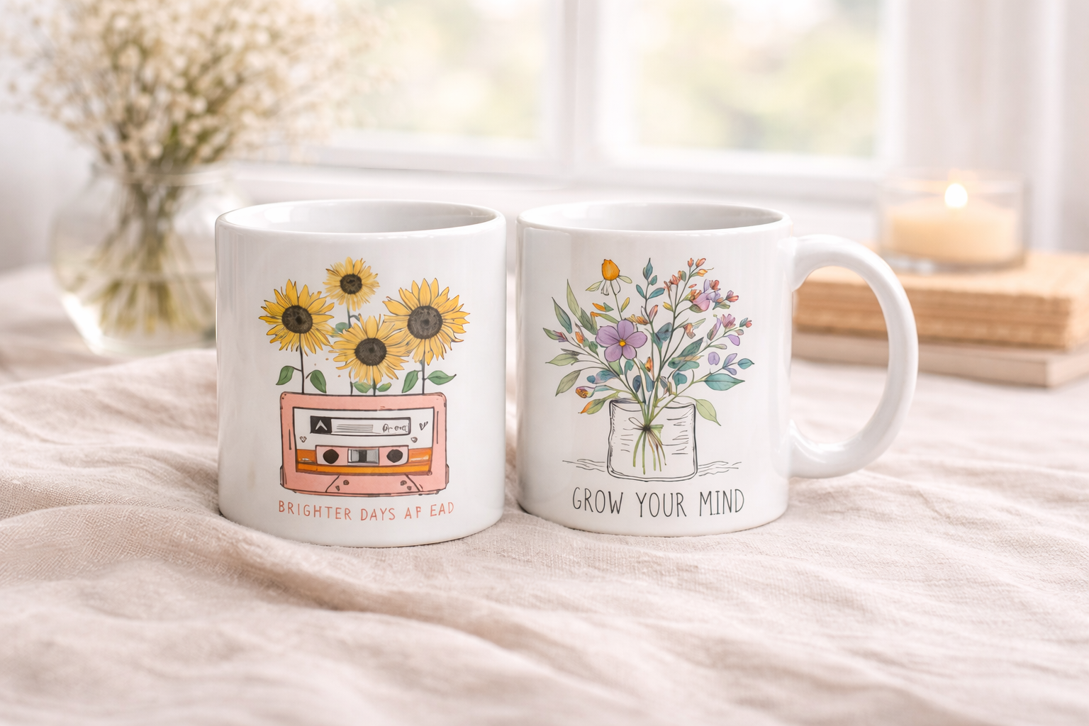
If you are looking for Floral Mug Designs that actually look good in real life, the sweet spot is simple: pick one clear flower direction, keep the layout breathable, and let the mug shape do part of the visual work. The best floral mugs are not always the busiest ones. They are the ones where color, spacing, and message feel calm together from arm’s length and up close.
A floral mug can lean elegant, playful, boho, botanical, vintage, or inspirational. The hard part is that many designs look charming in a small thumbnail, then start to feel crowded when printed at full wrap size. That is why this guide focuses on decisions that actually help: which floral style fits the person, what usually feels tasteful, and what tends to push a mug into clutter.
Whether you are buying a gift, designing your own wildflower coffee mug, or building a collection to sell, you will get clearer direction here, from style families to typography decisions and practical composition rules.
Floral Mugs by Style Family: What Actually Changes Visually
People often use floral terms interchangeably, but the mood differences are real. A Watercolor Floral Mug reads soft and artistic. A botanical layout reads cleaner and more intentional. A boho wildflower look feels relaxed and earthy. A vintage flower print can feel nostalgic and romantic, but also dated if color and placement are off.
Watercolor Floral Mug and Watercolor Wildflowers Mug
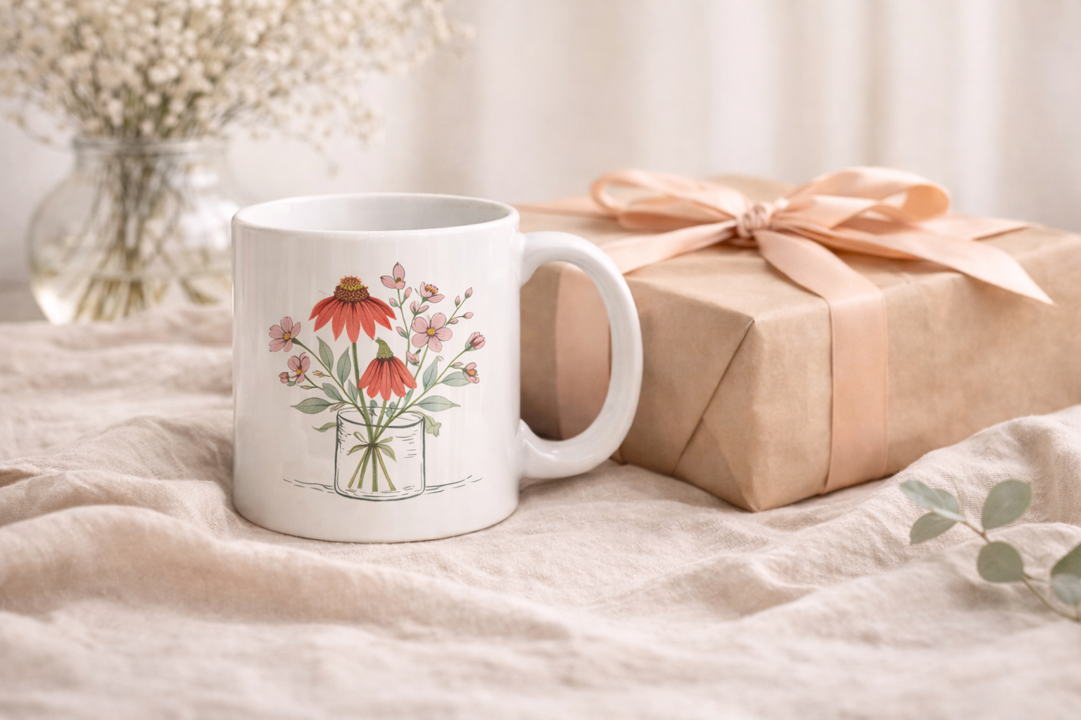
Watercolor styles usually have softer edges, layered paint textures, and a lighter emotional tone. They work well for spring gifts, teacher gifts, bridesmaid sets, and gentle desk mugs. A strong watercolor wildflowers mug design leaves breathing room between stems and blooms instead of filling every inch with paint.
If the flowers are vivid, keep the typography quieter. If the flowers are pale, you can afford a little more contrast in the text. This is where many mugs go wrong: bold flowers, a bold quote, and a decorative font all fighting for attention at once.
Wildflower and Boho Wildflowers Mug Styles
A boho wildflowers mug often uses hand-drawn stems, warm neutrals, dusty pinks, terracotta accents, and asymmetrical arrangements. It feels casual and modern when done with restraint. It feels messy when every element tries to be “feature worthy.”
Wildflower layouts are strong when they mimic natural growth patterns: clusters, uneven spacing, and directional movement. They are weaker when each flower is stamped at equal size in equal distance around the mug.
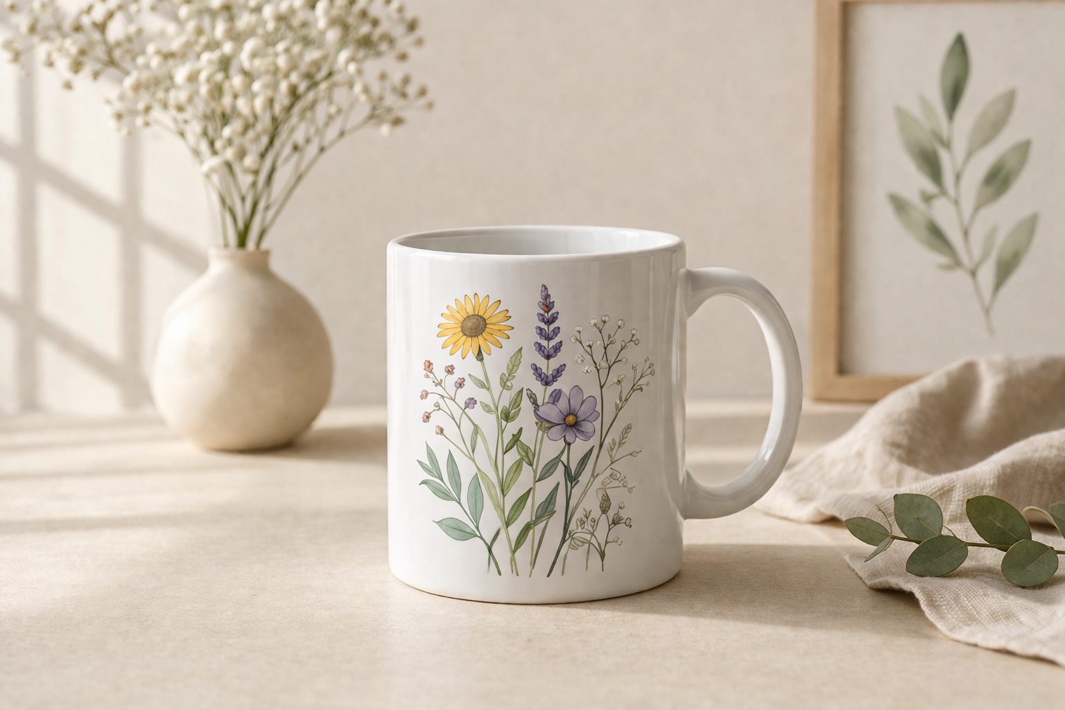
Botanical Floral Mug Design
Botanical styles are cleaner and more structured. Think specimens, defined leaves, and clearer silhouette edges. A botanical floral mug design is usually easier to pair with a name, monogram, or short line of text because the artwork already has visual discipline built in.
If your recipient likes minimal interiors, this is usually safer than a dense cottage floral print.
Vintage Flower Print Mug
A vintage flower print mug can be beautiful for mother-themed gifts, tea lovers, or nostalgic aesthetics. The most common problem here is color drift into muddy browns or muted combinations that flatten on ceramic. If you go vintage, keep one fresh accent color so the mug still feels alive.
Inspirational Floral Mugs
Inspirational floral mugs combine flowers with quotes, affirmations, or one-line reminders. They can be warm and giftable across many occasions, especially if text is short. Long quotes wrapped around a floral background usually become hard to read after printing curvature is considered.
Short text plus thoughtful flower framing usually wins. One clean line has more emotional impact than a paragraph floating over petals.
How to Choose the Right Floral Direction for the Right Person
Picking the style gets easier when you begin with recipient vibe, not flower type. Start with how the mug will be used and where it will live.
- For moms: soft watercolor, garden rose palettes, or elegant floral watercolor mug layouts with short heartfelt wording.
- For teachers: readable typography, lighter background, and practical quote length that reads quickly in a busy day.
- For bridesmaids: coordinated but not identical designs. Keep the same floral family and vary names or initial placement.
- For birthdays: vibrant floral mug styles with brighter contrast and celebratory but short messaging.
- For everyday desk use: cleaner botanical or wildflower framing with low-clutter centers.
If you are choosing between elegant and playful, look at contrast and line quality. Fine stems, fewer blooms, and negative space feel elegant. Dense bouquets, saturated color, and layered decorative fonts feel playful.
A pink and purple floral mug can look graceful or overly sweet depending on saturation. Slightly muted tones with one deeper accent usually feel more premium than high-saturation pink-purple across the full wrap.
When in doubt, test a design in grayscale for five seconds. If shape hierarchy still reads clearly, the mug will usually print well in color too.
What Makes Floral Mug Designs Look Beautiful and Balanced
Most floral mugs fail for one reason: they try to do everything at once. Beautiful designs have hierarchy. Your eye should know where to land first, second, and third.
1) Flower Density
A floral mug with vibrant flowers can be stunning, but only when bloom density is controlled. Dense at top and bottom with a calmer center works better than full-density everywhere. Think frame, not wallpaper.
2) Visual Breathing Room
For a floral background mug design, leave at least one low-detail zone for the eye to rest. If every centimeter has petals, leaves, dots, and texture, the mug looks busy before text is even added.
3) Color Strategy
A vibrant rose mug designs direction needs one star color and supporting colors. If red, pink, coral, and magenta all compete as “main,” the result looks loud, not lush. Use one lead floral shade and two quieter companions.
4) Mug Color Match
White ceramic gives watercolor and pastel florals the safest readability. On darker mugs, fine stem details disappear unless stroke weight is increased. A floral mug with colorful flowers that looks balanced on white can become low-contrast on black or navy.
5) Edge Behavior
Where flowers touch the handle zone matters. Hard cutoffs near the handle can make a polished design feel accidental. Let stems taper or intentionally wrap rather than abruptly ending.
Typography and Layout for Floral Mugs (With or Without Quotes)
Many floral mugs include names, initials, or short lines. Typography is often where a design becomes either polished or chaotic.
If You Use No Text
A pure floral graphic mug can look expensive when composition is intentional. Use directional movement: blooms drifting left to right, or base cluster plus top accent. Avoid random floating flowers that feel pasted in.
If You Use a Short Quote
For an inspirational floral coffee mug, keep wording to one short sentence or phrase. Two lines is usually the safe upper limit. Strong examples include calm affirmations or warm daily reminders. The floral artwork should support the quote, not compete with it.
Font Mood by Style
Script fonts can feel romantic but become hard to read fast, especially over painted petals. Serif fonts give a more editorial, elegant look. Rounded sans serif works well for modern boho and clean botanical styles. Decorative fonts should be used in tiny doses.
If you need help testing typography, a quick way is to preview layouts using mug mockup templates and compare reading distance. A design that looks charming at 200% zoom can disappear at normal desk-view scale.
Quote Placement Rules That Prevent Clutter
- Center text in the calmest area of the composition.
- Avoid placing key words over high-detail petals.
- Use one text color with clear contrast first, effects second.
- If the flower art is dense, shorten copy instead of shrinking font size.
A simple rule: if you need outlines, shadows, and glow all together just to make text readable, the floral background is too busy for that quote length.
Style Directions and Practical Floral Inspiration Ideas
Here is where floral direction becomes practical. Instead of grabbing random references, choose one lane and build around it.
Elegant Floral Watercolor Mug
This is usually soft gradients, petal overlap, and restrained color transitions. It works for bridal gifts, mothers, and spring celebrations. Keep copy minimal and avoid novelty effects. If you want assets, a curated watercolor flowers collection can help you compare line softness and bouquet shape styles.
Boho Wildflower Floral Mug
Earthy, relaxed, and slightly asymmetrical. Use dusty clay, olive, muted mustard, and warm cream combinations. Boho works best when artwork feels hand placed, not perfectly mirrored. A practical shortcut is to review wildflower assets and build from one floral family instead of mixing six unrelated ones.
Vibrant Floral Mug
For bold gifting and birthday energy, a vibrant floral mug can be fantastic. The control point is contrast: bright flowers need a calm background and clean text placement. Bright-on-bright everywhere turns into visual fatigue quickly.
Hand-Drawn Floral Design Mug
A hand-drawn floral design mug or hand-drawn flower design mug often feels artisanal and more personal. It is excellent for small-batch shop aesthetics. The best versions keep line consistency. When line thickness jumps too much across elements, the design feels stitched together from different sets.
Floral Pattern Inspirational Mugs
For quote-driven gifting, floral pattern inspirational mugs should prioritize legibility over decoration volume. If your quote matters emotionally, make sure it can be read without rotating the mug three times. A good pattern frames the message, it does not bury it.
When browsing references, use inspiration to map mood, color pacing, and composition logic. Do not rebuild someone else’s exact arrangement. For broader exploration, a tag-level floral design resource is useful for direction without cloning specific mug concepts.
Use-Case Guide: Which Floral Mugs Work Best for Which Occasion
Moms and Family Gifts
Sentimental floral styles with soft palettes perform well. Avoid overly trendy motifs that may feel dated quickly. If you are comparing ideas, this pairs nicely with approaches used in personalized photo mugs, where emotional clarity is stronger than design complexity.
Teachers
Teachers usually appreciate practical readability. A clean floral themed coffee mugs approach with one short message feels polished and useful at school. Tiny scripts and dense backgrounds are less practical for everyday classroom use.
Bridesmaids and Wedding-Adjacent Sets
Matching style family, varied names. Keep flowers consistent across the set, then personalize with initials or first names. If you like initial-based direction, you can cross-reference ideas from name and monogram mug layouts and merge them with floral framing.
Spring Gifts and Seasonal Drops
Spring gifting works best with lighter compositions and gentle contrast. For shops building seasonal catalogs, pair this page with your broader visual packs from Mother’s Day graphics and mug-specific inspiration from sublimation designs for mugs.
Everyday Desk Mug
For daily use, low-clutter layouts age better. Strongly themed holiday florals can feel less versatile over time. A clean botanical border with a short line of text usually stays enjoyable year-round.
If you are curating sets, a floral inspirational mug set feels cohesive when each mug shares one palette system and one typography family, with small floral variation per piece.
Common Mistakes That Make Floral Mugs Look Cluttered, Outdated, or Cheap
Most “almost good” floral mugs fail in predictable ways.
Too Many Flower Types in One Layout
Mixing roses, daisies, peonies, wild stems, leaves, butterflies, and decorative swirls in one wrap usually feels assembled rather than designed.
Overdecorated Typography
Script + shadow + outline + texture over busy petals is a classic readability trap. Choose one clear text treatment.
No Focal Point
If every bloom is equal size and equal saturation, the eye has nowhere to rest. A polished floral mug aesthetic needs hierarchy.
Ignoring Mug Curvature
Designs tested only on flat canvases can distort near handle areas. Always preview on curved mockups before finalizing. You can quickly sanity-check composition in your existing sublimation workflow.
Repeating the Same Layout Across a Whole Collection
Sellers often swap flower color only and call it a new SKU. Shoppers notice. Variation should include composition changes too: corner cluster, side sweep, full wrap frame, or minimal accent design.
For Sellers: Build Floral Collections Without Repeating Yourself
A floral catalog can scale fast without becoming repetitive if you vary structure intentionally.
Try using three repeating collection pillars:
- Quiet Botanical: low-density leaves and stems, high readability, minimalist text.
- Soft Watercolor: painterly blooms, moderate density, emotional gifting tone.
- Bold Seasonal Floral: high color contrast, statement blooms, short celebratory lines.
Within each pillar, vary one major variable at a time: colorway, placement, or text style. That keeps cohesion while giving customers real choice.
If your shop includes related mug content, linking conceptually to pages like funny coffee mug designs can also help visitors self-sort by mood: witty vs soft floral vs personalized sentiment.
A useful final check for sellers: if two mugs would look almost identical from a few feet away, they are probably too similar to deserve separate listings.
Final Guidance: Keep It Floral, Keep It Clear
The best Floral Mug Designs are not the busiest ones. They are the ones where flower mood, text mood, and recipient mood all point in the same direction. Start with purpose, choose one floral family, protect readability, and edit harder than you think you need to.
If you are designing for gifts, aim for emotional clarity. If you are designing for sales, aim for collection logic. In both cases, strong composition beats extra decoration every time.
And if a design feels almost right but slightly crowded, trust that instinct. Remove one element, give the flowers room, and the whole mug usually looks better immediately.