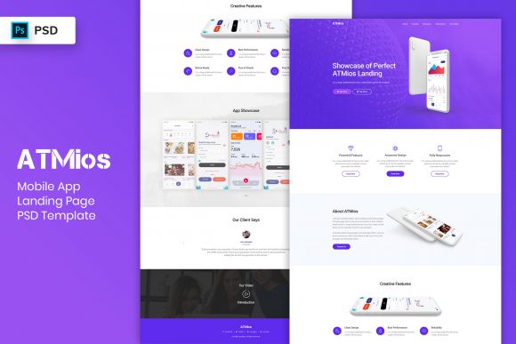
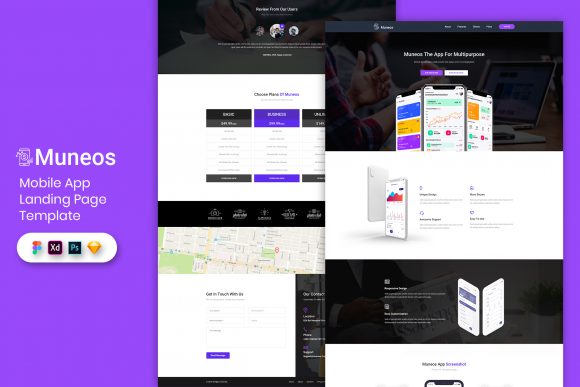
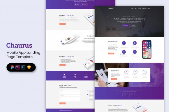
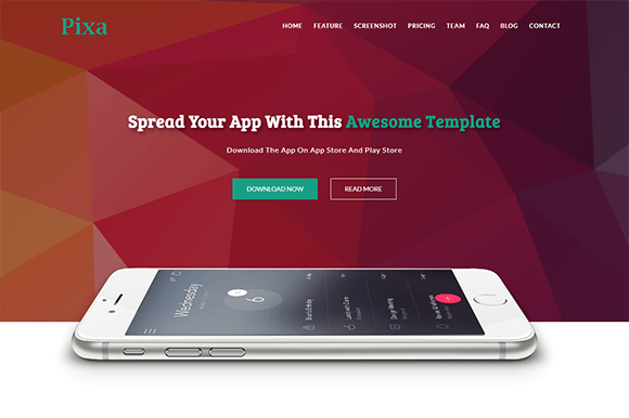
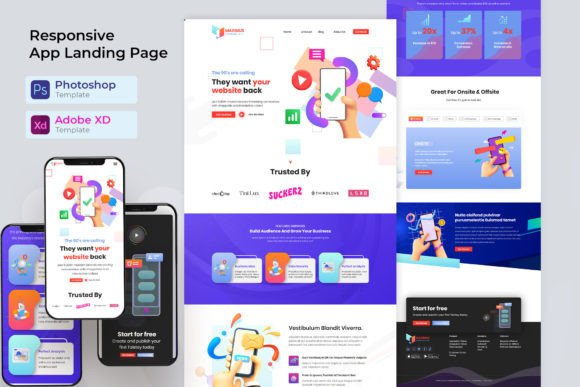
App Landing Pages: Templates Built to Drive Installs & Signups
App landing pages turn clicks into installs and signups with a clean flow: hero → value props → screenshots → trust → CTA → FAQ. Use this page to pick the right mobile app landing page template type (iOS/Android, onboarding, SaaS app, waitlist), customize fast – copy, sections, and CTAs – and keep everything scannable on mobile.
Why app landing pages work
App pages convert when they reduce doubt quickly: what the app does, who it’s for, and why it’s worth installing today. However, conversions drop when benefits are generic, screenshots feel unclear, or the CTA is hard to find. A strong template keeps the page focused, so users can decide faster on mobile.
- Clear value props: 3–6 outcome-focused benefits.
- Visual proof: real UI screenshots or a short product tour.
- Trust signals: ratings, testimonials, press, and security notes.
- One primary CTA: install, start free, or join waitlist.
App landing page template types
Choose a template based on your funnel step. Then keep one main CTA across the page (Install / Start free / Join waitlist).
App store install pages (iOS / Android)
- Best for: driving installs from ads, Pinterest, or social.
- Key blocks: value props, screenshots, ratings, install CTA.
SaaS app signup pages (product-led)
- Best for: web apps and tools with free trials or freemium.
- Key blocks: how it works, proof, onboarding steps, signup CTA.
Waitlist / early access pages (pre-launch)
- Best for: upcoming apps, beta access, feature launches.
- Key blocks: promise, screenshots/mockups, short opt-in, timeline.
Feature / product tour pages
- Best for: reducing “not for me” objections with clarity.
- Key blocks: feature grid, workflows, integrations, proof.
Must-have sections (the install-ready structure)
High-converting app landing pages are calm and scannable. Ideally, visitors should understand the app and the next step within 10 seconds – especially on mobile.
- Hero: outcome + who it’s for + one CTA.
- Value props: 3–6 benefits written as results.
- Screenshots: 3–6 screens that match the promise.
- Trust: rating, testimonials, press, security/privacy cues.
- FAQ: pricing, platforms, setup time, cancel anytime.
Copy blocks you can reuse
App pages convert faster when your copy is specific. For example, add the audience and the outcome in the hero, and then support it with simple proof near the CTA.
Headline formulas for app landing pages
- [App] for [Audience] (example: “Budgeting app for freelancers”).
- Do [Outcome] in minutes (example: “Track habits in minutes”).
- Get [Result] without [Pain] (example: “Plan workouts without spreadsheets”).
CTA button text
- Installs: “Install now”, “Get the app”.
- Signup: “Start free”, “Create account”.
- Waitlist: “Join the waitlist”, “Get early access”.
Conversion frameworks (copy-paste outline)
- Outcome → Benefits → Screenshots → Trust → CTA (best for installs)
- Problem → Solution → How it works → Proof → CTA (best for SaaS signup)
- Reveal → Preview → Bonus/Timeline → Waitlist → FAQ → CTA (best for pre-launch)
Conversion checklist (quick wins)
- One primary CTA: avoid competing buttons.
- Show the UI early: screenshots beat generic claims.
- Proof near CTA: ratings/testimonials close to the button.
- Mobile-first: short sections, calm spacing, big tap targets.
- Clarify terms: pricing cues, trial length, cancel anytime.
Recommended picks
Start with one page type and one CTA. Then improve conversion by testing the hero headline (audience + outcome) and placing trust right next to the CTA.
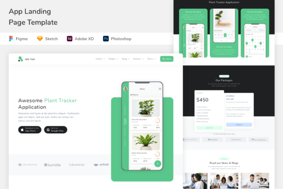
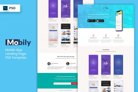
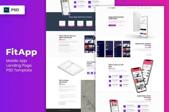
Mobile App Landing Pages
Install-focused layouts with screenshots, ratings, and a clear CTA.
View options →SaaS App Signup Pages
Product-led pages built around workflows, proof, and free signup CTAs.
View options →App Waitlist / Early Access Pages
Pre-launch pages with previews, benefits, and simple opt-ins.
View options →App Product Tour Pages
Feature grids and walkthrough sections designed to reduce hesitation.
View options →FAQ
How many screenshots should an app landing page have?
Usually 3–6 is enough. First, show the “main promise” screen. Then add supporting screens that match the benefits. Finally, place ratings or testimonials near the CTA for extra trust.
Should I use one CTA or multiple CTAs?
Use one primary CTA. If you need two actions (install vs waitlist), keep one as primary and use the other only as a secondary link lower on the page.
Related landing page hubs
Landing Page Templates (Main Hub)
Browse all landing page categories and styles in one place.
Explore →SaaS Demo / Free Trial Landing Pages
Feature-first pages built for demos, trials, and signups.
Explore →Next step
Pick one CTA (install, signup, or waitlist), make the value props specific, and show the UI early. After that, test the hero headline and move proof closer to the CTA – those two changes usually lift conversions the fastest.