CTA Button Copy Ideas: High-Intent Phrases That Get Clicks
CTA button copy works best when it matches the user’s next step: what they get, how fast, and how safe it feels. Use this guide to pick the right CTA style by goal (lead, purchase, demo, download), write microcopy that reduces friction, and keep buttons consistent across the page.
Why CTA button copy matters
Buttons get clicks when they remove uncertainty. Great CTA copy is clear about the reward (“what I get”), the effort (“how hard it is”), and the risk (“is it safe?”). In most cases, specific beats clever.
- Clarity: the user knows what happens after the click.
- Momentum: the CTA matches the stage (learn → try → buy).
- Confidence: microcopy reduces fear near the button.
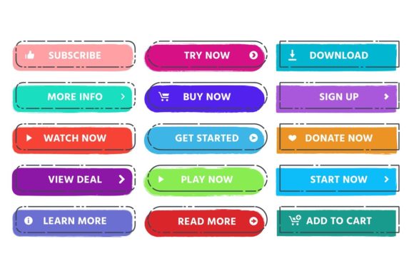
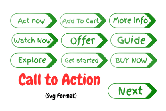
CTA button copy ideas (quick list)
Use these as starting points. Then adjust the noun to your offer (demo, audit, template, checklist, quote, trial, call).
- Start: Get Started • Start Here • Start Now
- Try: Try It Free • Start Free Trial • Preview It
- See: See Pricing • View Plans • Compare Options
- Learn: See How It Works • Watch the Demo • Explore Features
- Get: Get the Template • Download the Checklist • Grab the Guide
- Book: Book a Call • Schedule a Demo • Reserve Your Spot
CTA ideas by page goal
Lead capture (email / lead magnet)
- Send Me the Guide
- Get the Free Checklist
- Download the Template
- Get Weekly Tips
Product purchase
- Add to Cart
- Buy Now
- Get Instant Access
- Unlock the Bundle
Demo / consultation
- Book a Demo
- Schedule a Call
- Get a Free Quote
- Request an Audit
Checkout reassurance (near forms)
- Continue Securely
- Continue to Checkout
- Confirm & Get Access
- Save My Spot
Microcopy that boosts clicks (near the button)
Pair a strong CTA with one short “risk reducer.” Keep it tiny and factual.
- Risk: No credit card required • Cancel anytime • 30-day guarantee
- Speed: Takes 30 seconds • Instant download • Get results today
- Privacy: No spam • Unsubscribe anytime • We respect your inbox
- Clarity: You’ll receive: [X] • Includes: [Y] • Works for: [Z]
Copy formulas you can reuse
- Outcome CTA: “Get [Outcome]”
- Asset CTA: “Download the [Asset]”
- Try CTA: “Start Free Trial” + (microcopy: no card / cancel anytime)
- Time CTA: “Get Results in [Timeframe]” (only if true)
- Low-friction CTA: “See Pricing” / “View Plans” before asking to buy
Quick checklist (before you publish)
- One action: the button matches one clear next step.
- Specific: “Get the template” beats “Submit”.
- Consistent: same CTA across sections unless the goal changes.
- Risk reducer: add one short line near high-friction CTAs.
- Mobile-friendly: short label that fits on one line.
Recommended picks
Start with a clean CTA button set, then pair it with a small trust line and a simple testimonial block near the form.
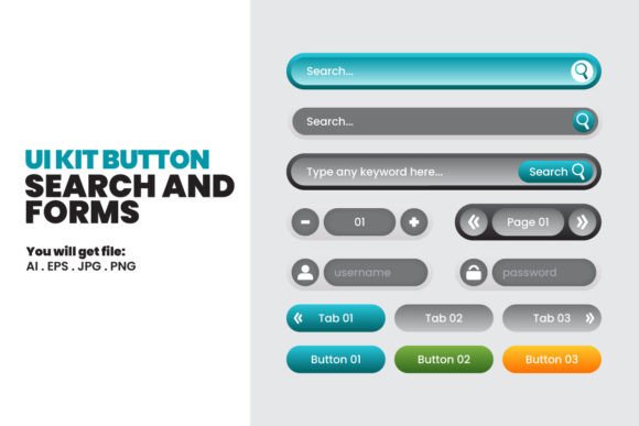
CTA Button Template Sets
Button styles, states, and layout variations for landing pages and funnels.
View options →Call-To-Action Sections
CTA blocks with headline + benefit bullets + button + microcopy line.
View options →Lead Magnet Opt-In Templates
Opt-in sections with strong CTA placement and low-friction design.
View options →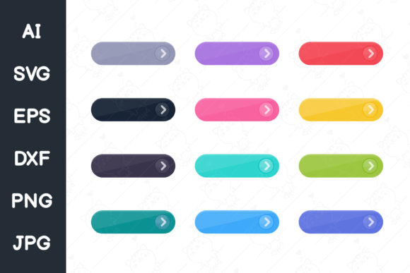
FAQ
How long should CTA button text be?
Usually 2–4 words. Keep it readable on mobile and avoid wrapping.
Should I use “Submit”?
Only if you can’t change it. Outcome-based CTAs (“Get the guide”, “Book a call”) almost always perform better.
More Template Guides
Social Proof Examples
Testimonials, reviews, logos, stats, and trust badges that lift conversions.
Explore →High-Converting Forms Guide
Field order, friction reducers, and trust cues that improve signups.
Explore →Landing Page Sections That Convert
Proven section order and blocks you can reuse across niches.
Explore →How to Choose a Template
Pick layouts by goal, traffic source, and offer – without overthinking.
Explore →Next step
Pick one primary CTA for the page goal, write one risk-reducing microcopy line, and keep the CTA consistent across the hero, mid-page, and final section. Then test 2–3 variants (Outcome vs Try vs See Pricing).