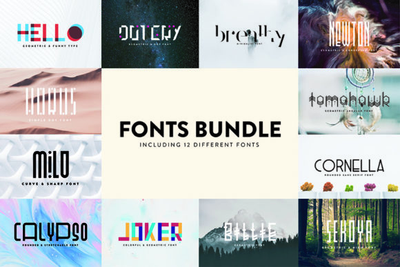
This guide to display fonts shows how to pick punchy titles that read in a split second – bold, condensed, outline/3D and retro sets – plus quick sizing rules for thumbnails, banners and price tags.
Editor’s top picks – Display Fonts
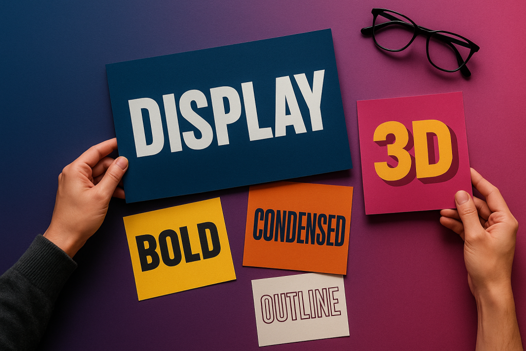
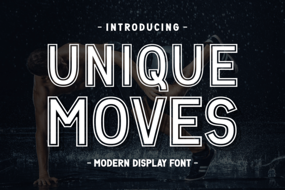
Ultra Bold
Heavy, compact titles that hit hard on posters and hero graphics.
Condensed
Perfect for long words and narrow spaces; great for price tags and thumbnails.
Outline & 3D
Outline, shadow and extrusion styles for layered, eye-catching headlines.
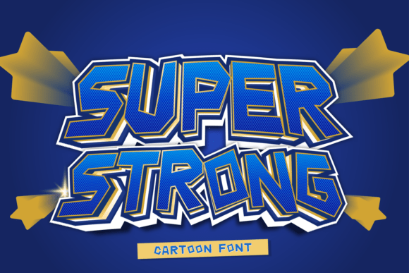
Sports
Varsity and jersey vibes – bold blocks with strong numerals.
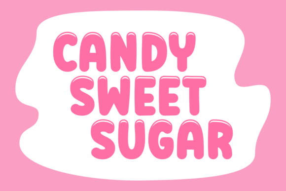
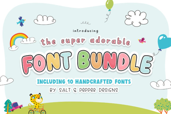
Rounded
Friendly, chunky forms that feel approachable on social graphics.
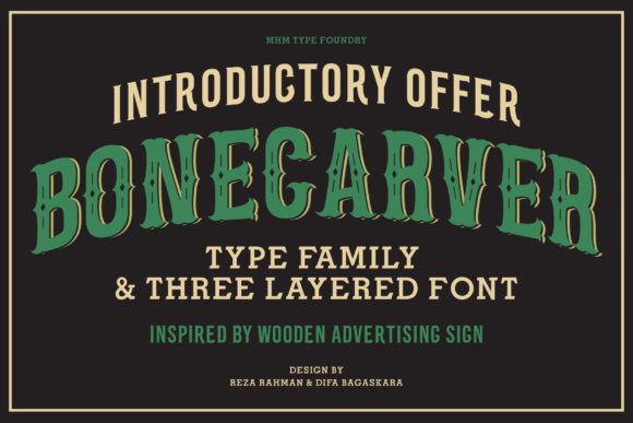
Retro/Vintage
Throwback curves and stripes – pair with grain or halftone textures.
Futuristic
Techy geometry and sharp details; increase tracking for tiny thumbnails.
Stencil
Industrial impact; holds up well in vinyl cutting and high-contrast prints.
Text tools for faster display titles
- Custom lettering – bespoke words that fit your layout perfectly.
- Font modification – tighten spacing, add alternates, outline layers.
- Outline/shadow effects – quick layered looks for thumbnails.
How to choose a display font
- Speed first. If the word isn’t readable at a glance, go bolder or simpler.
- Condense long words. Narrow widths keep big titles on one line.
- Contrast trick. Pair solid fill with outline/shadow for pop on busy photos.
- Tracking. Tighten at large sizes; add +5–10 for tiny captions.
- Numerals. For price tags, choose fonts with clear, balanced digits.
Quick sizing rules (thumbnails & banners)
- YT/TikTok thumbnail: main word ~35–45% of width; keep 1–3 words max.
- Banner hero: try 6–10vw for H1 and 1.2–1.4 line-height.
- Price tag: numerals at least 1.6× the label text; prefer condensed.
Try searches (display sets)
- Ultra Bold → Heavy hitters
- Condensed → Narrow titles
- Outline/Shadow → Outlined sets
- 3D/Extrude → 3D looks
- Sports → Varsity & jersey
- Rounded → Friendly rounds
- Retro/Vintage → Throwback styles
- Futuristic → Tech/neo
Font pairing recipes
- Ultra Bold Display + Neutral Sans – headline + body UI. Keep 1–2 weights for the body.
- Outline Title + Solid Fill – duplicate layer behind with +2–4 px offset for impact.
- Condensed Title + Wide Subtitle – contrast in width creates rhythm.
Projects you can ship today
- Channel thumbnails (YouTube/TikTok shorts)
- Hero banners and sale headers
- Price tags & stickers with clear numerals
- Event posters and flyers

FAQ
Which display fonts read best at small sizes?
Condensed or ultra-bold sans with open counters. Outline/3D can work if the fill contrast is strong.
Do I need a special license?
Standard commercial font licenses are usually fine for static graphics (banners, thumbnails, posters). Check the EULA if you plan web embedding or an app.
Curated quick picks

Serif Fonts
Classic, readable text & elegant headlines for print and web.
Sans Serif Fonts
Clean UI, decks & posters; pairs well with any display face.
Slab Serif Fonts
Blocky slabs for bold titles, badges and signage.
Handwritten Fonts
Casual notes for planners, labels and crafts.
Calligraphy Fonts
Flourished forms for invitations, cards and branding.
Signature Fonts
Stylish personal marks; sleek logos & watermarks.
Brush Fonts
Textured strokes for social posters and thumbnails.
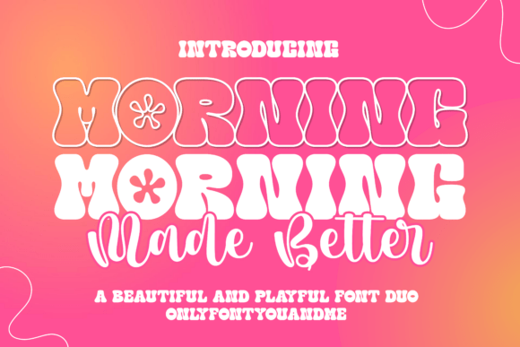
Retro / 70s / Groovy
Rounded, playful curves; poster-ready vibes.
Vintage Fonts
Aged textures & heritage serifs for badges & labels.
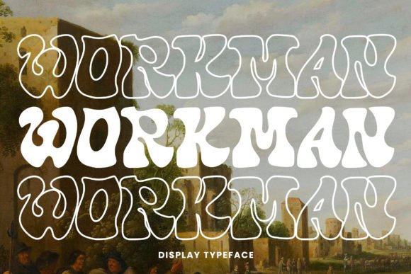
Outline Fonts
Hollow forms for stacked headlines and layered effects.
Typewriter Fonts
Mechanical charm for journals, menus & overlays.
Gothic & Blackletter
Dramatic heritage styles for certificates and logos.
Stencil (cut-friendly)
Bridges keep counters open – faster weeding for decals.
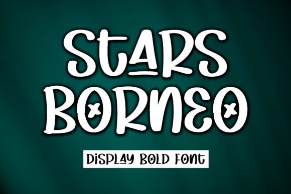
Bubble Fonts
Rounded, bubbly shapes for kids crafts & stickers.
Y2K Fonts
Glossy techno nostalgia for covers and thumbnails.
Cute Fonts
Soft, friendly forms for planners, tags & kawaii sets.
Graffiti Fonts
Street-style display for bold posters and tees.
Pixel Fonts
8-bit charm for retro games, badges and avatars.
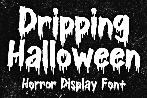
Scary Fonts
Horror textures and jagged display for spooky sets.