Ecommerce Website Templates: Clean Stores That Convert Visitors Into Buyers
Ecommerce website templates help you launch a high-converting online store fast with a proven structure: hero → product highlights → benefits → proof → offer → checkout CTA. Use this page to choose the right store layout (product brand, dropshipping, digital products, boutique, marketplace), follow simple conversion rules, and customize quickly – fonts, colors, spacing, and sections – without building from scratch.
Why ecommerce website templates work
Ecommerce sites don’t win by looking “fancy” – they win by reducing friction. Most stores lose sales because product pages feel unclear, trust signals are missing, shipping/returns are hidden, or the CTA is weak. Templates solve the “what goes where” problem and give you a clean system: product discovery → confidence → checkout.
- Speed: launch a store in hours instead of weeks.
- Clarity: clean hierarchy makes products easier to scan.
- Trust: reviews, guarantees, and policies appear where shoppers expect them.
- Conversions: stronger CTAs + better product presentation = more purchases.
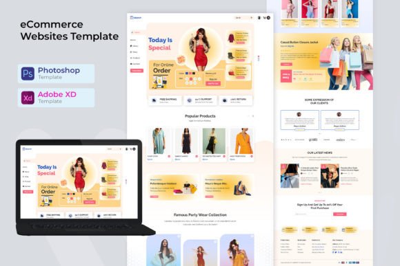
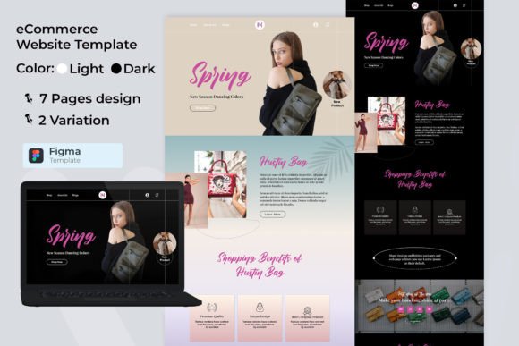
Ecommerce website template types
Pick one core store model first. Once the design looks consistent, add supporting pages (collections, product pages, promo landing pages) to build a simple growth system: traffic → product → checkout → repeat purchase.
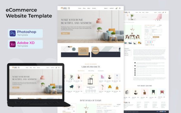
Product brand store (DTC)
- Best for: physical products, lifestyle brands, hero products.
- Use when: storytelling + brand trust matter.
- Key pages: Home, Shop/Collections, Product pages, About, Contact, Policies.
Dropshipping / offer-first store
- Best for: testing products, paid traffic funnels, impulse buys.
- Use when: speed + offer clarity are the priority.
- Key pages: Product page (long-form), Reviews, Shipping & Returns, Checkout CTA.
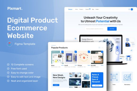
Digital products & downloads
- Best for: templates, printables, planners, ebooks, courses.
- Use when: you need a clean “value → preview → buy” flow.
- Key pages: Sales page, Product page, FAQ, Checkout, Access/Delivery info.
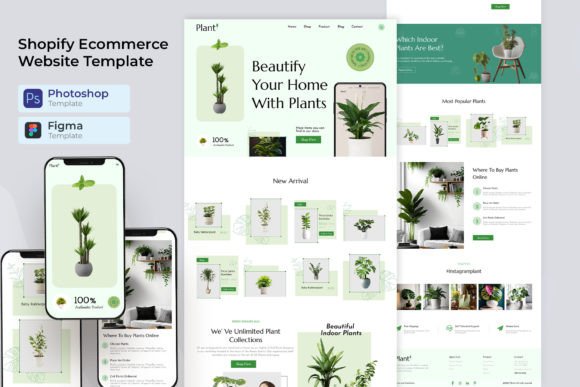
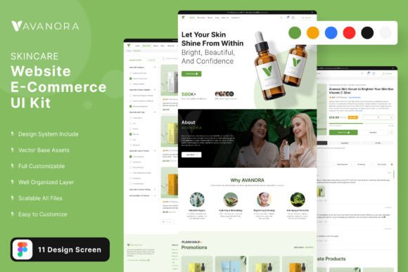
Boutique / niche shop
- Best for: handmade, fashion, beauty, local brands.
- Use when: visuals and lifestyle photography sell the product.
- Key pages: Lookbook, Collections, Product pages, About, Contact, Policies.
Marketplace / multi-category store
- Best for: many categories, many products, strong search/browse needs.
- Use when: navigation and filtering matter more than long product storytelling.
- Key pages: Category pages, Filters, Product pages, Deals, Cart/Checkout.
Must-have sections (the conversion-ready structure)
If you want more sales, build around clarity and trust. Shoppers should understand what you sell, why it’s worth it, and how fast they can get it within seconds.
- Hero: product promise + primary CTA (Shop now / View collection).
- Top products / best sellers: 4–8 items with clear pricing and short labels.
- Benefits: 3–6 reasons to buy (comfort, quality, results, materials).
- Social proof: reviews, ratings, UGC photos, “as seen in”.
- Offer / urgency: free shipping threshold, bundle deal, limited drop.
- Policies (visible): shipping, returns, warranty, secure checkout.
- Checkout CTA: clear buttons and minimal distractions.
Product page essentials (what shoppers must see)
The product page is where most conversions happen. Use this structure to reduce doubt and increase “Add to cart” clicks:
- Clear title + price: no vague names.
- Strong visuals: 5–8 images (and a short video if possible).
- Benefit bullets: 3–6 key points above the fold.
- Variants: size/color options with clear labels.
- Trust block: shipping time, returns, warranty, secure payment icons.
- Reviews: rating summary + real photos (UGC).
- FAQ: quick answers to objections (materials, fit, care, delivery).
Conversion frameworks (copy-paste outline)
Templates work best when you follow a repeatable flow. Pick one framework and apply it across homepage, collection pages, and promo landings.
- Promise → Products → Proof → Offer → CTA: best for most ecommerce homepages.
- Problem → Solution → Results → Reviews → CTA: best for “hero product” stores.
- Category → Filters → Best sellers → CTA: best for multi-category shops.
- Bundle → Savings → Comparison → Guarantee → CTA: best for AOV and upsells.
Readability checklist (ecommerce-friendly)
- Clear navigation: Shop, Collections, Best sellers, Sale, Contact.
- Visible pricing: no hidden costs or “surprise” shipping fees.
- Fast scanning: short labels + bullet benefits (not long paragraphs).
- Strong contrast: readable text on mobile.
- Trust near CTA: returns/shipping/warranty close to “Add to cart”.
- One primary CTA: don’t compete with too many buttons.
Recommended picks
Start with one scalable “system”. Open the library, filter by style (modern, minimal, luxury), then customize the hero headline, product highlights, and CTA first. Consistency matters more than endless redesigns.
Minimal Ecommerce Stores
Clean, typography-led shops that make products feel premium and easy to browse.
View options →Product Landing Page Templates
Offer-first layouts for hero products, dropshipping funnels, and paid traffic pages.
View options →Shop UI Kits (Figma/Canva)
Ready-to-edit UI kits for product grids, product pages, and checkout sections.
View options →Digital Product Shops
Sales-page style templates for templates, downloads, planners, and courses.
View options →FAQ
Do ecommerce website templates improve conversions?
They can. Templates improve conversion by using familiar shopping patterns: clear product grids, predictable product page layout, visible trust signals, and a strong CTA. Less confusion means more “Add to cart” clicks.
What should I customize first?
Start with your hero headline (what you sell + who it’s for), your primary CTA (Shop now / View collection), and your top product highlights. Then apply a font pair, 2–3 brand colors, and update imagery. Keep the structure – change the brand.
How many products should I show on the homepage?
Show 4–8 best sellers. It’s enough to build interest without overwhelming visitors. If you have many products, use collections and a “Shop all” link instead of one endless grid.
What trust elements should I show near “Add to cart”?
Keep it simple and visible: shipping time estimate, easy returns, warranty/guarantee, secure checkout, and reviews. These remove doubt at the exact moment the shopper decides to buy.
What makes an ecommerce product page convert better?
Clear visuals, benefit bullets above the fold, visible variants, reviews with photos, and a short FAQ. Make sure price, shipping, and returns are not hidden – uncertainty kills conversions.
Related template hubs
Browse all website layout categories and styles in one place.
Campaign-ready pages for ads, launches, lead capture, and signups.
Service-first layouts with clear offers, trust proof, and contact CTAs.
Clean “about + work + contact” structures for personal brands.
CV-style layouts for job seekers and career portfolios.
Great for creators who publish articles and build SEO traffic.
Store-ready layouts for product pages, collections, and conversion flows.
Drag-and-drop site layouts for small businesses and creators.
Minimal, modern website styles for portfolios and brands.
Designer-friendly layouts with strong structure and smooth UX.
WordPress page sections and full layouts you can customize fast.
Lightweight WP layouts built for speed, clarity, and clean design.
“Website-ish” systems for creators: portfolios, landing pages, and hubs.
How to choose, customize, and structure pages that convert.
Best use cases for ecommerce website templates
- Launching a new online store quickly (brand or niche)
- Creating product landing pages for ads and Pinterest traffic
- Building a digital products shop (templates, printables, courses)
- Improving trust and conversion rate with a cleaner layout
- Scaling to multiple collections without redesigning everything
Next step
Pick one template set, define a mini brand kit (fonts + 2–3 colors), and publish your best sellers first. Make shipping/returns visible, add reviews, and keep one primary CTA. When your store feels clean and trustworthy, conversions follow.