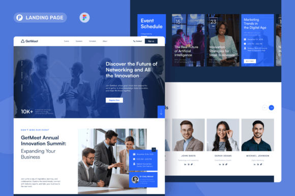
Event Registration Landing Pages: Templates Built to Increase Signups
Event registration landing pages turn clicks into registrations with a clean flow: hero → details → trust → signup → FAQ → reminders.
Why event registration landing pages work
Event pages convert when the decision feels easy: what the event is, who it’s for, when/where it happens, and how to reserve a spot. In contrast, registrations drop when details are scattered, the CTA is buried, or trust is missing. A strong template keeps everything in one place – so visitors can register without second-guessing.
- Clear details: date, time, location/timezone, and what attendees get.
- Less friction: short forms and obvious next steps after signup.
- More trust: host credibility, agenda, testimonials, and past attendance proof.
- Better tracking: one page, one conversion goal (registration).
Event registration landing page template types
Choose your template based on the event format and your primary goal. Then keep one main CTA across the page (Register / RSVP / Get tickets).
RSVP pages (free events)
- Best for: meetups, open houses, community events.
- Key blocks: date/time + location, highlights, RSVP form, directions.
- CTA: “Reserve a spot”, “RSVP now”.
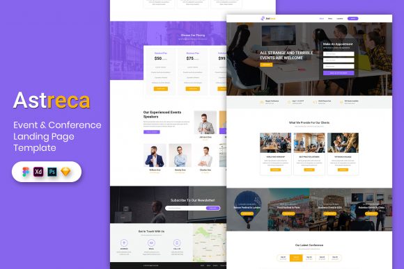
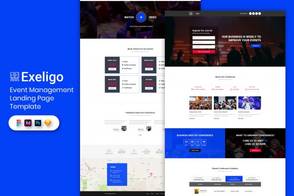
Ticketed event pages
- Best for: conferences, paid workshops, live shows.
- Key blocks: ticket tiers, what’s included, refund policy, FAQs.
- CTA: “Get tickets”, “Choose ticket”.
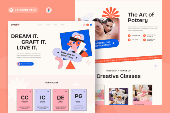
Workshop / class registration pages
- Best for: trainings, masterclasses, skill-based events.
- Key blocks: outcomes, agenda/modules, host trust, signup CTA.
- CTA: “Join the class”, “Register now”.
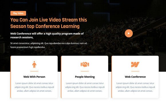
Virtual / hybrid event pages
- Best for: Zoom events, online summits, hybrid meetups.
- Key blocks: timezone clarity, access instructions, reminders, replay note.
- CTA: “Register to get the link”, “Get access”.
Must-have sections (the registration-ready structure)
High-converting event pages feel calm and obvious. Ideally, visitors should understand the event and how to register within the first 10 seconds – especially on mobile.
- Hero: event name + outcome + date/time + one CTA.
- What you’ll get: 3–6 bullets focused on benefits.
- Agenda: short schedule or key segments.
- Host trust: bio, logos, results, past attendee proof.
- Registration: short form + privacy note + confirmation expectation.
- FAQ: refunds, parking/venue, timezone, replay/access.
Copy blocks you can reuse
Event pages convert faster when the copy is specific. Add the date/time early, clarify who it’s for, and repeat the same CTA in every key section.
Headline formulas
- Join [Event] to learn [Outcome] (include date/time).
- Workshop: Build [Thing] in [Timeframe]
- [Audience] Meetup: Connect + Learn + Leave with [Result]
CTA button text
- Free RSVP: “Reserve a spot”, “RSVP now”.
- Tickets: “Get tickets”, “Choose ticket”.
- Workshops: “Register now”, “Join the class”.
Conversion frameworks (copy-paste outline)
- Promise → Details → Agenda → Trust → Register (best for most events)
- Highlights → Speakers/Host → Tickets → FAQ → CTA (best for ticketed events)
- Outcome → Who it’s for → Modules → Proof → Register (best for workshops)
Conversion checklist (quick wins)
- One primary CTA: avoid competing buttons.
- Time clarity: include timezone and location (or “online”).
- Short form: name + email is enough for most events.
- Trust near CTA: reviews/logos close to the form or button.
- Confirmation clarity: tell users what happens next (email + calendar link).
Recommended picks
Start with one event system: clear details + agenda + short registration. After that, improve signups by testing the headline specificity and moving proof closer to the CTA (faster than redesign).
Ticketed Event Pages
Ticket tiers, inclusions, and FAQ sections designed for purchase intent.
View options →Workshop Registration Pages
Outcome-first pages with modules, deliverables, and strong host trust.
View options →Virtual / Hybrid Event Pages
Timezone clarity, access instructions, reminders, and replay messaging.
View options →FAQ
How long should an event registration page be?
Long enough to remove doubt. For simple RSVP events, keep it short: details → highlights → CTA. For ticketed events, add more trust, refund info, and a stronger FAQ.
How many form fields should I use?
Use the minimum – then qualify later. For most registrations, name + email is enough. For ticketed events, collect details during checkout. If you need one qualifier, add a single dropdown instead of a long form.
Related landing page hubs
Landing Page Templates (Main Hub)
Browse all landing page categories and styles in one place.
Explore →Services / Agency Landing Pages
Quote and consultation pages built to convert service leads.
Explore →SaaS Demo / Free Trial Landing Pages
Feature-first pages built for demos, trials, and signups.
Explore →Next step
Pick one CTA (RSVP, tickets, or registration), make the details unmissable (time + location/timezone), and place trust right next to the CTA. Then test headline clarity and CTA placement before redesigning – those two changes usually move registrations the fastest.