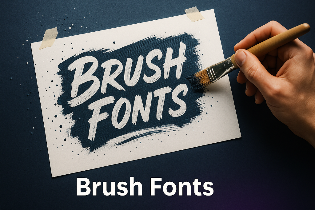
This guide to brush fonts covers textured strokes for social posters, YouTube thumbnails and bold sale banners – with quick tips to keep rough edges crisp at small sizes.
Editor’s top picks – Brush Fonts
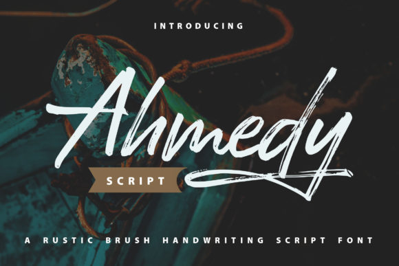
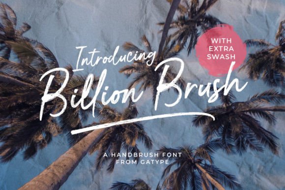
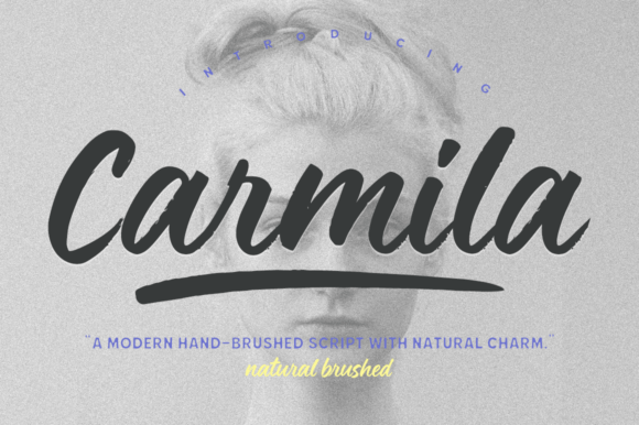
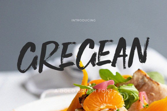
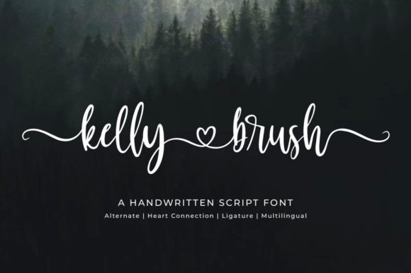
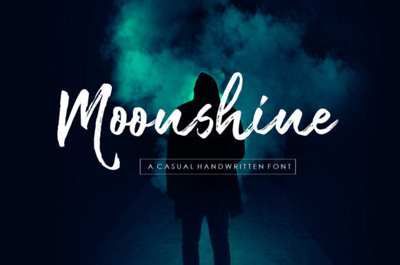
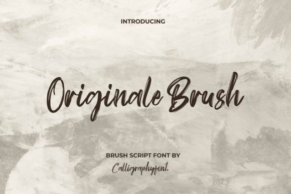
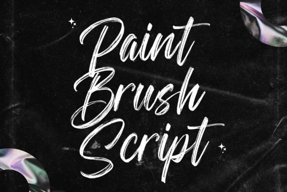
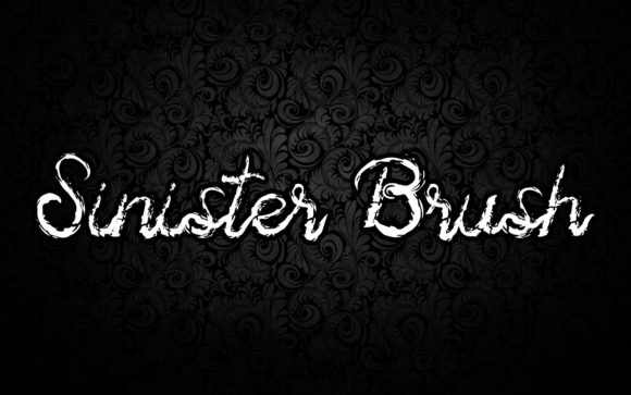
Brush Script
Casual, connected strokes with natural alternates – great for quotes and covers.
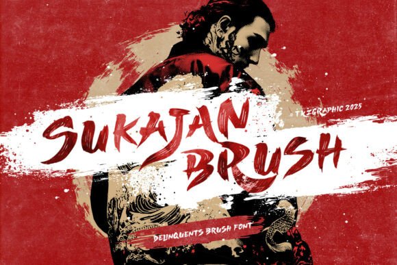
Dry Brush
Rough texture and broken ink for gritty thumbnails and streetwear graphics.
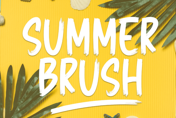
Marker
Paint-pen vibe with rounded corners – perfect for stickers and price tags.
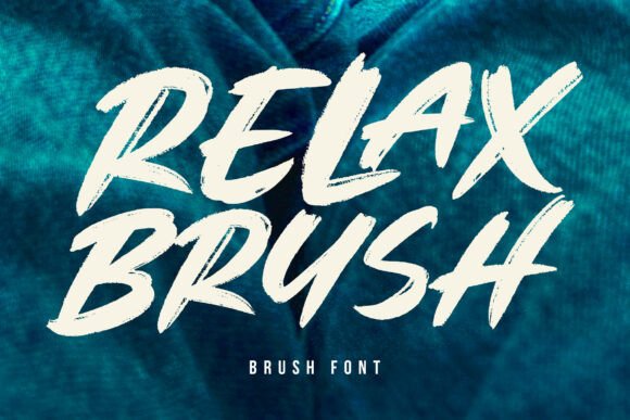
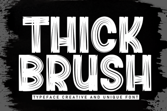
Bold Stroke
Thick, high-impact letters that hold up in tiny mobile previews.
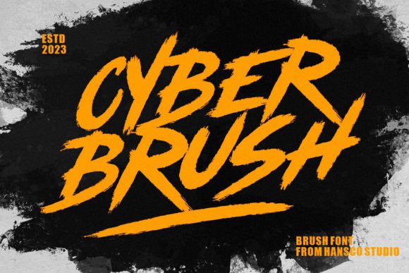
Urban / Street
Calligraffiti energy with sharp swashes; pair with a neutral sans for balance.
Grunge
Distressed edges, splatters and fades – best at medium+ sizes.
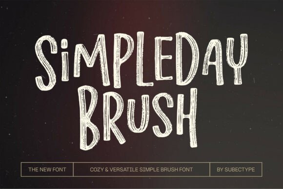
Kids / Chalk
Playful strokes for classroom posters, flashcards and craft labels.
Text tools for faster brush lettering
- Custom brush lettering logo – hand-drawn wordmark with alternates and swashes.
- Vectorize your sketch – clean bezier curves and expanded strokes for print.
- Font modification & cleanup – remove artifacts, add alternates, balance texture.
- Procreate brush lettering – digital brushes, compositing and layout polish.
How to choose a brush font
- Clarity at thumbnail size. Test at 200–300 px wide (YouTube/shorts). Prefer bold weights and simpler texture.
- Texture control. “Dry” looks gritty but can blur; pick cleaner edges for tiny captions.
- Alternates & ligatures. Look for A–Z alternates, beginning/ending swashes, double-letter fixes (ee, ll, tt).
- All-caps caution. Many brush scripts are designed for Title Case; full caps can look blocky – try a caps-friendly set.
- Spacing. Slightly tighter tracking for bold strokes; loosen if texture is heavy.
- Outline & export. Expand strokes, remove overlaps before print/CNC; keep raster effects out of final vectors.
Try searches (brush styles)
- Brush Script → Browse scripts
- Dry Brush → High-texture picks
- Marker / Paint Pen → Marker styles
- Bold Stroke → Thick display
- Street / Calligraffiti → Urban energy
- Chalkboard → Chalk looks
Font pairing recipes
- Bold Brush + Neutral Sans – Brush headline, clean UI sans for body/CTA.
- Brush Script + Condensed Sans – Script for the hero word, condensed small caps for subheads.
- Dry Brush + Grotesk – Gritty title with modern grotesk captions to restore legibility.
Project ideas you can ship today
- Sale banner with bold brush headline + crisp price tag.
- YouTube thumbnail – 2–3 words max, high contrast background, heavy stroke.
- Reels/TikTok cover – centered brush word + subtle outline for pop.
- Sticker pack – short phrases, white stroke/offset path for die-cut.
Small-size readability: quick checks
- At 200–300 px, texture shouldn’t crumble; if it does – pick a cleaner brush or add a thin outline.
- Boost contrast: dark text on light or vice versa; avoid busy photos behind strokes.
- Keep 2–3 words; long phrases lose impact on thumbnails.
Licensing: what matters
- Commercial use: confirm allowed for merch/ads if you plan to sell or promote.
- Seats/Users: one license per user unless the EULA says otherwise.
- Logo usage: most licenses allow static logos; always double-check “logo usage”.
FAQ
Which brush fonts read best on thumbnails?
Bold stroke or marker styles with cleaner edges. Dry/grunge textures work better at medium+ sizes.
Do brush scripts work in ALL CAPS?
Some do, many don’t. If the sample images show natural caps, you’re safe; otherwise prefer Title Case.
Can I upload brush fonts to Canva?
Yes for Canva Pro uploads. For Free accounts, use PNG/SVG lettered artwork or a system font.
Curated quick picks
Serif Fonts
Classic, readable text & elegant headlines for print and web.
Sans Serif Fonts
Clean UI, decks & posters; pairs well with any display face.
Slab Serif Fonts
Blocky slabs for bold titles, badges and signage.
Handwritten Fonts
Casual notes for planners, labels and crafts.
Calligraphy Fonts
Flourished forms for invitations, cards and branding.
Signature Fonts
Stylish personal marks; sleek logos & watermarks.
Display Fonts
High-impact titles that read in a split second.
Retro / 70s / Groovy
Rounded, playful curves; poster-ready vibes.
Vintage Fonts
Aged textures & heritage serifs for badges & labels.
Outline Fonts
Hollow forms for stacked headlines and layered effects.
Typewriter Fonts
Mechanical charm for journals, menus & overlays.
Gothic & Blackletter
Dramatic heritage styles for certificates and logos.
Stencil (cut-friendly)
Bridges keep counters open – faster weeding for decals.
Bubble Fonts
Rounded, bubbly shapes for kids crafts & stickers.
Y2K Fonts
Glossy techno nostalgia for covers and thumbnails.
Cute Fonts
Soft, friendly forms for planners, tags & kawaii sets.
Graffiti Fonts
Street-style display for bold posters and tees.
Pixel Fonts
8-bit charm for retro games, badges and avatars.
Scary Fonts
Horror textures and jagged display for spooky sets.