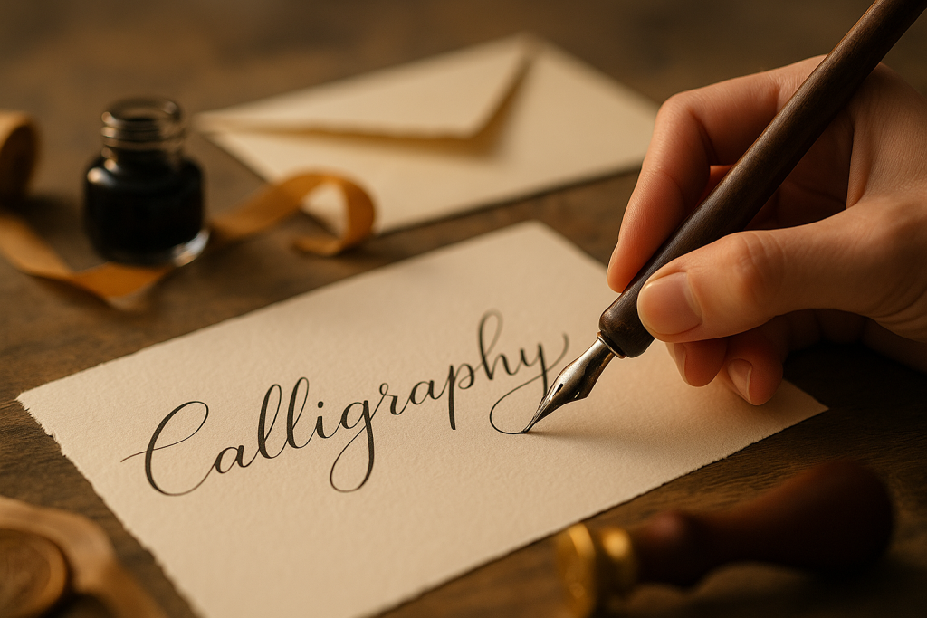
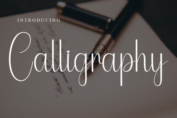
This guide to calligraphy fonts covers flourished scripts for invitations, cards and branding – from classic copperplate to modern calligraphy and clean signatures. You’ll find curated categories, pairing recipes, quick sizing rules, and licensing notes so your text stays beautiful and readable.
Editor’s top picks – Calligraphy Fonts
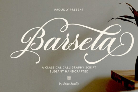
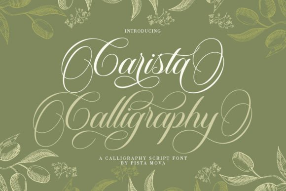
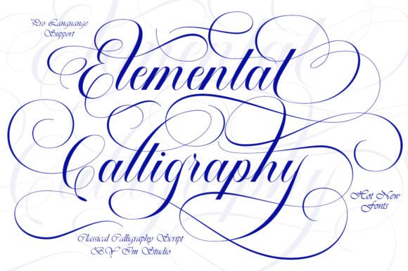
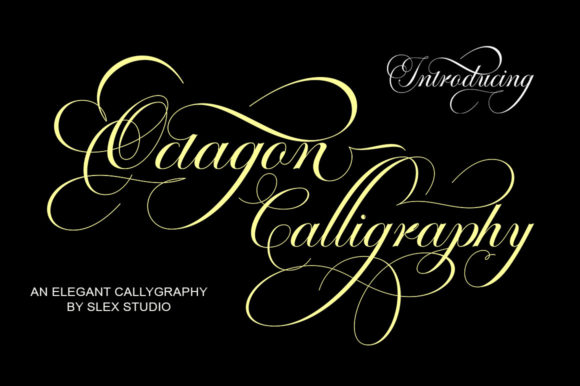
Classic Copperplate
Elegant contrast, formal rhythm, refined swashes – perfect for invitations and certificates.
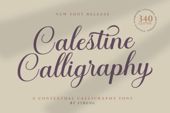
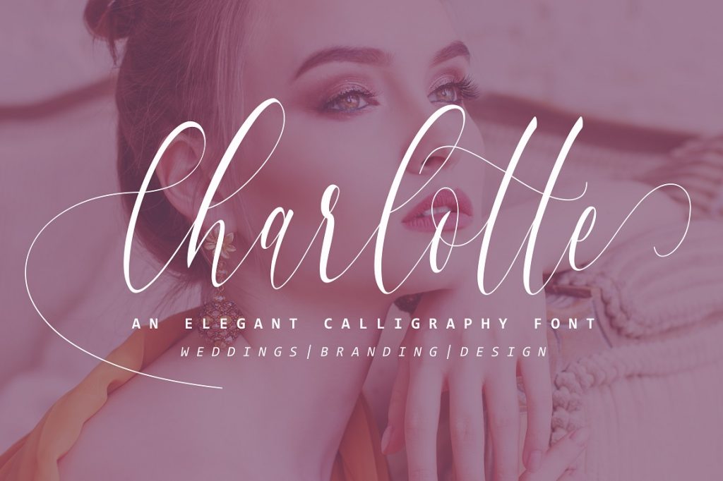
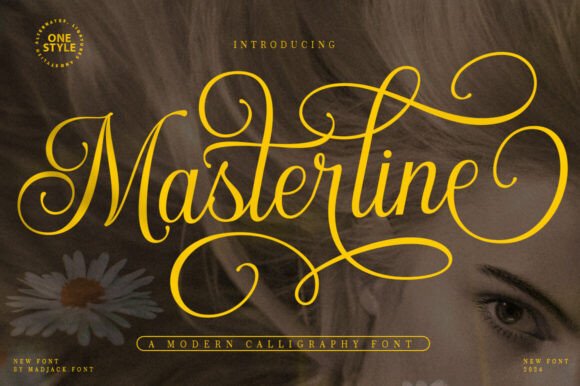
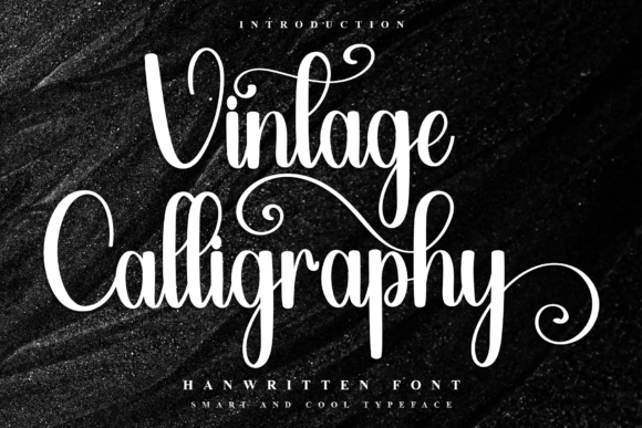
Modern Calligraphy
Playful baseline bounce and gentle swashes; great for save-the-date cards and quotes.
Signature Script
Minimal, pen-like flow for logos, name marks and upscale packaging.
Wedding Sets
Coordinated families (script + serif/sans) for invites, menus, place cards and signage.
Monoline / Minimal
Even-weight strokes for laser, vinyl and small print where high clarity is a must.
Brush & Retro
Textured paint feel; energetic headlines and social graphics.
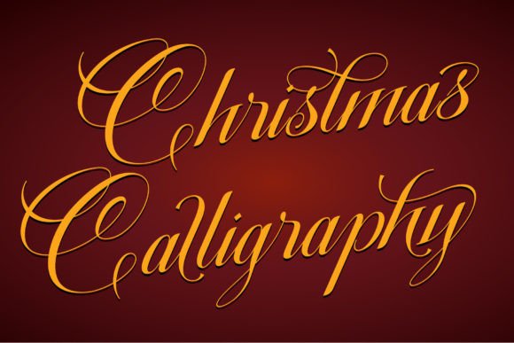
Blackletter
Gothic texture and gravitas – use sparingly or pair with a soft serif.
Text tools for faster calligraphy workflow
- Custom invitation lettering – bespoke names, flourishes and monograms for your suite.
- Vectorize your signature – clean Bézier curves for logos, foil and engraving.
- Script kerning & spacing – fix collisions, alternate joins, smart swash choices.
- Calligraphy logo design – timeless wordmarks with optical balance and ligatures.
How to choose a calligraphy font
- Readability first. Test names and long words at 10–12 pt (print) and 24–32 px (mobile). Avoid ultra-thin hairlines for text below 12 pt.
- Joining behavior. Look for solid connections, contextual alternates and multiple ‘s’/‘r’ forms to avoid awkward joins.
- Swashes with restraint. Reserve long entry/exit swashes for first/last letters; keep the middle clean.
- Glyph support. Check language accents (é, ñ, ç), numerals, ampersand, and basic punctuation.
- Print method. Foil/letterpress loves crisp vectors; textured brush effects are better for digital or large-format print.
Try searches (curated)
- Calligraphy fonts → All calligraphy
- Modern calligraphy → Playful bounce
- Wedding calligraphy → Invitation sets
- Signature script → Minimal logos
- Monoline script → Clean strokes
- Brush calligraphy → Textured looks
- Blackletter → Gothic styles
Font pairing recipes
- Modern Calligraphy + Transitional Serif – Script for headlines; serif for body on invitations. Scripts · Serifs
- Signature Script + Grotesk Sans – Chic logos and packaging; keep sans letter-spacing tight. Signature · Sans
- Copperplate + Small Caps Serif – Formal invites with readable details. Copperplate · Small caps
Project ideas you can ship today
- Invitation suite – invite, RSVP, details card, envelope addressing, wax seal monogram.
- Brand wordmark – clean signature for beauty/boutique; add a micro-swash only on the first or last letter.
- Social templates – quotes/reels covers with brush calligraphy and high contrast backgrounds.
- Event signage – welcome board, seating chart, bar menu; pick thicker strokes for viewing distance.
Flourishes & small-size readability
- Use long swashes only on initials or finals; avoid crossing the main word.
- Bump weight by +1 level for small print; keep counters open and avoid tight loops.
- Track +2–6 for print blocks; −5 to 0 for big headlines depending on the font.
- Always test names with tall + descending letters (f, g, j, y) to spot collisions.
Licensing: what matters
- Logos: most standard commercial licenses allow static logo creation; confirm “logo usage” in the EULA.
- Seats: one license per designer/workstation unless otherwise stated.
- Web/App: embedding requires a web/app license; static PNG/SVG text does not.
- Templates/Printables: check if the license allows use in templates for resale.
Curated quick picks
- Modern calligraphy: Browse
- Signature scripts: Browse
- Copperplate classics: Browse
- Monoline clean: Browse
- Brush texture: Browse
- Blackletter: Browse
FAQ – Calligraphy Fonts
Look for steady contrast, clear entry/exit strokes, and generous spacing. Avoid ultra-thin hairlines; at small sizes they break or fill in.
For invitations and cards, keep script headlines at ≥18–24 pt and body accents at ≥14–16 pt. Minimum stroke weight ~0.3–0.4 mm (≈1–1.5 px at 300 DPI) for reliable print.
Many calligraphy fonts need Contextual Alternates enabled. Turn on liga/calt (OpenType) in your app. If your app lacks OT features, try alternate glyphs manually.
Use dedicated initial and terminal alternates; don’t swash every letter. One flourish per word usually looks most refined.
Most calligraphy fonts aren’t designed for ALL-CAPS. Use Title Case or pair with a clean serif/sans for uppercase elements.
Keep one script + one helper face. Try a neutral grotesk (for details) or a classic serif (for elegance). Avoid mixing multiple scripts.
Serif Fonts
Classic, readable text & elegant headlines for print and web.
Sans Serif Fonts
Clean UI, decks & posters; pairs well with any display face.
Slab Serif Fonts
Blocky slabs for bold titles, badges and signage.
Handwritten Fonts
Casual notes for planners, labels and crafts.
Signature Fonts
Stylish personal marks; sleek logos & watermarks.
Brush Fonts
Textured strokes for social posters and thumbnails.
Display Fonts
High-impact titles that read in a split second.
Retro / 70s / Groovy
Rounded, playful curves; poster-ready vibes.
Vintage Fonts
Aged textures & heritage serifs for badges & labels.
Outline Fonts
Hollow forms for stacked headlines and layered effects.
Typewriter Fonts
Mechanical charm for journals, menus & overlays.
Gothic & Blackletter
Dramatic heritage styles for certificates and logos.
Stencil (cut-friendly)
Bridges keep counters open – faster weeding for decals.
Bubble Fonts
Rounded, bubbly shapes for kids crafts & stickers.
Y2K Fonts
Glossy techno nostalgia for covers and thumbnails.
Cute Fonts
Soft, friendly forms for planners, tags & kawaii sets.
Graffiti Fonts
Street-style display for bold posters and tees.
Pixel Fonts
8-bit charm for retro games, badges and avatars.
Scary Fonts
Horror textures and jagged display for spooky sets.