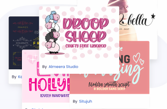
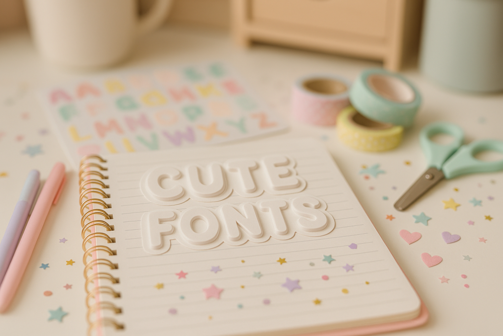
This guide to cute fonts rounds up soft, friendly type for planners, tags and kawaii crafts – rounded sans, bubbly display and neat monoline scripts that print clean and read small.
Editor’s top picks – Cute Fonts
Rounded Sans
Soft corners and friendly tone – perfect for headers, tabs and planner sections.
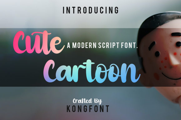
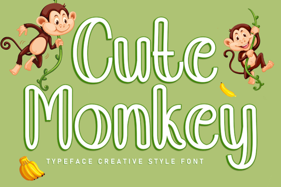
Bubble Display
Chunky, inflated forms for stickers, labels and thumbnail titles.
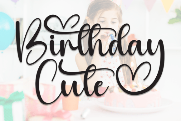
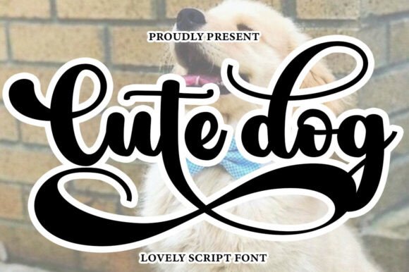
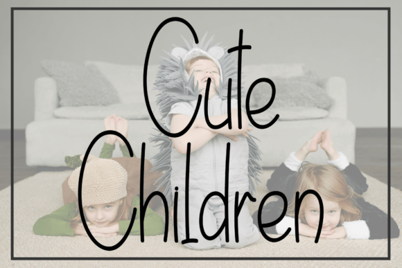
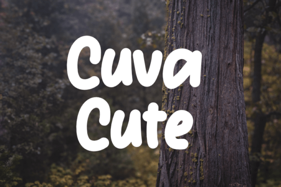
Monoline Script
Neat, even strokes – great for names, tags and small captions.
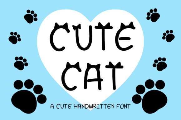
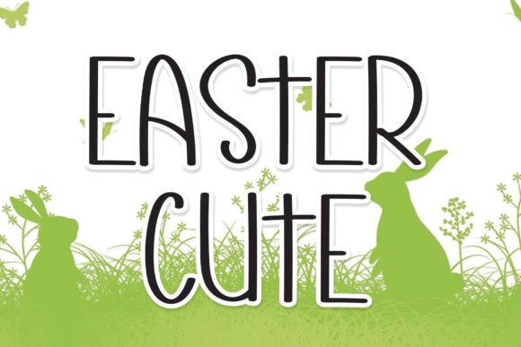
Kawaii
Playful faces with cute faces/dingbats; ideal for journaling and kids crafts.
Cute Serif
Short serifs and round bowls for a gentle, storybook feel.
Doodle & Dingbats
Hand-drawn icons and dividers to decorate spreads and trackers.
Outline / Shadow
Hollow or soft drop-shadow styles for layered pastel effects.
How to choose cute fonts
- Keep strokes sturdy. Avoid ultra-thin hairlines; 1.3–1.6 px at 24–32 px is a safe minimum for screens.
- Mind spacing. Slightly wider tracking helps bubbly/rounded forms breathe at small sizes.
- Readable numbers & accents. Ensure clear numerals and support for diacritics (é, ñ, ü).
- Pairs & family. A rounded sans + bubble display combo covers headers, labels and captions.
- Cut/print friendly. For stickers, prefer simple counters and fewer inner holes for easier weeding.
Try searches (cute sets)
- Rounded Sans → Browse rounded
- Bubble Display → Bubble styles
- Monoline Script → Neat scripts
- Kawaii → Kawaii picks
- Cute Serif → Chubby serifs
- Outline / Shadow → Outline sets
- Doodles / Dingbats → Divider icons
Font pairing recipes
- Bubble Display + Rounded Sans – Title pops, labels stay tidy. Bubble · Rounded
- Monoline Script + Clean Sans – Names/signatures with clear body text. Monoline · Sans
- Cute Serif + Outline Shadow – Storybook headers with layered pastel depth. Serif · Outline
Project ideas
- Planner headers, habit trackers, calendar stickers.
- Name tags and bottle labels for school/kids events.
- Kawaii quote prints, bedroom door signs, gift tags.
- Party sets: invitations, cupcake toppers, favor stickers.
FAQ
What sizes work best for cute bubble titles?
For mobile thumbnails, start at 80–120 px with +5–8% tracking; for planner headings, 18–28 pt prints crisply.
How to avoid ink bleed when printing?
Use sturdy weights, enable “rich black” only for titles, and test on your paper – glossy stickers can handle finer detail than matte paper.
Can I use these fonts commercially?
Most sets include a commercial license for finished products. Always check the seller’s EULA and terms.
Serif Fonts
Classic, readable text & elegant headlines for print and web.
Sans Serif Fonts
Clean UI, decks & posters; pairs well with any display face.
Slab Serif Fonts
Blocky slabs for bold titles, badges and signage.
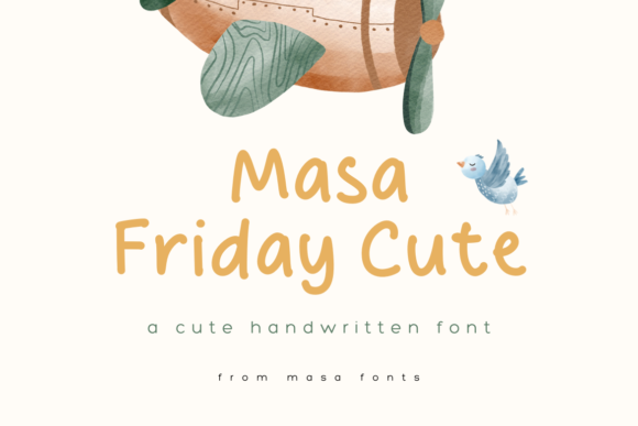
Handwritten Fonts
Casual notes for planners, labels and crafts.
Calligraphy Fonts
Flourished forms for invitations, cards and branding.
Signature Fonts
Stylish personal marks; sleek logos & watermarks.
Brush Fonts
Textured strokes for social posters and thumbnails.
Display Fonts
High-impact titles that read in a split second.
Retro / 70s / Groovy
Rounded, playful curves; poster-ready vibes.
Vintage Fonts
Aged textures & heritage serifs for badges & labels.
Outline Fonts
Hollow forms for stacked headlines and layered effects.
Typewriter Fonts
Mechanical charm for journals, menus & overlays.
Gothic & Blackletter
Dramatic heritage styles for certificates and logos.
Stencil (cut-friendly)
Bridges keep counters open – faster weeding for decals.
Bubble Fonts
Rounded, bubbly shapes for kids crafts & stickers.
Y2K Fonts
Glossy techno nostalgia for covers and thumbnails.
Graffiti Fonts
Street-style display for bold posters and tees.
Pixel Fonts
8-bit charm for retro games, badges and avatars.
Scary Fonts
Horror textures and jagged display for spooky sets.