This guide to graffiti fonts shows how to pick street-style display for bold posters, tees and stickers – bubble/throwup, marker tags, stencil, wildstyle, 3D/outline and drip sets – plus quick print tips so your art reads instantly.
Editor’s top picks – Graffiti Fonts
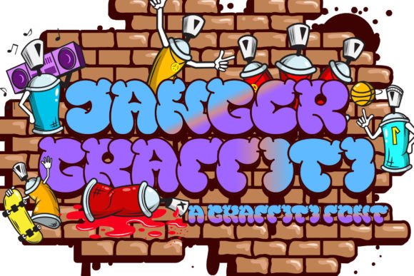
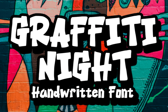
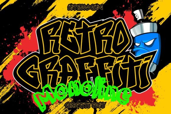
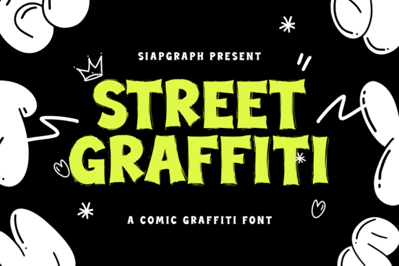
Bubble & Throwup
Rounded, friendly letters for posters, stickers and kid merch – easy to read at a glance.
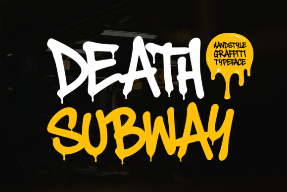
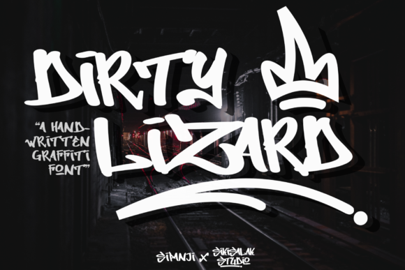
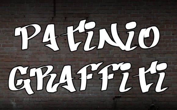
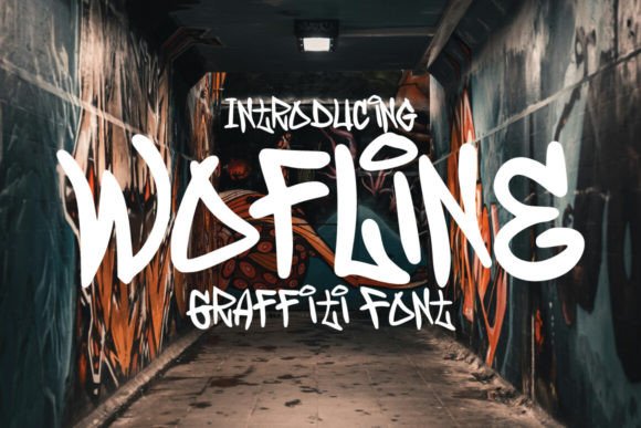
Marker Tag
Tag-style scripts with fast strokes and texture; great for captions and overlays.
Stencil
Cut-friendly bridges keep counters open – perfect for decals and spray templates.
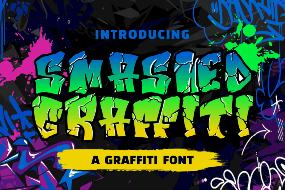
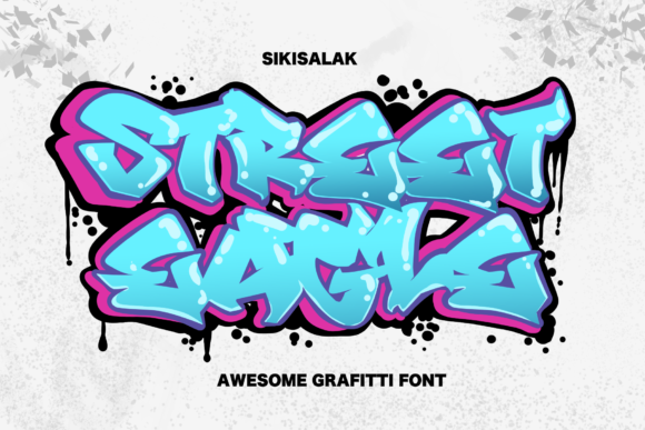
Wildstyle
Interlocking shapes and arrows; use sparingly and test at your final size.
3D / Outline
Hollow and extruded looks for layered posters and thumbnails.
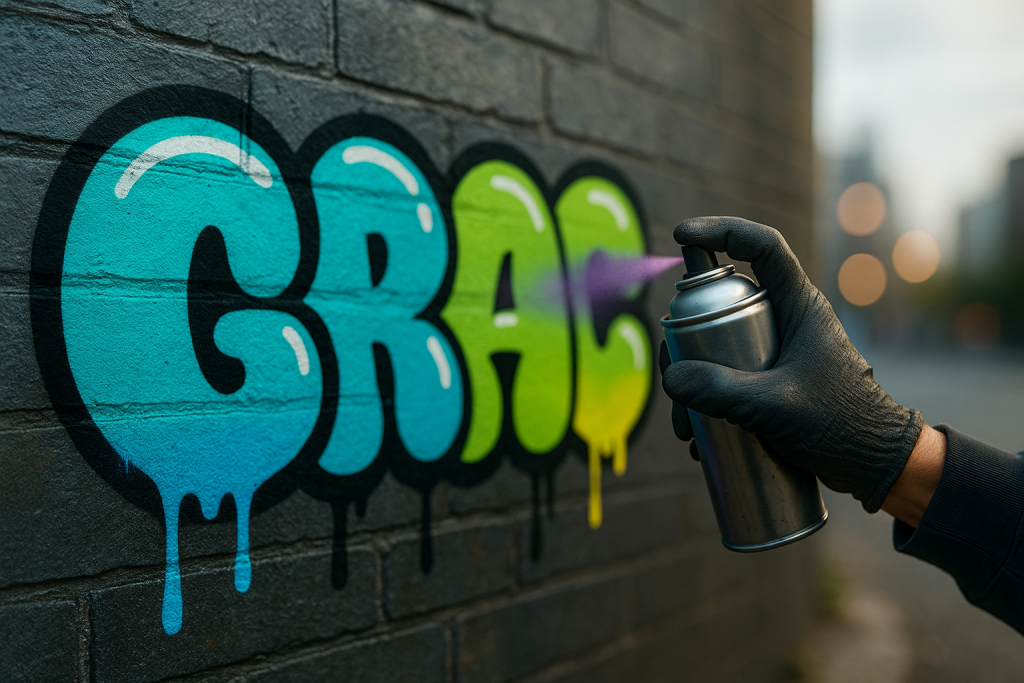
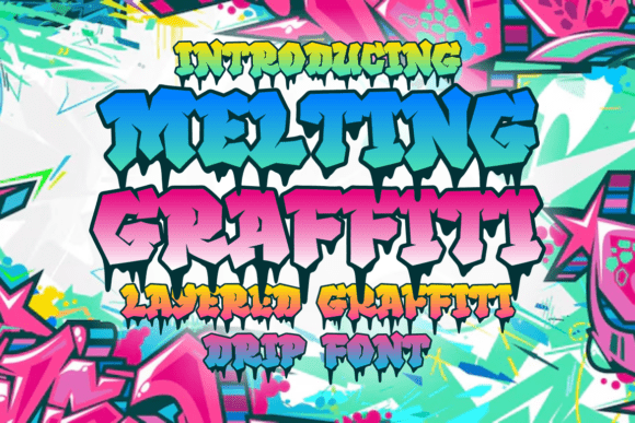
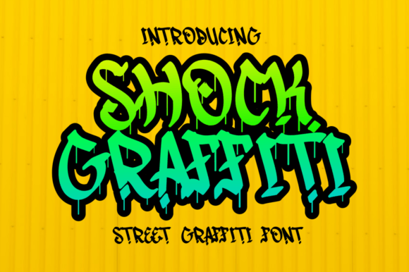
Drips & Splatter
Messy, high-energy sets – keep drips thick enough for print.
Brush / Street
Textured strokes with natural pressure – good for social posters.
90s Hip-Hop
Mixtape nostalgia – chunky caps and bright outline layers.
Text tools for faster graffiti workflow
- Custom tag lettering – unique wordmarks, arrows and flourishes.
- Vectorize & cleanup – expand strokes, fix overlaps, prepare for print/cut.
- Poster & tee mockups – fast previews for clients and shops.
How to choose a graffiti font
- Readability vs. attitude. Bubble, marker and stencil read quickest; wildstyle is for headlines only.
- Weight & contrast. Pick thicker stems for tees, stickers and cut vinyl.
- Layers. Many sets include fill, outline and shadow; stack them for impact.
- Alternates & ligatures. Look for swashes, arrows and stylistic sets to avoid repetitive forms.
- All caps? Most graffiti sets shine in all caps; test mixed-case if available.
- Language support. Check accents (é, ñ, ç) if you need multi-language titles.
Try searches (street-ready sets)
- Bubble / Throwup → Rounded bubbles
- Marker Tag → Fast scripts
- Wildstyle → Interlocks & arrows
- Stencil → Cut-friendly
- Drip → Drips & splatter
- Outline / 3D → Hollow/3D
- Brush Street → Textured strokes
Project ideas
- Tee graphic: stack fill + outline + drop shadow; keep main word 2000–3000 px wide.
- Sticker pack: add a 2–4 mm white keyline; avoid ultra-thin drips.
- Event poster: headline in bubble; details in clean sans.
- Thumbnail: condensed outline caps with thick stroke for legibility.
- Wall print: try stencil layers for a sprayed look.
Production tips (print & cut)
- Convert to outlines. Expand strokes and appearances before sending to print/cut.
- Offset path. Add a slight stroke/offset (1–2 px at web, 0.5–1 mm in print) to prevent ink choke.
- Minimums. Keep smallest drips/apertures ≥ 0.8–1 mm for vinyl; ≥ 1.2 mm for screen print.
- Color layers. For multi-layer looks, export separate spot colors or stacked SVG layers.
Licensing: what matters
- Merch. Most commercial licenses allow static artwork (posters/tees). Check EULA for print-on-demand.
- Seats. One license per designer/device unless stated otherwise.
- Trademark. You trademark your artwork (the logo/tag), not the typeface.
FAQ
Which graffiti styles read best fast?
Bubble/throwup, marker and stencil families are the most legible for tees, stickers and thumbnails.
How do I make sticker-friendly tags?
Outline the word with a 2–4 mm keyline, simplify drips, and expand strokes to vectors.
Can I use wildstyle for body text?
No – keep wildstyle for short headlines; pair details with a clean sans.
Curated quick picks
- Bubble/Throwup: Browse
- Marker tags: Browse
- Stencil sets: Browse
- Drips & splatter: Browse
- Outline/3D: Browse
Serif Fonts
Classic, readable text & elegant headlines for print and web.
Sans Serif Fonts
Clean UI, decks & posters; pairs well with any display face.
Slab Serif Fonts
Blocky slabs for bold titles, badges and signage.
Handwritten Fonts
Casual notes for planners, labels and crafts.
Calligraphy Fonts
Flourished forms for invitations, cards and branding.
Signature Fonts
Stylish personal marks; sleek logos & watermarks.
Brush Fonts
Textured strokes for social posters and thumbnails.
Display Fonts
High-impact titles that read in a split second.
Retro / 70s / Groovy
Rounded, playful curves; poster-ready vibes.
Vintage Fonts
Aged textures & heritage serifs for badges & labels.
Outline Fonts
Hollow forms for stacked headlines and layered effects.
Typewriter Fonts
Mechanical charm for journals, menus & overlays.
Gothic & Blackletter
Dramatic heritage styles for certificates and logos.
Stencil (cut-friendly)
Bridges keep counters open – faster weeding for decals.
Bubble Fonts
Rounded, bubbly shapes for kids crafts & stickers.
Y2K Fonts
Glossy techno nostalgia for covers and thumbnails.
Cute Fonts
Soft, friendly forms for planners, tags & kawaii sets.
Pixel Fonts
8-bit charm for retro games, badges and avatars.
Scary Fonts
Horror textures and jagged display for spooky sets.