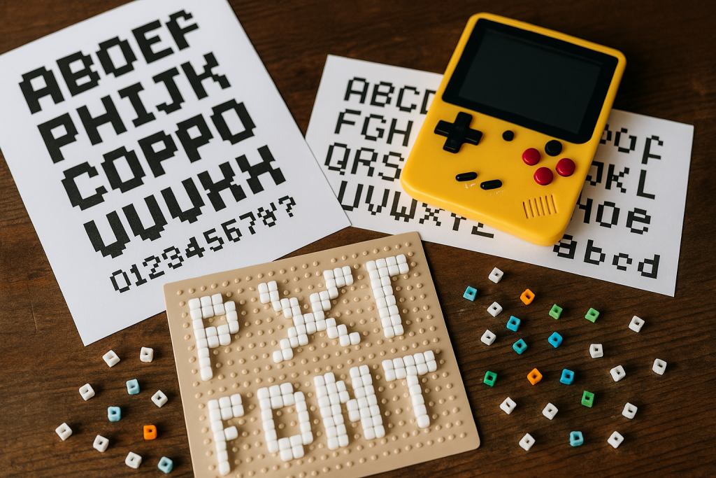
This guide to pixel fonts covers 8-bit styles for retro games, badges and avatars – from 8×8 and 16×16 bitmap grids to monospaced arcade faces – plus crisp-rendering tips so every pixel stays sharp.
Editor’s top picks – Pixel Fonts
8×8 Bitmap
Tiny HUD/UI text that stays readable at micro sizes; grid-tight, zero anti-alias.
16×16 Bitmap
More detail for menus, dialogue and inventory screens without losing the 8-bit feel.
Monospaced Pixel
Aligned columns for scoreboards, timers and code-style overlays.
Arcade / Title
Chunky headlines for splash screens, posters and channel thumbnails.
Rounded / Cute
Softer blocks for stickers, planners, kawaii labels and kids projects.
Outline / Shadow
Hollow or stroked letters for layered, poster-ready effects.
LCD / Scoreboard
Segmented numerals and caps for watches, counters and tech vibes.
Pixel Icons / Emoji
Sprites and UI pictograms to match your text style.
How to choose a pixel font
- Match the grid: 8×8 for tiny HUD; 12×12 or 16×16 for menus/dialogue.
- Keep it crisp: turn off anti-aliasing; export at 100% or exact 2×/3× multiples.
- Integer spacing: set whole-pixel line height and disable kerning in UI.
- Outline for contrast: add 1–2 px stroke or a shadow on busy backgrounds.
- Colors that pop: white on black; neon on dark; avoid mid-greys for tiny sizes.
Try searches (8-bit sets)
- 8×8 HUD → Browse 8×8
- 16×16 Dialogue → Browse 16×16
- Monospaced → Aligned numbers
- Arcade titles → Arcade picks
- Outline / Shadow → Outline sets
- Rounded / Cute → Cute pixel
Font pairing recipes
- Pixel Display + Grotesk Sans: headline energy with clean body text.
- Monospaced Pixel + UI Sans: techy counters with readable labels.
- Rounded Pixel + Handwritten: cozy indie vibe for planners and stickers.
Project ideas
- Game HUD, score and pause screens.
- Retro badges, enamel pins and die-cut stickers.
- Channel avatars and 32-px favicons.
- Posters and thumbnails with outline + drop shadow.
Quick crispness checks
- Preview at target size (100%) and at 2×; no blurry half-pixels.
- Export PNG/SVG (avoid JPG compression).
- Align icons to the same grid; avoid mixed resolutions.
FAQ
What size should I use for pixel fonts?
Stick to pixel-perfect sizes (multiples of whole pixels). Common breakpoints: 8, 12, 16, 24, 32, 48 px. Avoid fractional scaling (e.g., 13px or 1.25× transforms) to keep the grid crisp.
Can I use pixel fonts in a game or app?
Usually yes, but embedding often needs an app/game license versus a basic desktop license. Check the EULA for “app embedding,” “redistribution,” and “webfont” terms before you ship.
Best export format for thumbnails and badges?
PNG with transparent background. Export at 1×, 2×, or 4× using Nearest Neighbor (no anti-alias). Avoid JPEG – it introduces blur and artifacts on sharp edges.
How do I print pixel type without blur?
Scale by whole factors and export at 300 DPI using Nearest Neighbor. Keep each “pixel” at least 1–2 mm on the final print so the grid remains visible and not muddy.
Monospaced or proportional?
Monospaced is great for HUDs, scoreboards and code-like screens. Proportional can feel more modern for headlines. Pick based on alignment needs and vibe.
Color and outline tips?
Use limited palettes (e.g., 4–8 colors) for authentic retro feel. Add 1-px dark outline or drop-shadow to keep text readable over busy backgrounds.
Licensing notes
- Most commercial EULAs allow static logos and merch; game/app embedding may need a web/app license – check the EULA.
Serif Fonts
Classic, readable text & elegant headlines for print and web.
Sans Serif Fonts
Clean UI, decks & posters; pairs well with any display face.
Slab Serif Fonts
Blocky slabs for bold titles, badges and signage.
Handwritten Fonts
Casual notes for planners, labels and crafts.
Calligraphy Fonts
Flourished forms for invitations, cards and branding.
Signature Fonts
Stylish personal marks; sleek logos & watermarks.
Brush Fonts
Textured strokes for social posters and thumbnails.
Display Fonts
High-impact titles that read in a split second.
Retro / 70s / Groovy
Rounded, playful curves; poster-ready vibes.
Vintage Fonts
Aged textures & heritage serifs for badges & labels.
Outline Fonts
Hollow forms for stacked headlines and layered effects.
Typewriter Fonts
Mechanical charm for journals, menus & overlays.
Gothic & Blackletter
Dramatic heritage styles for certificates and logos.
Stencil (cut-friendly)
Bridges keep counters open – faster weeding for decals.
Bubble Fonts
Rounded, bubbly shapes for kids crafts & stickers.
Y2K Fonts
Glossy techno nostalgia for covers and thumbnails.
Cute Fonts
Soft, friendly forms for planners, tags & kawaii sets.
Graffiti Fonts
Street-style display for bold posters and tees.
Scary Fonts
Horror textures and jagged display for spooky sets.