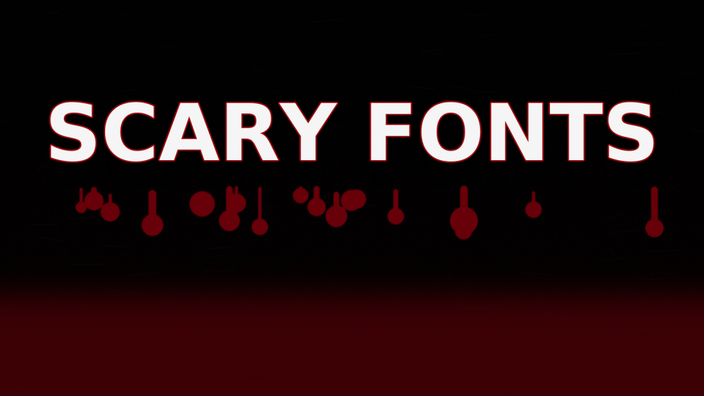
This guide to scary fonts covers rough/grunge, jagged, drip and eroded styles that pop on posters, thumbnails and tees – plus quick tests to keep horror type readable at small sizes.
Editor’s top picks – Scary Fonts
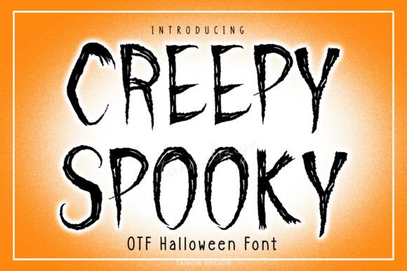
Rough / Grunge
Scratched and gritty textures for distressed headlines and overlays.
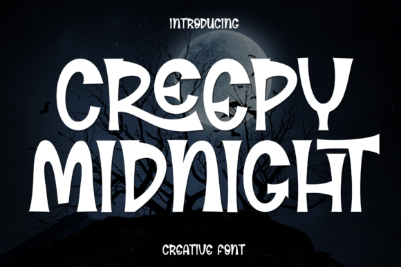
Jagged / Chiseled
Knife-edge shapes that read fast on posters and thumbnails.
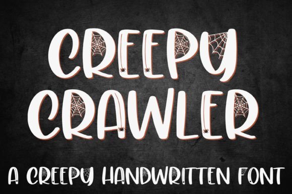
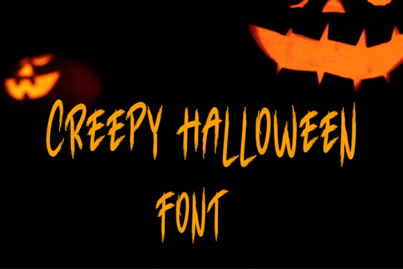
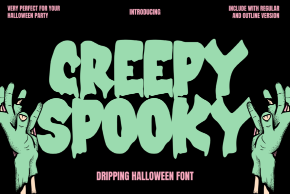
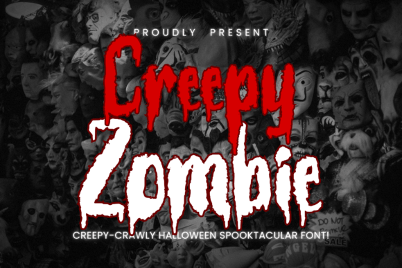
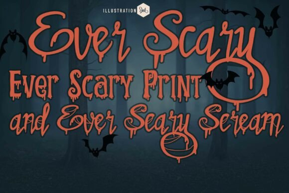
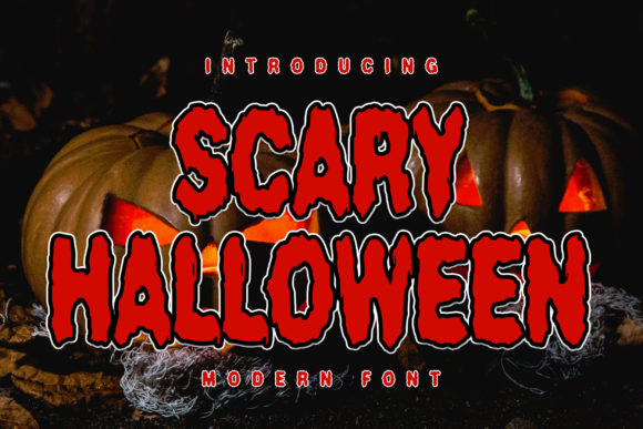
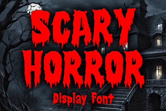
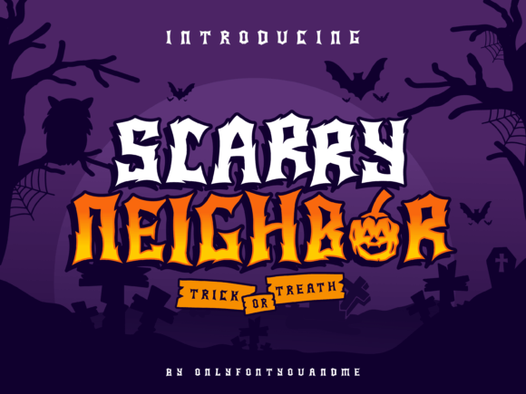
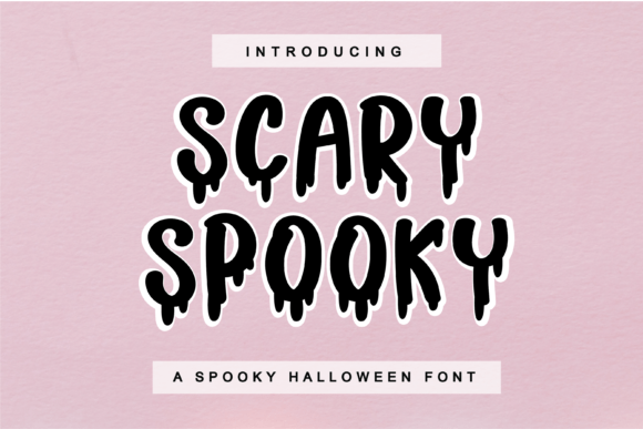
Drip / Blood
Viscous droplets and runny terminals – use thicker weights for clarity.
Eroded / Decayed
Broken counters and worn edges for aged, cursed vibes.
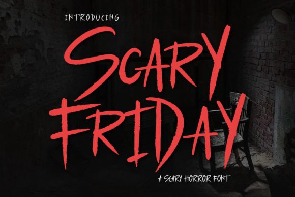
Hand-Scrawled
Uneven strokes like a frantic note – great for captions and overlays.
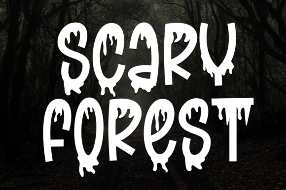
Slime / Monster
Bouncy, oozy forms for kid-friendly spooky sets and stickers.
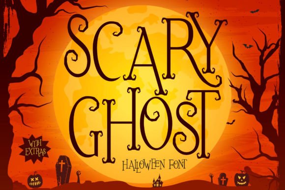
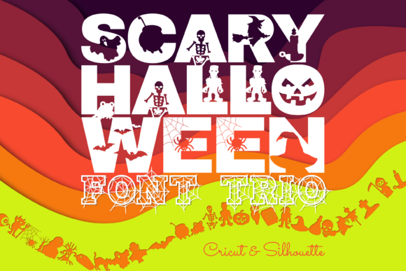
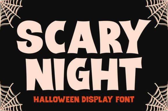
Halloween Mix
Seasonal all-rounders – quick wins for party invites and banners.
Try searches (horror styles)
- Rough & grunge → scratched textures and noisy edges
- Jagged & chiseled → knife-like terminals that read fast
- Drip/Blood → thick droplets for thumbnails
- Eroded/Decayed → worn, broken forms for aged vibes
- Hand-scrawled notes → uneven, frantic writing
- Slime/Monster → ooze and goo for kid-spooky sets
Font pairing recipes
- Jagged Display + Clean Sans: headline scares, caption stays readable. Find a clean sans
- Drip Display + Condensed Sans: save space on posters and price tags. Condensed options
- Hand-Scrawl + Stencil: found-footage look for labels and props. Stencil sets
What to make
- Posters & thumbnails: add outline/inner shadow for tiny screens.
- Party kits: invites, cupcake toppers, bottle labels, banners.
- Merch & tees: use bolder weights; test on dark fabric mockups.
- Decals & stickers: add bridges for cutters; avoid ultra-thin spikes.
Small-size readability: quick checks
- Test at 24–32 px; thicken drip/jagged details if they blur.
- Increase tracking slightly for eroded or condensed faces.
- High-contrast color pairs: black/white, acid green/black, orange/black.
- For cutters: convert to outlines and simplify nodes before export.
Licensing notes
- Commercial use: most sellers allow merch and printables – check EULA.
- Logo usage: usually fine for static logos; verify terms.
- Seats: one license per designer/device unless stated otherwise.
Curated quick picks
FAQ
Which scary fonts read best at small sizes?
Bold, high-contrast styles with clear counters and fewer spiky details. Avoid ultra-thin grunge textures for avatars, tags and stickers.
How do I keep horror text legible on dark backgrounds?
Use a light fill with a dark outline or drop shadow (1–3 px) and slightly increase tracking. Test at 24–32 px for thumbnails.
Are scary fonts good for Cricut/Silhouette cuts?
Yes, if you pick sturdier weights and simpler shapes. Avoid fragile spikes and tiny inner holes; consider a stencil variant for fast weeding.
Print vs. screen: anything to change?
For print, lessen heavy textures and add a clean outline to prevent ink fill-in. For screen, keep contrast high and use PNG/SVG to preserve edges.
Can I use these fonts commercially?
Usually yes under a standard commercial license for static graphics (posters, merch, labels). Always check the EULA for logo/merch terms and seat limits.
All caps or mixed case for horror headlines?
ALL CAPS gives impact but can reduce readability in long lines. Use short, punchy lines or mix caps with a condensed companion.
What pairs well with a scary display font?
Clean grotesk or humanist sans for body copy, or a neutral serif for captions. Keep the horror font only for the headline.
Do these fonts support accents and symbols?
Many do, but support varies. Check the glyph set for your language (á, é, ñ, ç) and numerals before purchase.
How do I add “blood drip” effects?
Use a drip-ready font or layer vector drips under the letters. Keep drips thicker than 1.5–2 mm for print and 2–3 px for screens.
Any quick sizing rules?
Headlines: 8–12% of canvas height; outline 1–3 px; tracking +2–6 for condensed or textured styles. Always squint-test at final size.
Serif Fonts
Classic, readable text & elegant headlines for print and web.
Sans Serif Fonts
Clean UI, decks & posters; pairs well with any display face.
Slab Serif Fonts
Blocky slabs for bold titles, badges and signage.
Handwritten Fonts
Casual notes for planners, labels and crafts.
Calligraphy Fonts
Flourished forms for invitations, cards and branding.
Signature Fonts
Stylish personal marks; sleek logos & watermarks.
Brush Fonts
Textured strokes for social posters and thumbnails.
Display Fonts
High-impact titles that read in a split second.
Retro / 70s / Groovy
Rounded, playful curves; poster-ready vibes.
Vintage Fonts
Aged textures & heritage serifs for badges & labels.
Outline Fonts
Hollow forms for stacked headlines and layered effects.
Typewriter Fonts
Mechanical charm for journals, menus & overlays.
Gothic & Blackletter
Dramatic heritage styles for certificates and logos.
Stencil (cut-friendly)
Bridges keep counters open – faster weeding for decals.
Bubble Fonts
Rounded, bubbly shapes for kids crafts & stickers.
Y2K Fonts
Glossy techno nostalgia for covers and thumbnails.
Cute Fonts
Soft, friendly forms for planners, tags & kawaii sets.
Graffiti Fonts
Street-style display for bold posters and tees.
Pixel Fonts
8-bit charm for retro games, badges and avatars.