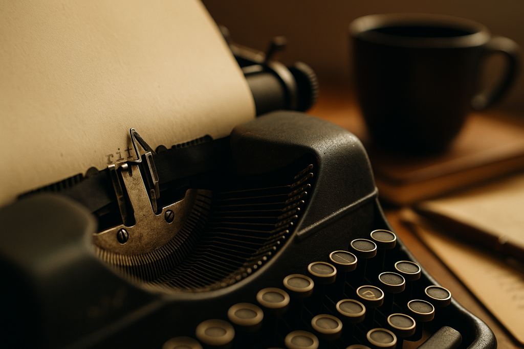
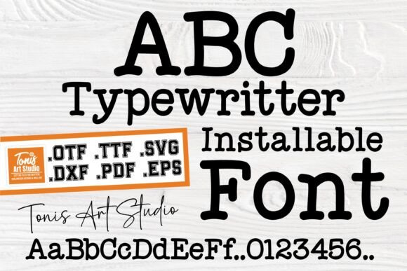
This guide to typewriter fonts covers clean and grungy styles with that mechanical charm – perfect for journals, menus, captions and vintage overlays. You’ll find curated picks, pairing tips and quick tests so your text reads clearly on paper and screens.
Editor’s top picks – Typewriter Fonts
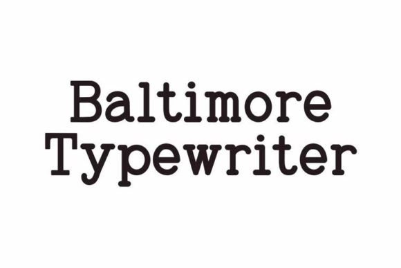
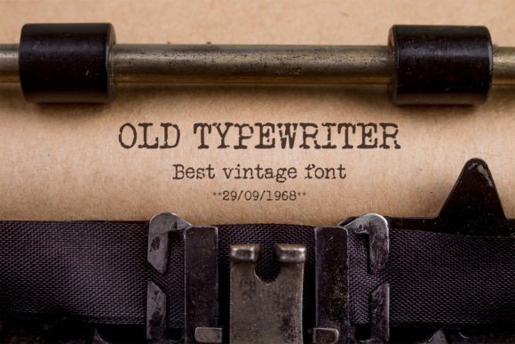
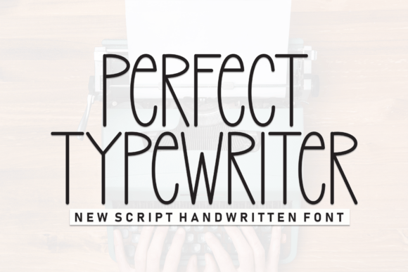
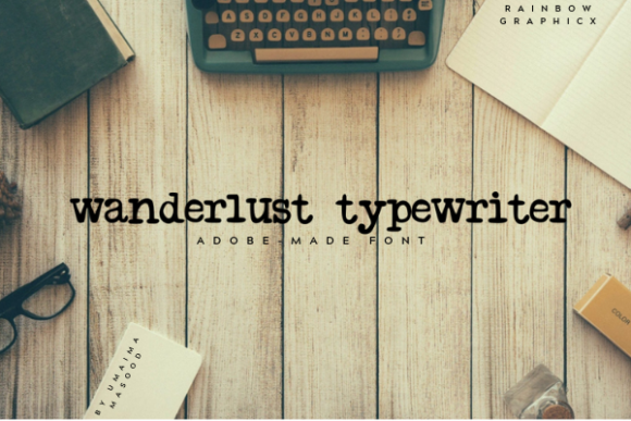
Clean Typewriter
Crisp, mono-spaced looks for menus, captions and UI overlays.
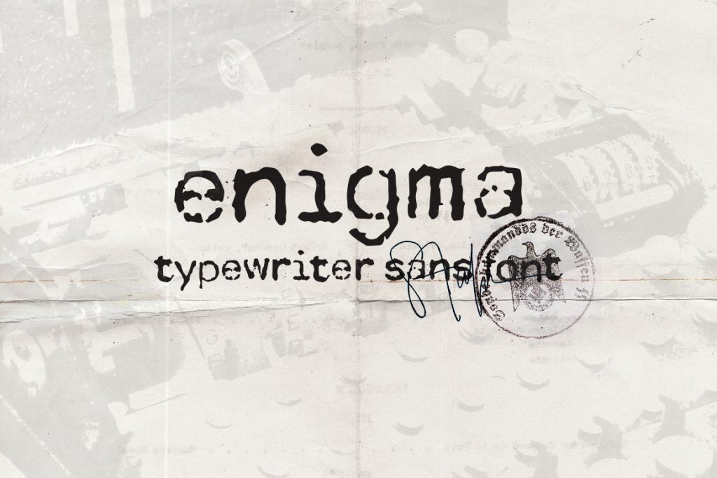
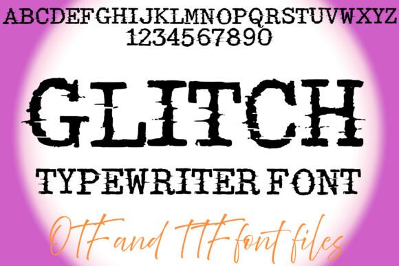
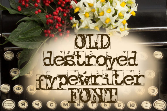
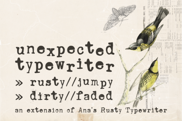
Rough / Grunge
Distressed ink, misaligned hits and vintage noise for journal vibes.
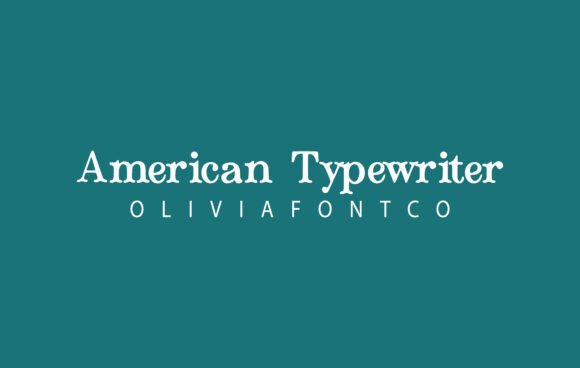
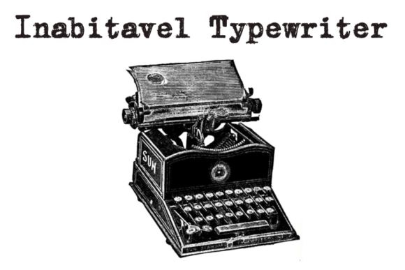
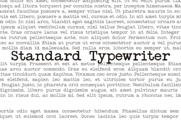
Mono / Courier-Style
Classic courier families with reliable spacing and old-school rhythm.
Labels & Badges
Stamp-like forms for packaging, stickers and branding badges.
Menu Sets
Readable weights and clean numerals for price columns and specials.
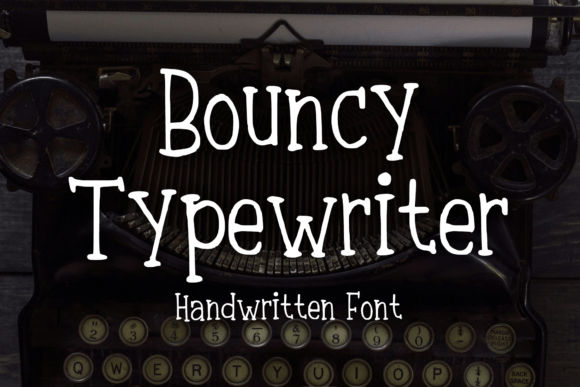
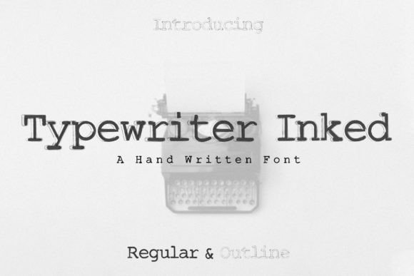
Journal Pages
Human, slightly imperfect hits ideal for prompts and scrapbooks.
Overlays
High-contrast glyphs that sit well over photos and textures.
Text tools & quick services
- Custom kerning & spacing – fix rhythm, tabular numbers and columns.
- Grunge/ink overlays – add subtle bleed, paper noise and stamp hits.
- Vectorize scans – clean up a real typewriter scan into crisp vectors.
How to choose a typewriter font
- Set the mood. Clean = menus/overlays; rough = journals, posters, retro packaging.
- Watch size & weight. For small captions, pick sturdier strokes (no ultra-thin ink gaps).
- Numerals & tabs. If you lay out prices or codes, test tabular numerals and lining figures.
- Language support. Check accents (é, ñ, ç) and punctuation for menus and labels.
Try searches
- Clean mono → Browse clean sets
- Grunge/distressed → Ink-worn styles
- Courier/CODE → Courier variants
- Menu friendly → Menu picks
- Journal pages → Journal vibes
Font pairing recipes
- Typewriter + Clean Sans – typewriter for headers, neutral sans for body and menus.
- Rough Typewriter + Grotesk Condensed – gritty headline with compact price columns.
- Typewriter + Script Accent – add a tiny handwritten note for journal prompts or cards.
Projects you can ship today
- Journal spreads: prompts, date stamps and collage captions.
- Menus & table tents: specials, codes and price lists with tabular numbers.
- Overlays: type-on-photo looks for posters, thumbnails and reels.
- Labels & packaging: heritage badges, paper seals and coffee bags.
Small-size & print checks
- At 12–14 pt (print) and 14–16 px (web), ensure ink gaps don’t disappear.
- For overlays, add a subtle paper/grain texture at low opacity to blend hits.
- Use slightly increased tracking for rough fonts; keep numerals aligned.
Licensing notes
- Commercial print is OK with a standard commercial license; always check the EULA.
- Web/app use needs a separate web/app license; static images usually don’t.
- Embedding (PDF templates) may require special terms; review before distributing.
Curated quick picks
Serif Fonts
Classic, readable text & elegant headlines for print and web.
Sans Serif Fonts
Clean UI, decks & posters; pairs well with any display face.
Slab Serif Fonts
Blocky slabs for bold titles, badges and signage.
Handwritten Fonts
Casual notes for planners, labels and crafts.
Calligraphy Fonts
Flourished forms for invitations, cards and branding.
Signature Fonts
Stylish personal marks; sleek logos & watermarks.
Brush Fonts
Textured strokes for social posters and thumbnails.
Display Fonts
High-impact titles that read in a split second.
Retro / 70s / Groovy
Rounded, playful curves; poster-ready vibes.
Vintage Fonts
Aged textures & heritage serifs for badges & labels.
Outline Fonts
Hollow forms for stacked headlines and layered effects.
Gothic & Blackletter
Dramatic heritage styles for certificates and logos.
Stencil (cut-friendly)
Bridges keep counters open – faster weeding for decals.
Bubble Fonts
Rounded, bubbly shapes for kids crafts & stickers.
Y2K Fonts
Glossy techno nostalgia for covers and thumbnails.
Cute Fonts
Soft, friendly forms for planners, tags & kawaii sets.
Graffiti Fonts
Street-style display for bold posters and tees.
Pixel Fonts
8-bit charm for retro games, badges and avatars.
Scary Fonts
Horror textures and jagged display for spooky sets.