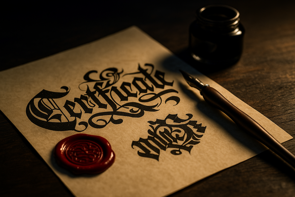
This guide to gothic & blackletter fonts covers Old English, Fraktur and Textura styles for certificates, logos, labels and tattoos – with quick pairing ideas and readability checks so ornate letterforms still communicate clearly.
Editor’s top picks – Gothic & Blackletter
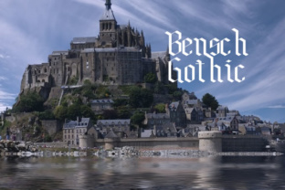
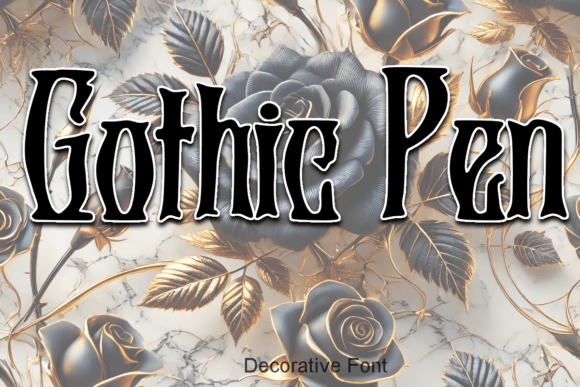
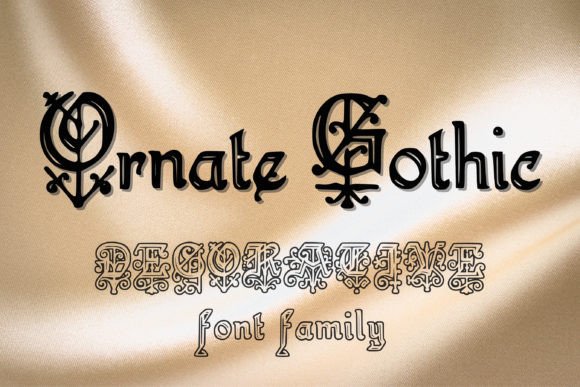
Old English
Dramatic certificates, seals and classic logos. Heavy strokes; use for short titles.
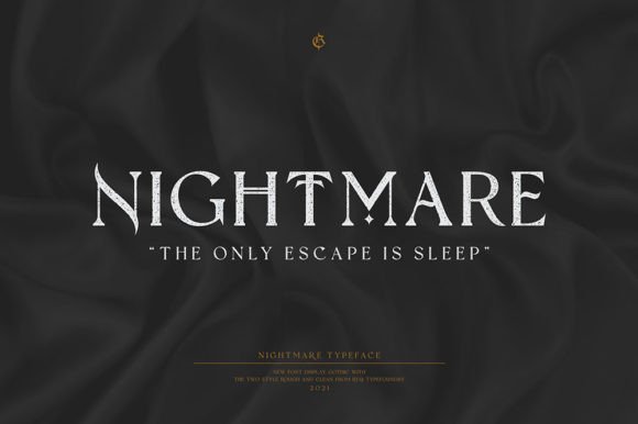
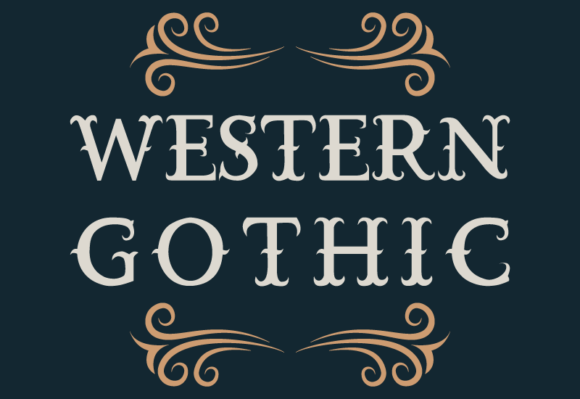
Fraktur
High-contrast curves and broken joins; elegant for labels and posters.
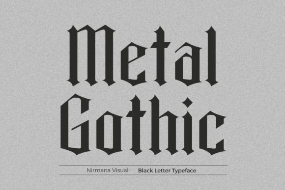
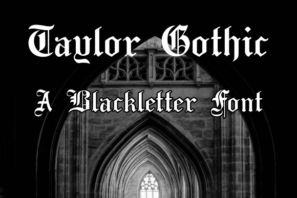
Textura
Tall, narrow rhythm with tight texture; striking in single words or initials.
Certificates
Readable blackletter with clean alternates and lining numerals.
Logos & Wordmarks
Sturdy caps, simplified terminals and solid spacing for badges and beer labels.
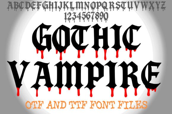
Tattoo Lettering
Bold forms with open counters for legibility on skin; keep swashes minimal.
Vintage Labels
Blend blackletter titles with heritage serifs for whiskey, barber or apothecary vibes.
How to choose a blackletter font
- Clarity first: if you can’t read the word in 1–2 seconds, pick a simpler cut or use small caps.
- Moderate swashes: decorative alternates are great for initials; keep running text plain.
- Spacing: add tracking for narrow Textura; tighten slightly for chunky Old English.
- Numbers & accents: check lining numerals and diacritics if you need multilingual names.
- Contrast & weight: heavier styles print better on rough paper and engrave more cleanly.
Try searches (curated)
- Old English / Blackletter → Browse Old English
- Fraktur (elegant) → Fraktur picks
- Textura (narrow) → Textura styles
- Certificate titles → Formal sets
- Gothic logo marks → Logo-ready
- Tattoo lettering → Tattoo picks
Font pairing recipes
- Blackletter + Clean Sans – Blackletter for the title, a modern sans for dates and locations. See branding tips →
- Blackletter + Transitional Serif – Heritage headline with readable body (menus, certificates). Serif ideas →
- Blackletter + Script Accent – Use a small flourish (e.g., “& Co.”) to soften the tone. Script picks →
Projects you can ship fast
- Certificate title with seal and small-caps recipient name.
- Heritage label (barber, coffee, brewery) – pair with a clean helper font.
- Gothic logo – vectorize outlines and simplify terminals for small sizes.
- Tattoo lettering – test at 8–10 mm cap height; avoid ultra-thin hairlines.
Readability: quick checks
- Squint test at 28–36 px: read in 1–2 seconds?
- Increase tracking for tight Textura; reduce for heavy Old English.
- Prefer plain alternates for words like Ill, Min, Th to avoid ambiguity.
FAQ
Can I set long paragraphs in blackletter?
It’s best for short titles, names and certificates. Use a readable serif or sans for body text.
Do I need special licensing?
A standard commercial license typically covers static prints, logos and packaging; always confirm “logo usage” and seats in the EULA.
What about engraving or foil?
Pick heavier styles with simpler terminals; convert to outlines and clean nodes before production.
Curated quick picks
Serif Fonts
Classic, readable text & elegant headlines for print and web.
Sans Serif Fonts
Clean UI, decks & posters; pairs well with any display face.
Slab Serif Fonts
Blocky slabs for bold titles, badges and signage.
Handwritten Fonts
Casual notes for planners, labels and crafts.
Calligraphy Fonts
Flourished forms for invitations, cards and branding.
Signature Fonts
Stylish personal marks; sleek logos & watermarks.
Brush Fonts
Textured strokes for social posters and thumbnails.
Display Fonts
High-impact titles that read in a split second.
Retro / 70s / Groovy
Rounded, playful curves; poster-ready vibes.
Vintage Fonts
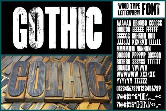
Aged textures & heritage serifs for badges & labels.
Outline Fonts
Hollow forms for stacked headlines and layered effects.
Typewriter Fonts
Mechanical charm for journals, menus & overlays.
Stencil (cut-friendly)
Bridges keep counters open – faster weeding for decals.
Bubble Fonts
Rounded, bubbly shapes for kids crafts & stickers.
Y2K Fonts
Glossy techno nostalgia for covers and thumbnails.
Cute Fonts
Soft, friendly forms for planners, tags & kawaii sets.
Graffiti Fonts
Street-style display for bold posters and tees.
Pixel Fonts
8-bit charm for retro games, badges and avatars.
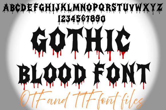
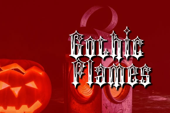
Scary Fonts
Horror textures and jagged display for spooky sets.