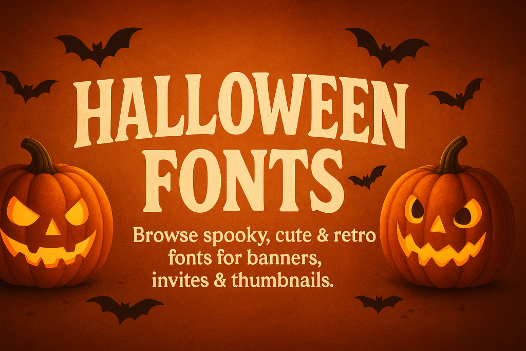
Browse & save: high-impact Halloween fonts for banners, Etsy thumbnails, party invites, classroom printables, and store hero images. Handpicked styles for spooky headers, candy price tags, trick-or-treat promos, and retro Halloween vibes.
Text Tools for Faster Workflow
Preview fonts, style text and convert to webfonts in one place.
Best Halloween font styles (what works & why)
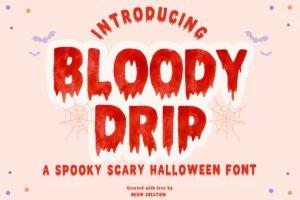
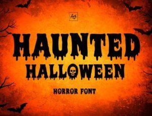
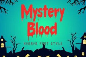
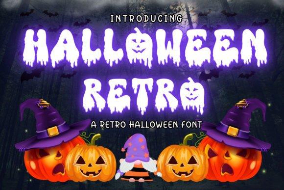
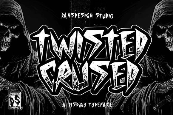
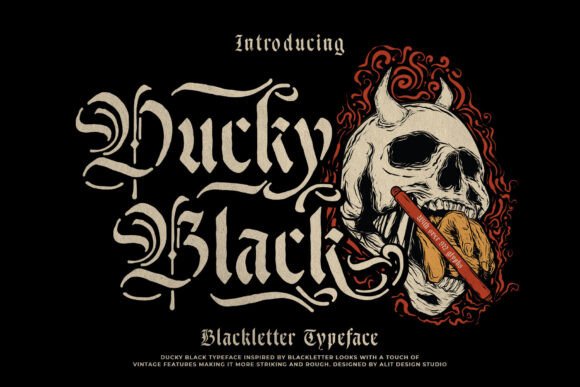
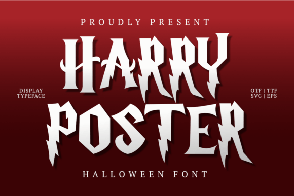
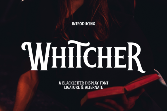
Spooky / Horror
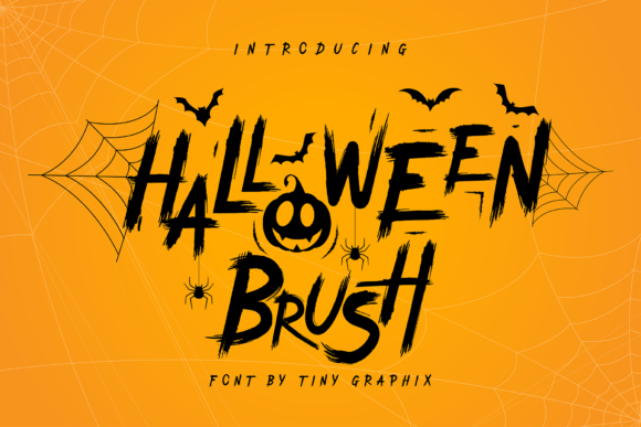
Rough, distressed, and high-contrast letters for fear-factor headlines. Great on dark hero images; pair with a neutral helper sans for body text.
Try searches:
- horror → gritty headlines & poster titles
- dripping → blood/slime accents for hero text
- scary → haunted invites & overlays
- zombie → rough-cut labels & stickers
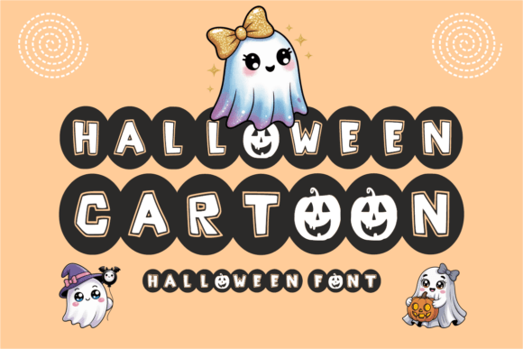
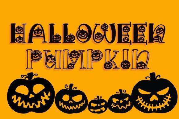
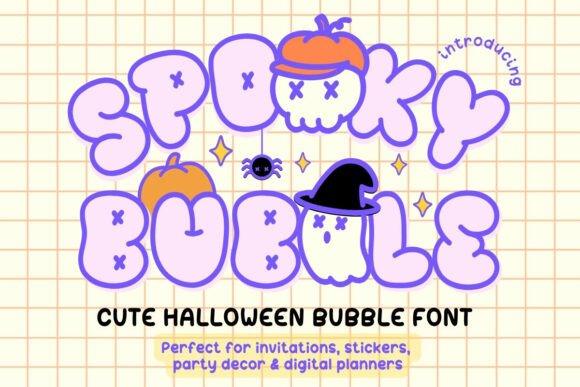
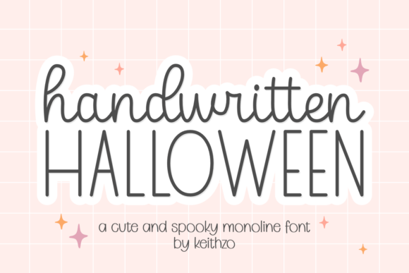
Cute / Kawaii
Rounded, friendly letterforms for kid crafts, candy labels, and classroom printables. Think pumpkins, smiles, and bright colors.
Try searches:
- cute → candy labels & party tags
- kawaii → kid crafts & classroom printables
- pumpkin → invitations, menus & banners
- cartoon → thumbnails & YouTube titles
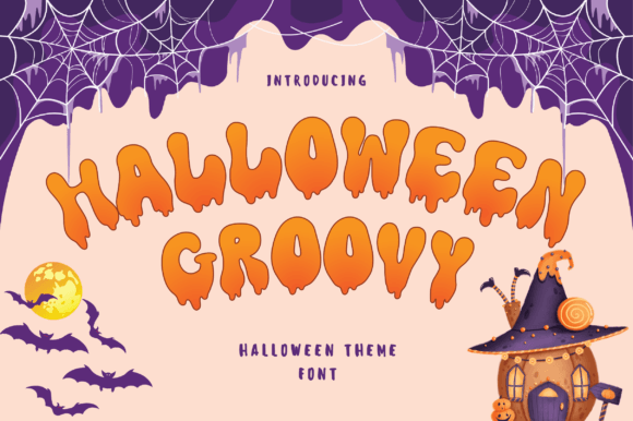
Retro / Vintage
Throwback vibes for themed parties and posters. Pair with grain/texture for an authentic print look.
Try searches:
- retro → 70s flyers & social headers
- groovy → costume-party posters & reels
- vintage serif → classy invites & menus
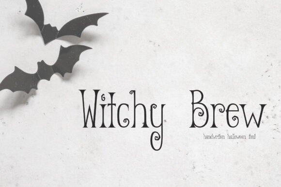
- witchy → magical headers & badge logos
Handwritten / Brush
Energetic strokes for countdowns, last-minute deals, and social frames. Use sparingly for emphasis.
Try searches:
- brush → urgency badges & countdowns
- marker → bold price tags & stories
- handwritten → notes, captions & quotes
- dry brush → edgy hero text & stickers
Readable Serif & Sans (for body/captions)
When you need clarity, use open, neutral faces for details and disclaimers; reserve the spooky styles for headlines.
Try searches:
- sans serif → captions & disclaimers
- serif → elegant invites & menus
- tabular figures → perfect price numbers
- condensed sans → tight badges & app tiles
Font pairing recipes (copy/paste)
- Impact headline + neutral sans body – HEAVY CONDENSED DISPLAY + open, humanist sans for legibility.
- Brush accent + condensed price – Brush/Marker for “Today Only”, Condensed Sans for “$129 → $79”.
- Premium serif + mono digits – Modern Serif for message, Monospace/Tabular for prices & countdowns.
Rule of thumb: one loud star + one quiet helper. Keep contrast in weight/width, not in chaos.
Color & layout tips for Halloween creatives
- Contrast first: black/dark background + white or yellow type; red for accents only.
- Badge shapes: circles/rounded squares read best at small sizes (app cards, carousels).
- Numerals pop: tabular figures align 10/100/1000 neatly.
- Don’t over-italicize: narrow italic + condensed = illegible on small screens.
- Accessibility: aim for WCAG AA contrast on text over photos.
Where to get Halloween lettering
Curated fonts & bundles
- Massive library with frequent Halloween bundles and commercial licensing.
- One place to grab matching families (headlines + supporting text).
- Great for fast campaign turnarounds.
Custom lettering fast
Need a custom sale lockup, stylized numerals, or a brand-matched wordmark? Hire a type pro.
- Brief idea: style (impact/brush/retro), target sizes (web, socials, print), words (e.g., “Spooky Sale”, “Up to 70% off”), formats (SVG/AI/PNG), deadline, license.
- Deliverables you can request: editable AI/SVG, outlined EPS, web export (WOFF2), kerning tuned for your words, dark/light versions.
Ready-to-use copy (steal these headlines)
- Spooky Deals Start Now – Up to 70% Off
- Trick-or-Treat Doorbusters – Today Only
- Early Access – Members Save More
- Last Chance – Prices Go Up at Midnight
- Halloween Preview – Limited Stock
Workflow for speed (10-minute banner)
- Choose one Bold/Impact font + one helper sans.
- Set background to near-black (#0C0C0C) and add a soft vignette.
- Headline in all-caps, −10 to −30 tracking (depends on font).
- Price with tabular figures; pair a red badge #E11900.
- Export 1x/2x WebP; hero at 1600–2000 px width; card at 1200×628 and 1080×1080.
FAQ
Bold condensed sans with strong numerals. They read at a glance and compress well in small spaces.
Brush adds urgency, but keep it to accents. For long text, neutral sans remains the most legible.
Only if the license permits commercial use. Paid options usually include cleaner licensing and better hinting.
Pick fonts with tabular figures (monospaced numerals). If absent, ask a designer to tweak numerals for your lockup.
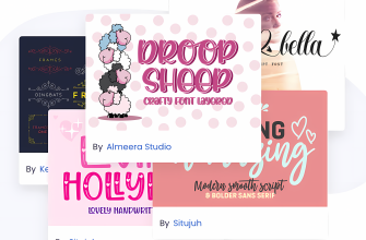
Explore More Resources
- Seasonal Fonts – Spring, Summer, Autumn & Winter
- Christmas Fonts – Festive, Elegant & Crafty Picks
- Wedding Fonts – Elegant Scripts, Signature Looks & Modern Minimal
- Birthday Fonts – Fun, Script & Playful Picks
- Valentine’s Fonts – Romantic, Script & Stylish Picks
- Mother’s Day Fonts – Lovely, Script & Elegant Picks