This guide to headline fonts and poster fonts shows how to pick punchy display families for banners, price tags, thumbnails and hero graphics – including quick sizing rules so your message reads in a split second.
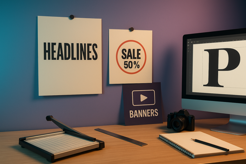
Editor’s top picks – Headlines & Posters
Impact Sans (Grotesk)
Blunt, high-contrast sans for loud sale banners and hero lines.
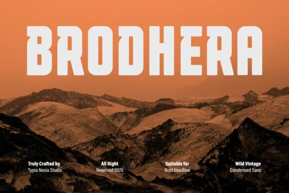
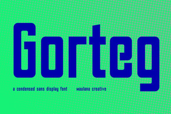
Condensed Sans
Tall, space-saving titles for narrow flyers and price tags.
High-impact Slab
Sturdy serifs with square shoulders – sports, menus, signage.
High-contrast Serif
Elegant Didone drama for fashion/editorial posters.
Outline / Shadow
Layered looks for depth – pair with a solid helper for readability.
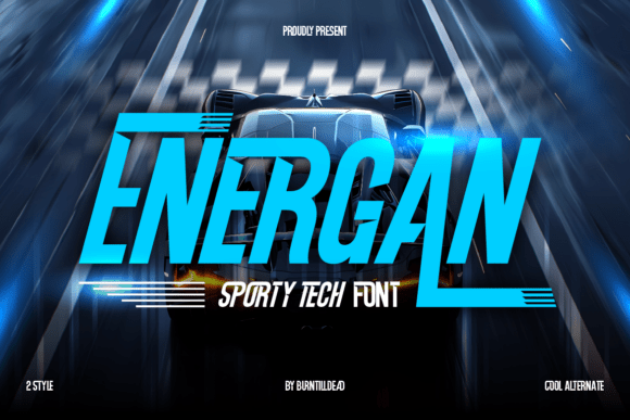
Sport / Varsity
All-caps energy for tournaments, leagues and school events.
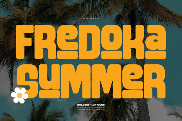
Retro / Groovy
Playful curves and big shadows for party flyers and promos.
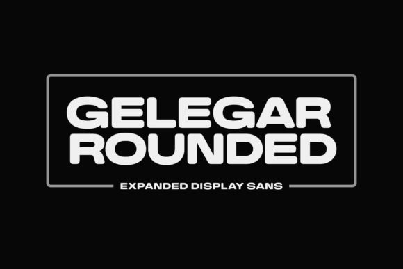
Wide / Expanded
Low-profile, stretched titles that feel cinematic in hero images.
Bold Script Accents
One expressive word to spark emotion – keep it short and thick.
Variable Display
Fine-tune width/weight live for tight grids and responsive layouts.
Text tools for faster poster workflow
- Custom headline typesetting – optical kerning/tracking, clean all-caps spacing for instant clarity.
- Text effects & 3D/outline layers – shadows, strokes, extrude, halftones ready for print/web.
- Poster & banner mockups – present your design on walls, billboards and storefronts.

How to choose a headline font
- Read in 3 seconds. Use 3–6 words max. If it needs a paragraph, it’s not a headline.
- Viewing distance rule. Roughly: text height ≈ viewing distance / 200 (inches) or / 250 (mm). Example: 3 m away → ~12 mm letters.
- All-caps needs tracking. Add +10–40 tracking; tighten kerning pairs like AV, Ta, Yo by hand.
- Hierarchy = 3 sizes. Big headline, medium kicker, small details; avoid four+ competing sizes.
- Numbers matter. Choose fonts with clear numerals for prices and dates.
- One trick per line. Outline or shadow or gradient – not all at once.
Try searches (headline-ready sets)
- Impact sans → blunt, modern titles for sale banners and thumbnails. Browse impact sans
- Condensed → tall, narrow words that fit small areas and price tags. See condensed picks
- Slab serif → blocky confidence for menus, sports and outdoor boards. Slab display
- High-contrast serif → chic editorial drama. Didone styles
- Outline/Shadow → stacked layers for depth; keep a solid backup for tiny sizes. Layered fonts
- Varsity/Sport → bold, collegiate titles with instant energy. Varsity sets
- Retro/Groovy → friendly curves for parties and seasonal promos. Retro display
- Wide/Expanded → cinematic, low-height headlines for hero images. Wide sans
- Bold script → one emotional word as an accent. Script accents
Sizing & export cheat-sheet
- Print DPI: 300 DPI for small prints, 150–200 DPI for large posters viewed from afar.
- Color: CMYK for print, RGB for screens; avoid rich black for small text (use 100K).
- Strokes: minimum stroke ≈ 0.25 pt for print; avoid hairlines on coated papers.
- Bleed & safety: 3–5 mm bleed; keep text 5–8 mm from the edge.
- Outline before print: convert type to curves to avoid missing fonts; export PDF/X-1a.
- Web thumbnails: 1280×720 (YouTube), 1080×1350 (IG portrait), 1000×1500 (Pinterest); export 1× and 2×.
Font pairing recipes
- Impact Sans + Neutral Sans – Shouty headline with a quiet helper. Impact ideas
- Didone + Grotesk – Fashion headline with clean secondary info. Didone sets
- Condensed + Wide – Contrast of widths for dynamic posters. Condensed picks · Wide picks
- Varsity Slab + Script Accent – Sports energy with one friendly word. Varsity ideas

Project ideas you can ship today
- Sale banners – two-word punchline, huge numerals, outline backup at small sizes.
- Price tags – condensed title + big price; verify numeral clarity.
- Event posters – bold headline + date/place; use three sizes only.
- Thumbnails – 3–4 words max; test at 10% zoom to simulate mobile.
- Menu boards – slab headers for sections, neutral helper for items.
FAQ
What size should my headline be?
As a rule of thumb: text height ≈ viewing distance / 200 (in). For indoor posters viewed at 2–3 m, 10–15 mm letters read comfortably.
Should I set headlines in all caps?
All caps can work for short words; add extra tracking and fix kerning pairs by hand to avoid clashing shapes.
How do I keep outline/shadow readable?
Use high contrast (light text / dark shadow or vice versa) and keep inner strokes ≥ 1–1.5 pt for print.
Are variable fonts worth it?
Yes – you can nudge weight/width to fit tight grids without changing families, which keeps the brand consistent.
Best export format?
For print use PDF/X-1a with fonts outlined. For web thumbnails export PNG/JPG at 1×/2× and add a crisp sharpen.
- Bold display (impact): Browse
- Condensed headlines: Browse
- Serif display (Didone): Browse
- Outline & shadow sets: Browse
- Retro/groovy titles: Browse
- Sports/varsity: Browse
Wedding Fonts
Elegant scripts & refined serifs for invitations, menus, signage and day-of details.
Logos & Branding Fonts
Clean, memorable display & versatile sans/serifs for wordmarks and brand systems.
Cricut & Silhouette Fonts
Cut-friendly (fewer inner holes), bold display and smooth scripts that weed easily.
Laser Cutting & Engraving Fonts
Stencil, single-line & sturdy forms that survive small bridges and fine engravings.
Social Media & Canva Fonts
Scroll-stopping display with strong contrast and clarity at small mobile sizes.
Etsy & Printables Fonts
Trendy sets for wall art, planners, labels and templates – commercial-use friendly.
Tattoo Fonts
Script, blackletter and vintage sets with legible strokes and balanced contrast.
Monogram Fonts
Circle/diamond styles, intertwined initials and elegant caps for gifts & linens.
Invitations & Cards
Readable pairings (display + body) for RSVPs, place cards, thank-you notes.
Kids & School Fonts
Friendly, chunky and classroom-safe sets for worksheets, labels and bulletin boards.
Teachers & Classroom Fonts
Neat handwriting, dashed tracing and clean sans for educational materials.
