High-Converting Forms Guide: Fields, Layouts & Copy for More Signups
High-converting forms reduce friction and make the next step feel safe. Use this guide to choose the right form type, order fields correctly, add trust cues, and write microcopy that gets more submissions – without making the form longer.

Why high-converting forms work
Great forms win by doing two things at the same time: they feel fast and they feel safe. Speed comes from fewer decisions. Safety comes from clear expectations, privacy cues, and proof near the form.
- Less friction: fewer fields and clearer labels.
- More clarity: users know what happens after submit.
- Higher trust: privacy, security, and proof reduce hesitation.
High-converting form patterns
Pick the pattern based on intent. Don’t force a long form on low-intent traffic.
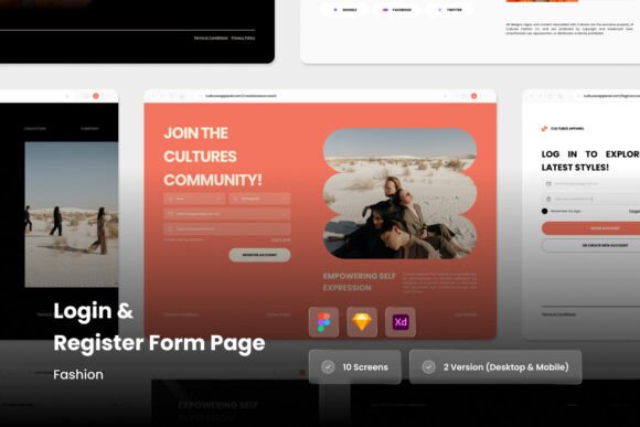
1) Short lead form (2–4 fields)
Best for: landing pages, ads, quick quotes.
Goal: start a conversation, not collect a biography.
2) Multi-step form (progressive)
Best for: higher-intent leads and longer qualification.
Goal: feel shorter while capturing more data.
3) Checkout / signup form
Best for: purchases and account creation.
Goal: reduce anxiety (security + guarantees + support link).
4) Booking / consultation form
Best for: services, agencies, freelancers.
Goal: qualify without scaring users away.
Best field order (simple rule)
- Easy first: name (optional) or email.
- Value next: what they want (dropdown / short answer).
- Contact last: phone only if you truly need it.
- Optional details: move to step 2 or after confirmation.
Microcopy formulas (copy-paste)
- Header: “Get a [result] in [timeframe].”
- Button: “Get My Quote” / “Send My Request” / “Book My Call”.
- Privacy line: “No spam. Your info stays private.”
- Expectation: “We reply within [X hours].”
Trust cues that lift conversions
- One testimonial near the form (short + specific).
- Security / privacy line under the button.
- Proof of legitimacy: “Trusted by…” or “Rated 4.8/5 (1,240 reviews)” when real.
- Guarantee / cancellation clarity: “Cancel anytime” / “No commitment”.
Quick checklist
- Fewer fields: remove anything you don’t use.
- Clear CTA: button says what happens next.
- Error-proof: helpful validation + examples (email/phone formats).
- Mobile-first: big tap targets, no tiny dropdowns.
- Trust line: privacy + response-time note.
Recommended picks
Start with a short lead form pattern, then test a multi-step version if you need more qualification. Keep visuals clean and trust cues close to the button.
Form Sections & Lead Capture Blocks
Simple, clean form layouts for landing pages and service sites.
View options →Contact Form Designs
Contact and inquiry form layouts with clean spacing and clear labels.
View options →Multi-Step / Survey-Style Forms
Progressive layouts that feel shorter while qualifying leads.
View options →Trust Badges Near Forms
Security and privacy cues that reduce hesitation before submit.
View options →FAQ
How many fields should a landing page form have?
As few as possible. For most landing pages, 2–4 fields is a strong starting point. If you need more data, use a multi-step form.
Should I ask for a phone number?
Only if you will actually call and the user expects it. Otherwise, make it optional or move it to step 2.
More Template Guides
Landing Page Sections That Convert
Proven section order and reusable blocks for faster pages.
Explore →Next step
Start with a short form. Add one trust line and one expectation line under the button. Then test one change at a time: fewer fields, clearer CTA, or a multi-step version.