How to Choose a Template: A Simple Framework
How to choose a template comes down to one thing: match the layout to the user’s next step. Use this guide to pick templates by goal (lead, sale, download, KDP), by platform (WordPress, Shopify, Canva), and by traffic source (ads vs SEO), so your page feels clear, trustworthy, and easy to act on.
Why choosing the right template matters
A template is not just design – it’s a conversion path. When the structure matches the visitor’s intent, the page feels obvious: what it is, why it matters, and what to do next. When structure is wrong, people scroll, hesitate, and leave.
- Clarity: the page answers the “what is this?” question immediately.
- Trust: proof appears near the claims (not buried at the bottom).
- Momentum: the CTA matches the next step (learn → try → buy).
A simple decision framework (5 questions)
Use these questions to choose any template in under two minutes.
- What is the goal? Lead, sale, download, booking, or KDP product.
- Who is the audience? Cold traffic needs more clarity + proof than warm traffic.
- What’s the “next step” CTA? “Get the guide” vs “Book a call” vs “Buy now”.
- What must be included? Pricing, FAQ, testimonials, form, comparison, downloads.
- What are constraints? Platform (WordPress/Shopify/Canva), time, and editing skill.
Choose a template by goal
Lead generation (services, quotes, consultations)
Look for: hero with one CTA, short form, trust line, testimonials, FAQ, and a final CTA. Avoid multi-offer layouts.
Product sale (digital or physical)
Look for: benefits, “what you get,” proof near price, guarantees, and clean checkout CTA. Use comparison/pricing cards if you have plans.
Lead magnet / download
Look for: short copy, clear deliverable preview, one opt-in form, privacy line, and instant-access promise.
Presentation / pitch deck templates
Look for: clean typography, consistent slide system, and preview-friendly layouts. Add “use cases” and a download CTA.
KDP interiors
Look for: clear structure, must-have pages list, print-ready checklist, and a “recommended picks” section that opens relevant searches.
Choose a template by platform
- WordPress: prioritize section blocks, anchors, and fast editing (Gutenberg-friendly content patterns).
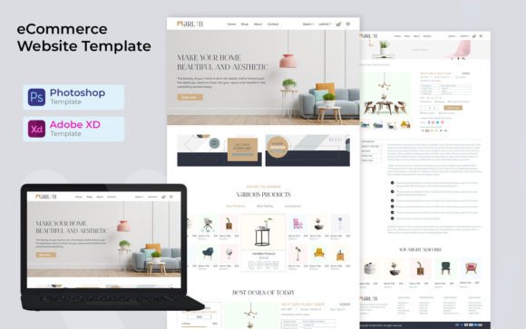
- Shopify: product-first structure, trust near price, and mobile-friendly buy buttons.
- Landing builders (Instapage etc.): strong hero + form + proof blocks, minimal navigation.
- Canva: speed + consistency. Choose systems with reusable styles and clear export workflow.
Choose a template by traffic source
- Ads / cold traffic: clarity + proof early + risk reducers near the CTA.
- Social / warm traffic: shorter pages can work, but keep proof + CTA visible.
- SEO traffic: deeper content, clear section anchors, FAQs, and “next step” CTAs.
Common template pitfalls
- Wrong CTA: “Buy now” on a page that should capture leads.
- Random blocks: sections that don’t support the decision sequence (clarity → proof → details → CTA).
- Too many offers: multiple actions competing on one page.
- Proof too late: testimonials/logos buried after long explanations.
Quick checklist (before you commit)
- Goal is obvious: one primary action (lead, buy, download, book).
- Above-the-fold works: headline + subhead + CTA + tiny trust line.
- Proof is early: at least one proof block near the hero.
- Offer is tangible: “what you get” is concrete.
- Risk reducers exist: privacy, cancel anytime, guarantee, response time.
- Mobile is clean: CTAs don’t wrap, spacing is readable.
Recommended picks
If you’re unsure, start with a proven structure template and then swap the niche visuals. Structure is what converts.
KDP Interior Templates
Print-ready interiors for journals, planners, trackers, and logbooks.
View options →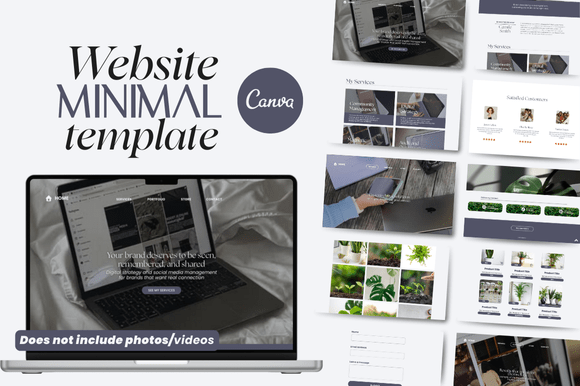
FAQ
Should I pick design or structure first?
Structure first. Design can be swapped quickly, but a mismatched structure breaks clarity and conversions.
How many templates should I test?
Start with one strong template, then test 2–3 variations (different hero, proof style, or CTA copy). Too many options slows execution.
When do I need a long page?
When traffic is cold or the decision is high-friction. Add proof, “how it works,” and FAQs – but keep the order logical.
More Template Guides
Landing Page Sections That Convert
A proven section order + copy checklist for high-converting pages.
Explore →Social Proof Examples
Testimonials, reviews, logos, stats, and trust badges that lift conversions.
Explore →Next step
Pick a template that matches one goal and one CTA. Then make the offer tangible (“what you get”), add proof near claims, and place a small risk reducer near the button. That’s the fastest path to a page that feels confident and converts.