This guide to invitation fonts shows how to pair elegant script with clean serif/sans for weddings, birthdays and thank-you cards – plus quick sizing rules, print specs and Canva-friendly picks.
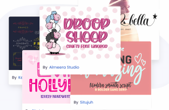
Editor’s top picks – Invitations & Cards
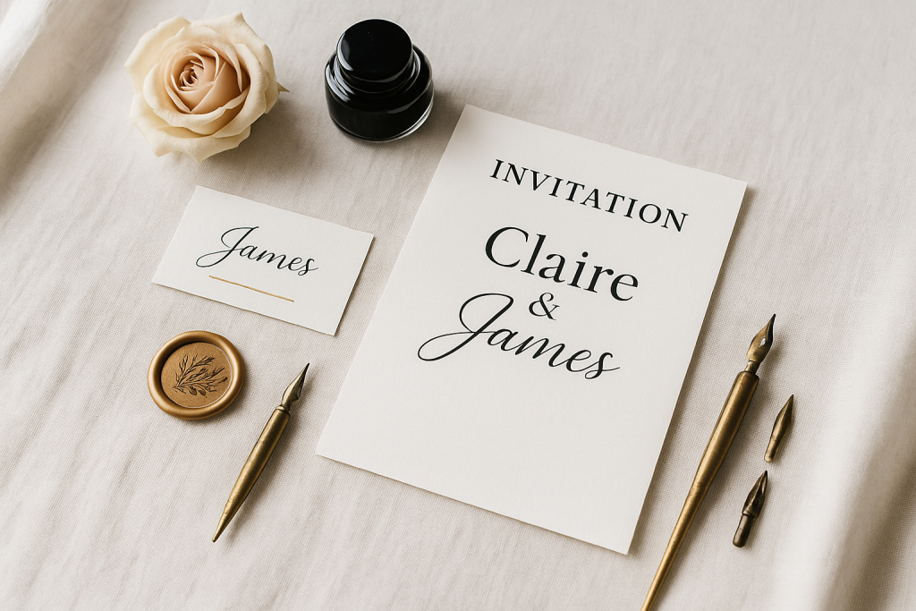
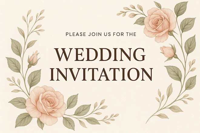
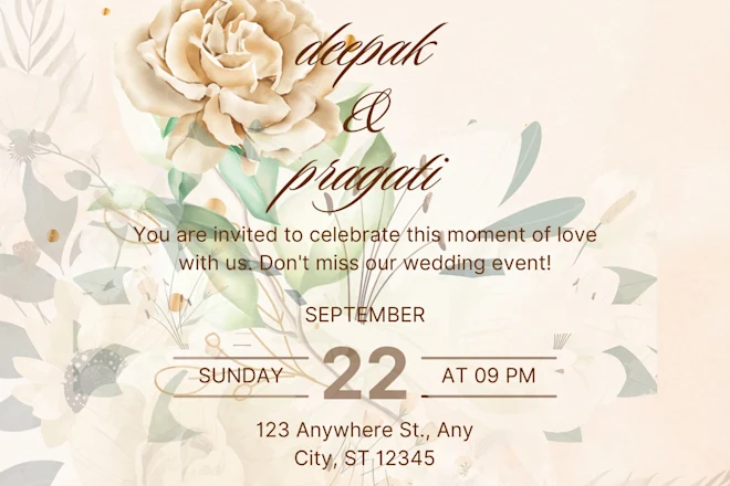
Wedding Invitations
Elegant script for names + readable serif for details. Aim 13–11 pt body with 1.2–1.35 line-height.
Birthday & Party
Playful display + clean sans for time and address. Keep numerals crystal clear.
Thank-You Cards
Handwritten warmth with tidy lowercase forms; avoid extreme slant for legibility.
RSVP Cards
Small-size clarity. Use a sober serif/sans at 10–11 pt; boost letterspacing by +1–2% if needed.
Place Cards
Big names in script (>24 pt) + tiny table info in a clean sans (8.5–9 pt) for tight spaces.
Holiday Cards
Festive display with generous spacing; test in metallic foil or white-on-photo.
Baby Shower
Soft monoline scripts + round sans for headers. Keep contrast low for a gentle look.
Graduation
Bold display for the year + legible serif for ceremony info; avoid fussy alternates.
Text tools for faster invitation layout
- Professional typesetting – clean hierarchy, kerning and hyphenation control.
- Custom calligraphy names – signature flourishes drawn to match your script.
- Vectorize your sketch – turn pencil layouts into print-ready SVG/PDF.
Font pairing recipes
- Flowing Script + Transitional Serif – Script for names (36–48 pt), serif for body (11–12 pt). Scripts · Serifs
- Monoline Script + Humanist Sans – Friendly vibe for baby/birthday. Keep script ≥28 pt; sans body 11 pt. Monoline · Sans
- High-contrast Didone + Grotesk – Luxe headline + crisp details. Avoid hairline weights below 11 pt. Didone · Grotesk
Print specs: quick cheatsheet
- Common sizes: 5×7″ (A7) invite, A6 RSVP, tent place cards 3.5×2″ (folded: 3.5×4″).
- Resolution: 300 dpi; add 0.125″ (3 mm) bleed each side.
- Body text: 10.5–12 pt; small items (RSVP/addresses): 9–10.5 pt.
- Minimum stroke: 0.25–0.3 pt for digital; 0.35–0.4 pt for foil/letterpress.
- Ink & foil: boost tracking +2–4% on dark stock or metallic foil.
Color & layout tips
- Contrast first: dark text on light stock wins readability; for photo invites, use solid panels or soft overlays.
- Hierarchy: names > event > date/time > venue > details; give each level a distinct size/weight.
- All caps? Keep tracking +4–8% on small caps; avoid script in ALL CAPS.
Try searches (invitation-ready sets)
- Calligraphy scripts → Romantic names & flourishes
- Readable serifs → Classic body copy
- Clean sans → Modern details & RSVP
- Place card scripts → Big names, smooth curves
- Holiday card display → Festive headlines

Licensing notes
- Print use: a standard commercial license usually covers printing static cards; embedding the font in a website/app requires a separate web/app license.
- Vendors: if a printer needs source files with live text, outline the final artwork or ensure they have a license.
Curated quick picks
- Wedding scripts: Browse
- Minimal serif families: Browse
- Humanist sans for details: Browse
- RSVP & small text: Browse

Wedding Fonts
Elegant scripts & refined serifs for invitations, menus, signage and day-of details.
Logos & Branding Fonts
Clean, memorable display & versatile sans/serifs for wordmarks and brand systems.
Cricut & Silhouette Fonts
Cut-friendly (fewer inner holes), bold display and smooth scripts that weed easily.
Laser Cutting & Engraving Fonts
Stencil, single-line & sturdy forms that survive small bridges and fine engravings.
Social Media & Canva Fonts
Scroll-stopping display with strong contrast and clarity at small mobile sizes.
Etsy & Printables Fonts
Trendy sets for wall art, planners, labels and templates – commercial-use friendly.
Headlines & Posters
Impactful display families for banners, price tags, thumbnails and hero graphics.
Tattoo Fonts
Script, blackletter and vintage sets with legible strokes and balanced contrast.
Monogram Fonts
Circle/diamond styles, intertwined initials and elegant caps for gifts & linens.
Kids & School Fonts
Friendly, chunky and classroom-safe sets for worksheets, labels and bulletin boards.
Teachers & Classroom Fonts
Neat handwriting, dashed tracing and clean sans for educational materials.