This guide to kids & school fonts shows how to pick friendly, chunky and classroom-safe sets for worksheets, labels and bulletin boards — including quick sizing rules so young readers can recognize letters at a glance.
Editor’s top picks — Kids & School Fonts
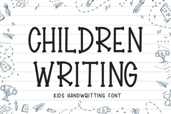
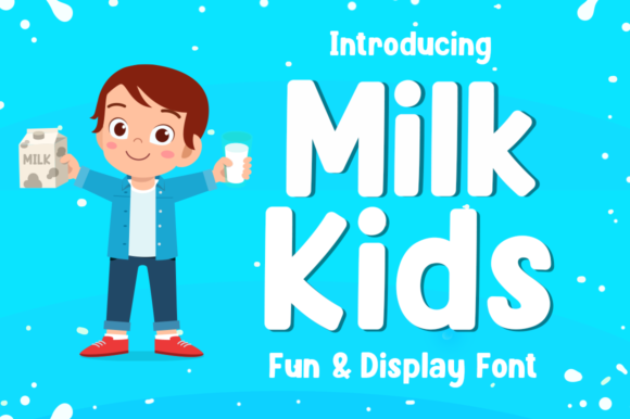
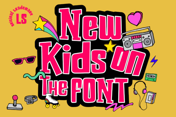
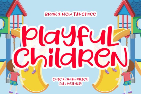
Chunky Display
Rounded, high-contrast letters that stay legible on posters and bulletin boards.
Dotted / Tracing
Dash-guided alphabets for handwriting practice and printable worksheets.
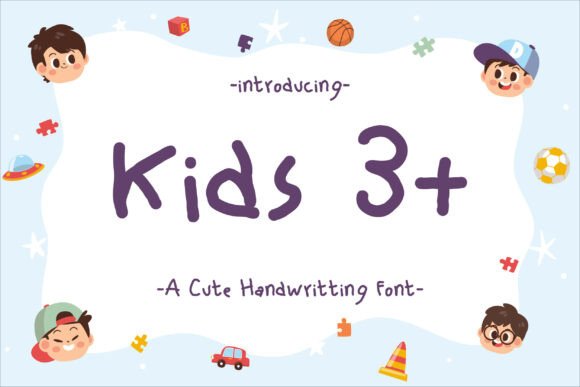
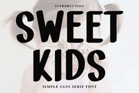
Clean Handwriting
Neat, classroom-safe forms with clear a/g and simple numerals for early readers.
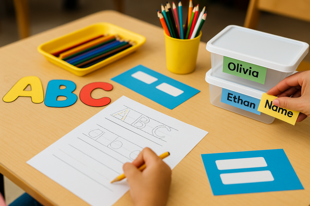
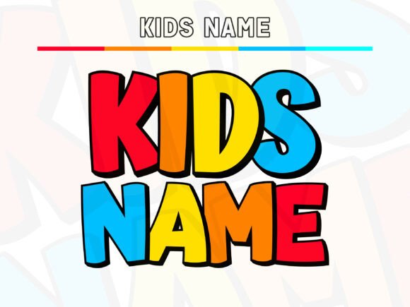
Labels & Name Tags
Bold caps and condensed options for cubbies, folders and classroom bins.
Flashcards
Simple, open shapes for A-Z cards, sight words and blends/digraphs.
Classroom Posters
Big display families for rules charts, calendar headers and schedule boards.
How to choose kid-friendly fonts
- Big shapes, open counters. Avoid ultra-thin hairlines and decorative swashes for early grades.
- Single-storey a/g for K-2. Helps beginners match letters to readers they use at school.
- Sizing rule of thumb. Posters: 120–200 pt; labels: 36–60 pt; worksheets body: 18–24 pt.
- Spacing. Slightly increase tracking for beginners (+5–20) to prevent letter crowding.
- Symbols & accents. Ensure numerals are clear and punctuation is easy to spot.
Try searches (classroom-ready)
- Bubble/Playful → Chunky bubble sets
- Friendly Sans → Clean classroom sans
- Dotted/Dashed → Tracing alphabets
- Outline/Color-in → Color-in letters
- School Labels → Label fonts
- Bulletin Titles → Board headers
Font pairing recipes
- Chunky Display + Clean Sans — Fun header for posters with a neutral body for instructions.
- Outline Bubble + Solid Bubble — Title + shadowed subhead for bulletin boards.
- Dotted Tracing + Handwriting — Practice line paired with a neat example line.
Projects you can print today
- Alphabet wall: A–Z cards with pictures; keep letters 140–200 pt for distance reading.
- Nameplates & cubby labels: condensed caps to fit small strips; add icons for non-readers.
- Sight-word cards: simple sans at 100–140 pt; one word per card, high contrast.
- Reward charts & routines: bold headings + clean checklists for morning/evening tasks.
Licensing & classroom safety
- Classroom-safe usage: most commercial licenses allow printing worksheets and posters for your class. Check the EULA for redistribution limits.
- School-wide sharing: if multiple teachers use the font, you may need more seats or a site license.
- Digital worksheets: sharing as flattened PDFs is usually fine; embedding the font for editing may require an extra web/app license.
Curated quick picks
- Chunky display (bulletin boards): Browse
- Dotted tracing (worksheets): Browse
- Clean classroom sans: Browse
- Outline color-in letters: Browse
Wedding Fonts
Elegant scripts & refined serifs for invitations, menus, signage and day-of details.
Logos & Branding Fonts
Clean, memorable display & versatile sans/serifs for wordmarks and brand systems.
Cricut & Silhouette Fonts
Cut-friendly (fewer inner holes), bold display and smooth scripts that weed easily.
Laser Cutting & Engraving Fonts
Stencil, single-line & sturdy forms that survive small bridges and fine engravings.
Social Media & Canva Fonts
Scroll-stopping display with strong contrast and clarity at small mobile sizes.
Etsy & Printables Fonts
Trendy sets for wall art, planners, labels and templates — commercial-use friendly.
Headlines & Posters
Impactful display families for banners, price tags, thumbnails and hero graphics.
Tattoo Fonts
Script, blackletter and vintage sets with legible strokes and balanced contrast.
Monogram Fonts
Circle/diamond styles, intertwined initials and elegant caps for gifts & linens.
Invitations & Cards
Readable pairings (display + body) for RSVPs, place cards, thank-you notes.
Teachers & Classroom Fonts
Neat handwriting, dashed tracing and clean sans for educational materials.