Landing Page Sections That Convert: Proven Order + Copy Checklist
Landing page sections convert best when each block answers one question fast: what it is, why it matters, how it works, and why it’s safe to choose. Use this guide to build a clean, high-converting section order, write tighter copy, and avoid “random blocks” that confuse visitors.
Why landing page section order matters
A landing page converts when it reduces uncertainty in the right sequence: clarity first, proof second, details third, and commitment last. When sections are out of order, visitors feel “not sure yet” and keep scrolling until they leave.
- Clarity: what it is + who it’s for + the outcome.
- Trust: proof that it works for people like them.
- Understanding: how it works and what they get.
- Safety: risk reducers near the CTA (privacy, cancel, guarantee).
A proven landing page section order
This structure is simple, scannable, and works for services, products, and downloads. You can shorten it, but keep the logic.
- Hero: promise + who it’s for + primary CTA + micro trust line.
- Social proof: 3–6 testimonials OR logo row OR rating strip.
- Problem → outcome: what changes after using it.
- Benefits: 3–6 outcome bullets (not features).
- How it works: 3 steps + timeframe + what happens next.
- What you get: deliverables / inclusions (very concrete).
- Pricing / plan / offer: make the decision easy.
- FAQ: handle objections right before the final CTA.
- Final CTA: repeat promise + risk reducer.
What each section should do (fast)
1) Hero
Goal: instant clarity. One strong sentence + one CTA. Add a small trust line under the button (no spam / cancel anytime / reply in 24h).
2) Social proof
Goal: “This works for people like me.” Use specific proof (role + result). Keep it short and recent.
3) Problem → outcome
Goal: make the pain feel understood and the outcome feel inevitable. Keep it short: “Before → After”.
4) Benefits
Goal: why it matters. Benefits should read like outcomes: faster, easier, safer, clearer.
5) How it works
Goal: remove confusion. Three steps are enough: start → get value → finish/next step.
6) What you get
Goal: make the offer tangible. List deliverables, access, formats, timelines, and support.
7) Pricing / offer
Goal: easy decision. Keep options limited. Highlight one recommended choice when appropriate.
8) FAQ + final CTA
Goal: remove last objections. Then repeat the promise and CTA with a small risk reducer.

Copy patterns you can reuse
- Hero: “Get [Outcome] without [Pain].”
- Benefit bullets: “So you can [Result]” / “Without [Friction]”.
- How it works: “Step 1: [Action] → Step 2: [Value] → Step 3: [Result]”.
- Proof: “[Role] got [Result] in [Timeframe].”
- Risk line: “No spam • Cancel anytime • Support included.”
Common mistakes that lower conversions
- Too many CTAs: different buttons with different actions across one page.
- Feature overload: long lists with no outcomes or context.
- Proof at the bottom: visitors need trust early, not after 2,000 words.
- No risk reducers: forms without privacy/response-time cues.
- Random section order: “pricing” before “how it works” for cold traffic.
Quick checklist
- Hero clarity: outcome + audience + CTA above the fold.
- Proof early: at least one proof strip under the hero.
- Benefits > features: 3–6 outcome bullets.
- How it works: 3 simple steps.
- Offer is tangible: “what you get” is concrete.
- Objections handled: FAQ right before the final CTA.
- Risk reducer: privacy / cancel / reply time near forms.
Recommended picks
Start with a clean landing page template, then add reusable section blocks (hero, pricing, FAQ, testimonials) so every new page stays consistent.
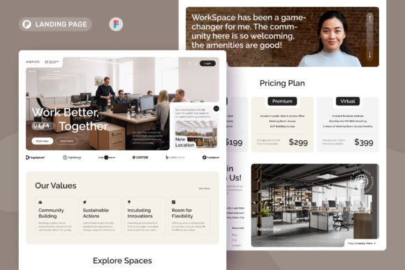
Landing Page Templates
Full layouts with a proven structure: hero → proof → benefits → CTA.
View options →Hero Section Layouts
Headline + subhead + CTA patterns that improve above-the-fold clarity.
View options →Pricing Table Blocks
Plan cards with a “recommended” highlight and clear CTA placement.
View options →FAQ & Accordion Sections
Clean FAQ blocks that handle objections right before the CTA.
View options →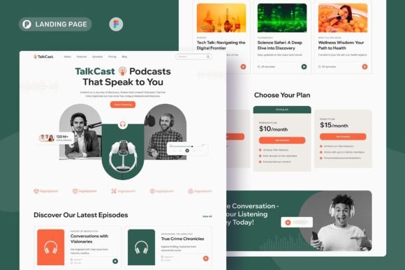
FAQ
How long should a landing page be?
As long as it needs to answer questions in order. Cold traffic usually needs more proof and clarity than warm traffic.
What sections matter most?
Hero clarity, early proof, benefits, and a clear “how it works.” Pricing and FAQ become critical when the decision is higher friction.
More Template Guides
Social Proof Examples
Testimonials, reviews, logos, stats, and trust badges that lift conversions.
Explore →How to Choose a Template
Pick a layout by goal, traffic source, and offer – without overthinking.
Explore →Next step
Build a page once using the proven order. Then reuse the same section system (hero, proof, benefits, how-it-works, pricing, FAQ) across future pages so everything stays consistent and easier to test.