This guide to logo and branding fonts shows how to choose clean sans, signature scripts and modern display for memorable wordmarks, plus quick tests to keep your logo readable at any size.
Editor’s top picks – Logo & Branding Fonts
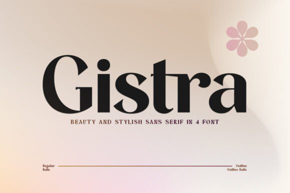
Clean Sans / Grotesk
Neutral, versatile and timeless – ideal for scalable wordmarks and brand systems.
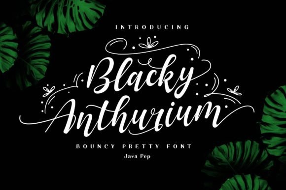
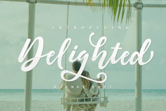
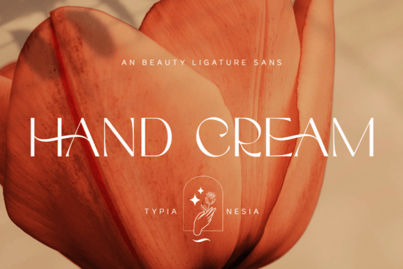
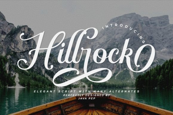
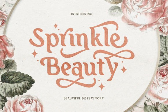
Signature Script
Handwritten elegance for boutique, beauty and personal brands; keep strokes bold for clarity.
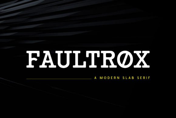
Serif (Transitional/Slab)
Confident, editorial voice. Slabs add sturdiness for signage and packaging.
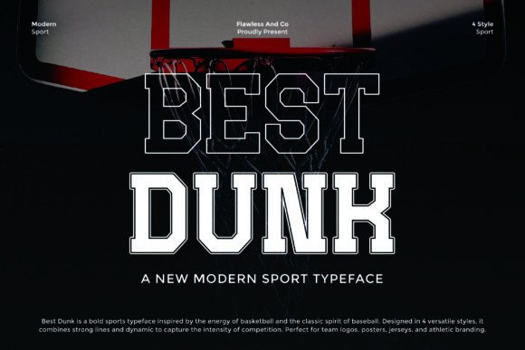
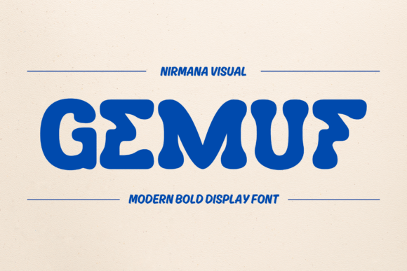
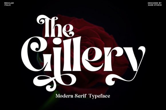
Modern Display
Distinctive shapes for bold wordmarks – use sparingly and test at small sizes.
Vintage / Heritage
Classic charm for badges and label brands – pair with a clean helper face.
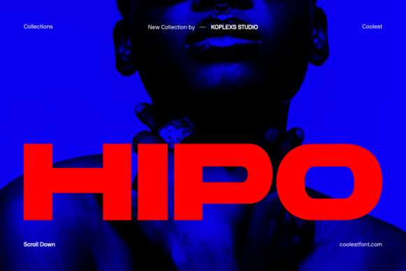
Tech / Futuristic
Geometric precision and sharp details; watch tracking for tiny UI avatars.
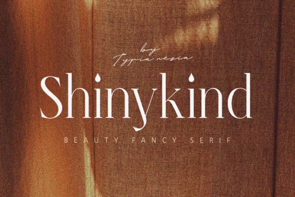
Luxury (High-contrast)
Didone style with elegant contrast – upscale feel for fashion and beauty.
Text tools for faster logo workflow
- Custom wordmark typesetting – optical kerning, ligatures and spacing tuned by hand.
- Signature logo lettering – bespoke script marks based on your name/initials.
- Font modification & cleanup – refine letterforms, build alternates and vector outlines for a unique mark.
- Fiverr Logo Maker (AI) – quick DIY start: create a concept instantly, then polish spacing, kerning and distinctive touches.
How to choose a logo font
- Readability at small sizes. Test at 24–32 px (favicon/social avatar). Avoid ultra-thin hairlines.
- Unique but simple. One distinctive detail per wordmark is enough – don’t overdecorate.
- Letterfit & kerning. Tight but breathable spacing; adjust pairs like AV, Ta, To, Yo.
- Multi-style family. Extra weights/condensed variants help build a consistent brand system.
- Accents & symbols. Ensure language support (é, ñ, ç) and clear numerals.
- License. Confirm EULA allows logo usage (most do) and commercial use for your business.
Try searches (logo-ready sets)
- Clean Sans / Grotesk → Browse clean sans
- Geometric Sans → Geometric options
- Humanist Sans → Humanist options
- Signature Script → Signature picks
- Luxury Didone → High-contrast serifs
- Tech / Futuristic → Tech styles
- Vintage / Badge → Retro & badge sets
- Monograms & Initials → Monogram fonts
- Condensed Sans → Narrow wordmarks
Font pairing recipes
- Clean Sans + Signature Script – Sans for the wordmark, a small script accent for submarks. Sans ideas · Signature ideas
- Serif (Transitional) + Grotesk – Editorial headline with modern body copy. Serif picks · Grotesk picks
- Luxury Didone + Condensed Sans – Fashion tone with compact secondary typography. Didone sets · Condensed sets
Brand assets you can ship today
- Primary wordmark + submark (stacked/initials) for avatars and stickers.
- Badge logo for packaging; keep counters open and borders thick for print clarity.
- Monogram for luxury tags and seals; test foil/emboss simulation.
- Social kit: square avatar, story highlight covers, favicon at 32 px.
Small-size readability: quick checks
- Squint test at 24–32 px: still legible? If not, choose bolder weights or simplify shapes.
- Increase tracking slightly for condensed or tech faces.
- Avoid ultra-thin hairlines; prefer solid stems and clear apertures.
- Convert to outlines and manually tune kerning pairs in the final artwork.
Licensing: what matters for logos
- Logo usage: most font EULAs allow creating a static logo. Always check the seller’s terms.
- Seats/Users: one license per designer/device unless the EULA states otherwise.
- Web/App: using the font on a website/app requires a web/app license; your static logo file does not.
- Trademark: you can usually trademark a logo created with a licensed font; register the artwork, not the font.
FAQ
Which fonts read best at small sizes?
Clean sans (grotesk/humanist) and sturdy serifs with open apertures. Avoid ultra-thin hairlines and overly condensed forms.
Do I need a special license for a logo?
Typically no – a standard commercial license allows static logo creation. Check the EULA for “logo usage” to be sure.
Curated quick picks
- Clean sans (brand systems): Browse
- Signature logo scripts: Browse
- Luxury Didone: Browse
- Tech/Futuristic: Browse
- Vintage/Badge: Browse
- Condensed wordmarks: Browse
Wedding Fonts
Elegant scripts & refined serifs for invitations, menus, signage and day-of details.
Cricut & Silhouette Fonts
Cut-friendly (fewer inner holes), bold display and smooth scripts that weed easily.
Laser Cutting & Engraving Fonts
Stencil, single-line & sturdy forms that survive small bridges and fine engravings.
Social Media & Canva Fonts
Scroll-stopping display with strong contrast and clarity at small mobile sizes.
Etsy & Printables Fonts
Trendy sets for wall art, planners, labels and templates – commercial-use friendly.
Headlines & Posters
Impactful display families for banners, price tags, thumbnails and hero graphics.
Tattoo Fonts
Script, blackletter and vintage sets with legible strokes and balanced contrast.
Monogram Fonts
Circle/diamond styles, intertwined initials and elegant caps for gifts & linens.
Invitations & Cards
Readable pairings (display + body) for RSVPs, place cards, thank-you notes.
Kids & School Fonts
Friendly, chunky and classroom-safe sets for worksheets, labels and bulletin boards.
Teachers & Classroom Fonts
Neat handwriting, dashed tracing and clean sans for educational materials.