If you are choosing between a name mug, an initial mug, and a monogram mug, the easiest way to decide is to match the style to the purpose. A full name feels warmer and more personal. An initial usually looks cleaner and easier to live with every day. A monogram tends to feel more polished, structured, and a little more formal. The best Personalized Name Mugs are not the ones with the most decoration. They are the ones where the typography, spacing, and placement already look right before anything extra is added. This guide will help you choose a mug style that feels personal, readable, and actually elegant in real use, not just in a mockup.
Name Mugs vs Initial Mugs vs Monogram Mugs: What Changes Visually
These three formats are often grouped together, but they create very different impressions. That matters if you want the final mug to feel intentional rather than generic.
Personalized Name Mug
A Personalized Name Mug uses a full first name, full name, or a short custom line built around a name. This is usually the most direct and instantly personal option. It works especially well for gifts because the recipient does not have to interpret the design. It immediately reads as something made for them.
Full-name designs also give you more room to shape the mood. A simple sans-serif first name can look modern and minimal, while a flowing script can make the same mug feel softer and more gift-oriented.
Best fit: birthdays, teachers, coworkers, bridesmaids, moms, daily desk mugs, and simple personalized gift sets.
Mug With Initial
A Mug With Initial or Personalized Initial Mug uses one letter as the main feature, sometimes paired with a smaller name or short supporting line. This format gives the design more breathing room. It is often the cleanest choice when you want something subtle, modern, and easy to style in different spaces.
It is also more forgiving than a long name layout. One letter is easier to center, easier to scale, and easier to keep visually balanced. That is why initials often work so well for minimalist kitchens, office mugs, and product lines that need broad appeal.
Best fit: everyday coffee mugs, office use, neutral interiors, couples who prefer understated personalization, and shops building a clean, repeatable design system.
Monogram Mug Design
A Monogram Mug Design usually feels more structured than a simple initial. It can be a single letter treated in a classic monogram style, or a multi-letter composition with visual hierarchy. A strong Monogram Coffee Mug tends to look more formal, more classic, and more gift-ready for occasions where a plain name line might feel too casual.
The key difference is not just the letter itself. It is the composition. A monogram often relies on proportion, symmetry, framing, and a clear focal point. When done well, it feels refined. When done badly, it can look crowded very quickly.
Best fit: wedding parties, anniversary gifts, housewarming sets, elevated kitchen styling, and premium-looking personalized collections.
How to Choose the Right Format for Your Purpose
The fastest way to choose is to think about mood first, not decoration.
- If you want the mug to feel warm, personal, and immediately giftable, start with a Mug With Name.
- If you want it to feel clean, versatile, and easy to use every day, start with an initial.
- If you want something more polished, formal, or classic, start with a monogram.
After that, think about where and how the mug will actually be used. A teacher gift usually needs instant readability. A bridesmaid mug can carry slightly more styling because the occasion already supports a dressed-up look. A daily home coffee mug should still feel good once the novelty fades, which is why cleaner layouts often age better than heavily decorated ones.
If you are designing for a shop, it helps to develop three parallel directions instead of trying to force one design style to do everything: one clean name layout, one restrained initial version, and one more elegant monogram option. That gives buyers choice without making the collection feel scattered.
What Makes Personalized Name Mugs Look Elegant Instead of Busy
When a custom mug looks cheap, the problem usually is not the mug itself. It is the lack of hierarchy. Too many elements are competing at once, so the design never settles.
If you want Custom Name Mugs to look polished, a few design basics matter more than extra decoration:
- One focal point: let the name, the initial, or the monogram carry the design. Do not give everything equal visual weight.
- Clear contrast: one strong text color and one restrained support color are usually enough.
- Good margins: the design needs room away from the rim, the base, and especially the handle area.
- Readable letterforms: ornate fonts only work if the name can still be read instantly.
- Consistent visual weight: random mixtures of very thin and very heavy elements often make a mug feel unstable.
In practice, elegant mug design is usually about restraint. If a draft feels crowded, the smartest fix is often to remove one decorative element rather than adding another one to “balance it out.”
Typography Does Most of the Work
Typography changes the mood of Name Mug Designs faster than almost anything else. The same mug can feel playful, minimal, formal, soft, or premium depending on the font direction.
Script fonts
Script brings softness, movement, and a more obviously gift-like tone. It works well for names, bridal gifts, family mugs, and warmer personal styles. The risk is legibility. Thin loops and delicate strokes can look beautiful close up but disappear when printed too small or viewed from a distance.
If you use script, it usually helps to let the script be the star and keep everything else quiet.
Serif fonts
Serif type feels classic, grounded, and a little more formal. It is especially strong for Monogram Letter Mug layouts, elegant family gifts, or mugs that need to feel timeless rather than trendy. A serif monogram with enough space around it often looks more expensive than a more decorative alternative.
Sans-serif fonts
Sans-serif is the cleanest route for modern clarity. It works especially well for a Coffee Mug Name Design with a short first name or a minimal Mug With Initial. If you want something easy to live with every day, sans-serif is one of the safest and strongest choices.
Decorative fonts
Decorative lettering can work, but it needs discipline. On mugs, overly ornate type can tip into visual noise very quickly. A better approach is to use decorative style for one hero element only, then support it with simpler text or no support text at all.
If you need ideas for font direction before you start layout testing, a selective browse through monogram font resources and script font options can help you define a style family first instead of jumping between random type choices.
For on-site reference, it also makes sense to compare those ideas with your own typography-focused pages like Monogram Fonts.
Placement and Mug Color Matter More Than People Expect
A good Monogrammed Coffee Mug Design is not only about the artwork itself. Placement changes how the design feels when the mug is sitting on a desk, held in the hand, or photographed for a listing.
Front-center placement
This is the safest and most familiar option. It works well for gifts, product photography, and most Personalized Name Mug Ideas because it is clear and easy to read at a glance.
Offset placement near the handle
This feels a little more boutique and understated. It is usually stronger for initials and monograms than for long full-name layouts. When done well, it can make the mug feel more styled and less mass-market.
Wrap-style placement
This can work for repeating patterns, longer name treatments, or supporting graphics, but it is also the easiest layout to overdo. If the composition goes all the way around the mug, the rhythm needs to stay simple or the result starts feeling crowded from every angle.
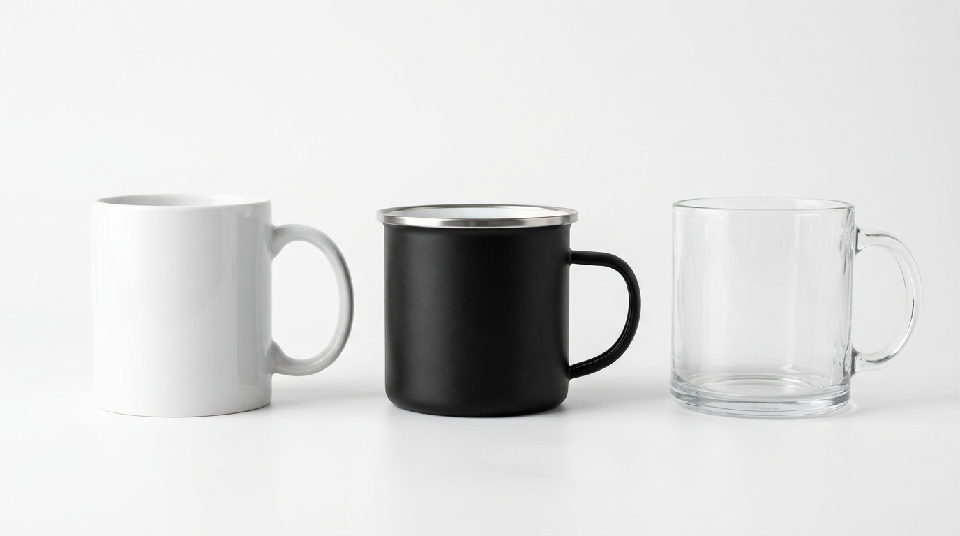
Mug color strategy
- White mugs: the easiest choice for contrast and the most flexible across almost all design styles.
- Black mugs: dramatic and elegant with light text or gold-style detailing, but much less forgiving if contrast is weak.
- Soft neutral mugs: excellent for restrained initials, serif monograms, and more premium-looking minimal layouts.
- Colored interiors or handles: useful as a small accent, but the design should still make sense without relying on that extra color.
If you are testing ideas for listings or content, using a few controlled mockup scenes from Mug Mockup Templates makes it easier to judge readability, scale, and balance before moving any further.
Gold-Style Name and Monogram Designs: Elegant When Kept Under Control
A Personalized Gold Name Mug or Gold Monogram Coffee Mug can look beautiful, but gold effects only work when the rest of the design stays calm. The problem is rarely gold itself. The problem is what usually gets added around it.
Gold-style details tend to work best when:
- the background is clean,
- the lettering already has good structure,
- support text is minimal,
- the design has enough empty space around it.
If the layout already feels busy, metallic effects usually make that busyness more obvious. Used with restraint, though, gold can shift a mug from everyday to occasion-ready very quickly. That is why it works especially well for bridesmaid gifts, monogram sets, and more dressed-up kitchen styling.
Style Directions That Actually Translate Well to Real Mugs
Inspiration is useful, but it helps much more when it turns into a direction you can actually follow. These are some of the most reliable routes for name and monogram mugs.
Minimal modern name mug
A single first name in a medium-weight sans-serif with generous empty space. This is one of the strongest options for daily use because it feels current without trying too hard.
Soft script name mug
A flowing script for the name with a very small supporting line underneath. This works well for birthdays, bridesmaid gifts, and warmer home-oriented designs. The key is to keep the supporting elements secondary.
Classic serif initial mug
One strong capital letter, centered well, sometimes with a subtle name line below. It is simple, upscale, and especially good for desks, neutral kitchens, and understated gifting.
Formal monogram layout
A structured monogram with balanced spacing, sometimes lightly framed, sometimes left unframed. This suits weddings, anniversaries, or any gift where you want a more composed and traditional feel.
Monoline monogram for everyday use
This is a cleaner, lighter version of the monogram look. It keeps the elegance of initials but removes the heaviness that some formal monograms can have. That is why many Monogram Coffee Mug Ideas work best when the monogram is simplified rather than over-decorated.
When you want more visual references, a restrained look through mug design resources can help you study structure and style direction before you build your own version.
Choosing by Recipient or Occasion
Once you stop thinking only in terms of style and start thinking about the person receiving the mug, the right direction becomes much easier to spot.
For moms, grandmothers, and family gifts
Full names, affectionate short forms, or soft script layouts usually feel warmer than initials alone. These mugs tend to work best when the design feels personal first and decorative second.
For dads and coworkers
A simple name line or clean initial often looks stronger than anything overly ornate. Clarity usually wins here.
For bridesmaids and wedding gifts
Monograms, serif initials, and restrained gold-style accents are natural fits. They feel dressed up without needing much extra detail.
For teachers and thank-you gifts
A readable full name or title-based line usually lands better than a complex monogram. Something like “Ms. Taylor” often feels more useful and more personal in real life.
For couples
Matching mugs work best when the design system stays consistent but the personalization changes. That might mean the same font family with two different names, or the same monogram style with different letters.
For personal everyday use
This is where simplicity usually wins. The best everyday mug is the one that still feels good after months of use, not the one that looked busiest in the first product photo.
If your mug idea is more photo-based or built around a personal gift moment, it can also help to compare layout direction with other custom mug formats. For example, a name mug and a photo mug create very different emotional effects, even when the mug itself is simple. If you want to explore that angle, see Personalized Photo Mugs for a more image-led approach to custom mug design. If you want something more playful or quote-driven instead, see Funny Coffee Mugs for ideas built around witty sayings, sarcastic styles, and giftable humor.
Common Mistakes That Make Custom Mugs Look Cheap
Most weak mug designs fall into the same traps:
- using too many fonts at once,
- making the name too large for the printable space,
- adding flourishes that do not improve readability,
- using low-contrast text on a colored mug,
- treating a monogram like decoration instead of structure,
- adding metallic or decorative effects before the base layout works.
A simple workflow prevents a lot of this: choose the format first, then the type direction, then the placement, then the color. Many clutter problems happen because people start with decoration instead of structure.
How to Use Inspiration Without Copying
The most useful inspiration is structural, not literal. Instead of copying someone else’s finished mug layout, look at what is actually making it work.
- Where is the focal point?
- How much empty space is left around it?
- Is the design driven by the typography or by decoration?
- What makes it feel classic, playful, minimal, or formal?
Then rebuild from those principles using your own font choices, spacing, and color direction. That gives you something informed, not imitated. For sellers especially, this matters. A strong collection should feel consistent, not like a collage of borrowed styles.
Practical Inspiration Checks Before You Finalize
If you are reviewing Monogram Mug Ideas, look for structure you can reuse: one clear focal letter, disciplined spacing, and supporting text only when it genuinely improves the design. That is what turns loose inspiration into usable Monogram Mug Design Inspiration.
For buyers who want a cleaner daily cup, a Coffee Mug With Name Design often works better than a heavily framed monogram. In that case, keep the Name On Mug short, easy to read, and built around one clear type direction. For more formal gifting, Elegant Monogram Mugs and a restrained Elegant Monogram Mug Design usually feel stronger than anything overloaded with flourishes.
A simple example is a Personalized Letter M Mug with a serif capital M, a subtle supporting name line, and enough negative space around the letter. That kind of layout can look much more polished than a busier design with twice as many elements.
Final Direction: The Fastest Way to Choose Well
If you want the simplest possible rule, use this one:
- Choose a full-name mug when the goal is warmth and personal connection.
- Choose an initial mug when the goal is a cleaner, more versatile everyday look.
- Choose a monogram mug when the goal is something more classic, formal, or gift-ready.
From there, keep the design focused. Test it in a light version and a higher-contrast version. Make sure it still reads clearly at a glance and still looks balanced without needing extra decoration to rescue it.
The best Personalized Name Mug Inspiration is usually not the loudest idea. It is the one that balances identity, readability, and style well enough that the mug still feels good to use long after the first unboxing moment.