This guide to outline fonts shows how to use hollow, inline and layered styles for stacked headlines and thumbnails – plus quick sizing rules so your message reads in a split second.
Editor’s top picks – Outline Fonts
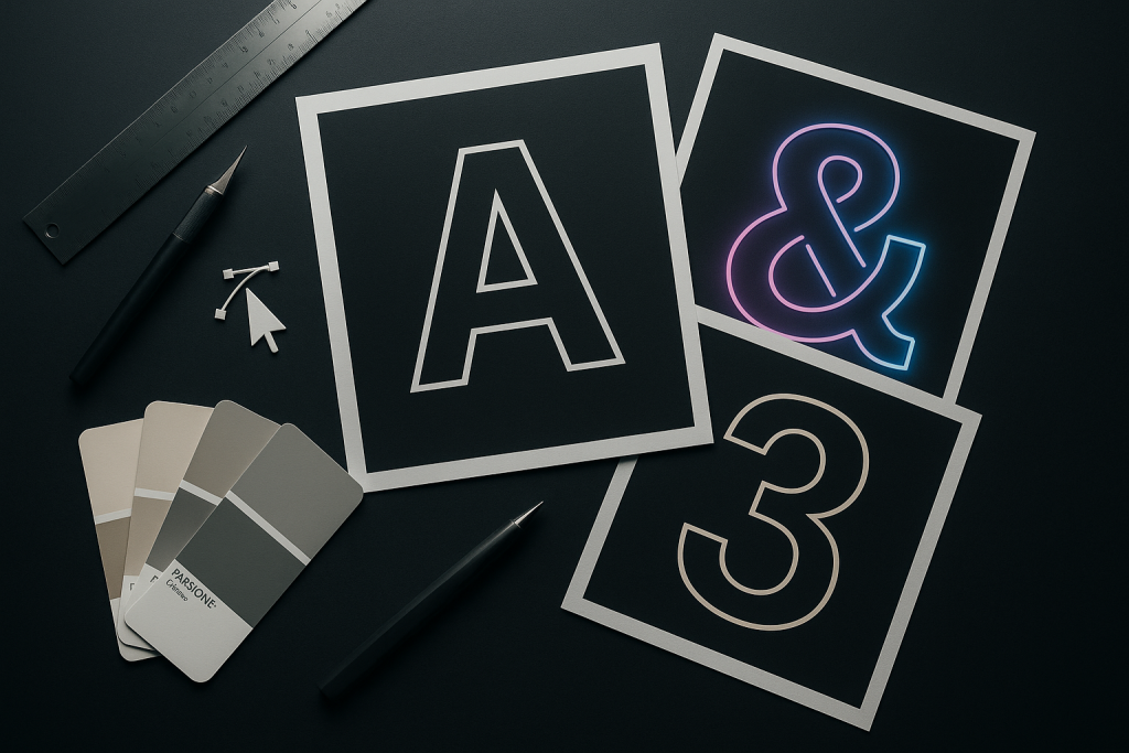
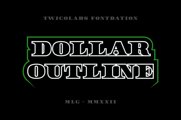
Bold Outline
Thick strokes for punchy, stacked headlines and price tags.
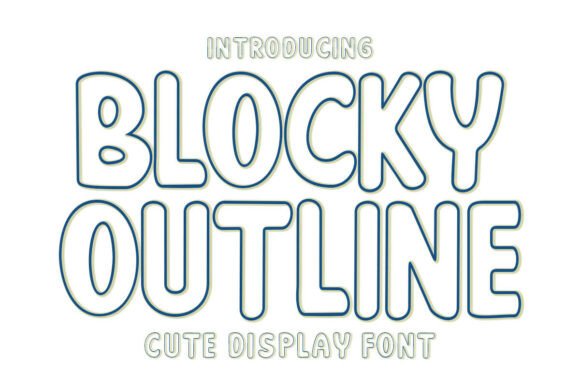
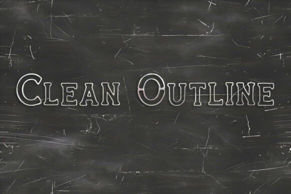
Thin Outline
Light contours for elegant posters; pair with a solid helper font.
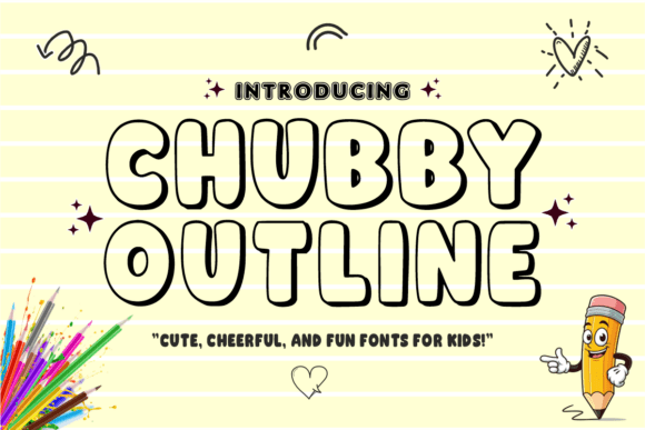
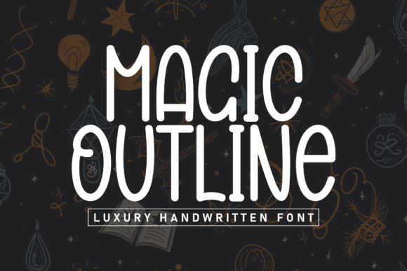
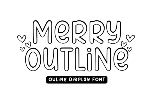
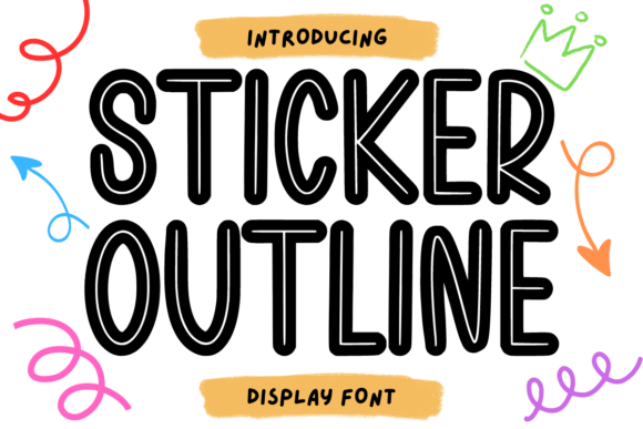
Inline
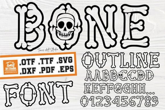
Double contour or inner line for vintage and sign-painted vibes.
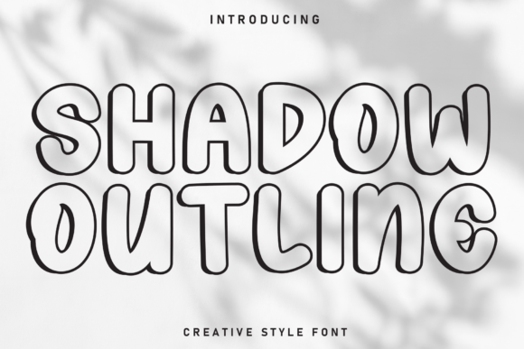
Shadow/Drop
Built-in drop shadow for fast depth and layered effects.
3D/Extrude
Extruded sides for faux 3D headlines and thumbnails.
Neon
Tubular lines that glow – perfect for nightlife and promo tiles.
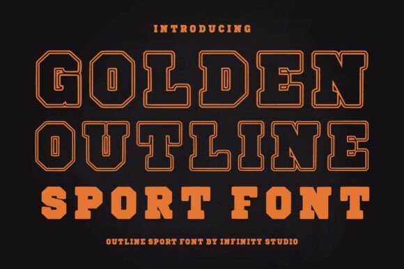
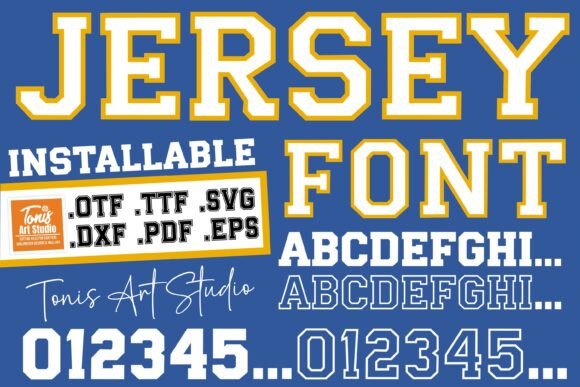
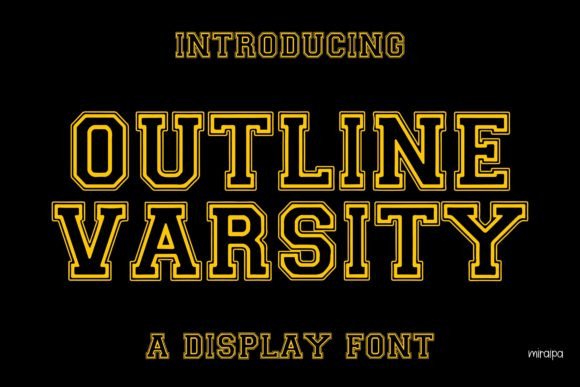
Sport/Jersey
Varsity outlines and doubles for team numbers and scoreboards.
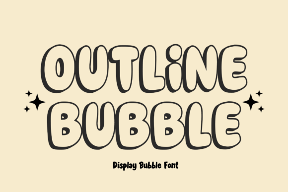
Retro/Bubble
Playful rounded contours for 70s posters and stickers.
Tech/Sci-Fi
Geometric wireframes and modular outlines for UI tiles.
How to choose an outline font
- Stroke thickness: for 1080-px thumbnails keep the outline at ~2–4 px; for posters scale proportionally.
- Counters stay open: letters like A, O, e should not collapse at small sizes.
- Contrast & layering: add a solid underlay (fill) or shadow to improve readability on busy photos.
- Pair with solids: outline headline + solid subhead (grotesk/condensed) = fast, clean hierarchy.
- For cutting/engraving: outline = двойной проход; объединяйте/offset в один контур перед резкой.
Try searches (outline-ready sets)
- Outline (general) → Browse outline
- Inline → Inline styles
- Neon outline → Neon picks
- 3D/Extrude → 3D sets
- Shadow outline → Shadow styles
- Sport/Jersey → Jersey outlines
- Retro/Bubble → Retro bubble
- Graffiti outline → Graffiti sets
Font pairing recipes
- Bold Outline + Condensed Grotesk – punchy headline + compact price/CTA.
- Thin Outline + Serif – elegant editorial tone; keep kerning tight.
- Neon Outline + Mono – nightlife posters; add subtle glow layer.
Text tools for faster outline workflow
- Custom outline lettering – hand-tuned spacing and layered files (fill+stroke+shadow).
- Vector offset/expand stroke – convert strokes to outlines for print/cut.
- Font modification (inline) – build inner-line or layered variants.
Readability: quick checks
- At 1080×1080: headline 120–200 px; outline 2–4 px; add solid underlay if background is busy.
- Simplify backgrounds; increase tracking on condensed outlines.
- Export at 2× for platforms that recompress (TikTok, IG Reels covers).
FAQ
Are outline fonts readable on mobile?
Yes, if stroke width is sufficient (2–4 px at 1080) and background contrast is high. Add a solid underlay if needed.
How do I get a filled version?
Many families include layers (fill/outline/shadow). Otherwise duplicate text behind, expand stroke, and offset for a clean fill.
Can I turn any font into an outline?
Yes: apply stroke/expand in your editor or order a vector offset service to get production-ready outlines.
Licensing?
Most standard commercial licenses cover static graphics. Check the EULA for usage and seat limits.
Serif Fonts
Classic, readable text & elegant headlines for print and web.
Sans Serif Fonts
Clean UI, decks & posters; pairs well with any display face.
Slab Serif Fonts
Blocky slabs for bold titles, badges and signage.
Handwritten Fonts
Casual notes for planners, labels and crafts.
Calligraphy Fonts
Flourished forms for invitations, cards and branding.
Signature Fonts
Stylish personal marks; sleek logos & watermarks.
Brush Fonts
Textured strokes for social posters and thumbnails.
Display Fonts
High-impact titles that read in a split second.
Retro / 70s / Groovy
Rounded, playful curves; poster-ready vibes.
Vintage Fonts
Aged textures & heritage serifs for badges & labels.
Typewriter Fonts
Mechanical charm for journals, menus & overlays.
Gothic & Blackletter
Dramatic heritage styles for certificates and logos.
Stencil (cut-friendly)
Bridges keep counters open – faster weeding for decals.
Bubble Fonts
Rounded, bubbly shapes for kids crafts & stickers.
Y2K Fonts
Glossy techno nostalgia for covers and thumbnails.
Cute Fonts
Soft, friendly forms for planners, tags & kawaii sets.
Graffiti Fonts
Street-style display for bold posters and tees.
Pixel Fonts
8-bit charm for retro games, badges and avatars.
Scary Fonts
Horror textures and jagged display for spooky sets.