Product Launch / Coming Soon Landing Pages: Templates Built for Waitlists & Pre-Orders
Product launch and coming soon landing pages help you build momentum before release with a proven flow: hero → promise → waitlist / pre-order CTA → proof → FAQ → reminders. Use this page to choose the right coming soon landing page template type (waitlist, pre-order, early access, app launch, newsletter), follow a quick conversion checklist, and customize fast – copy, countdown, sections, and CTAs – without rebuilding from scratch.
Why product launch / coming soon pages work
Launch pages convert because they focus on one goal: get the signup. Most launches underperform when the promise is vague, the CTA is buried, there’s no urgency, or there’s no proof. A strong template gives you the right structure – so you can communicate one clear reason to join your waitlist or pre-order.
- Clear promise: what’s coming + why it’s worth joining early.
- Momentum: waitlist + reminders build demand before launch day.
- Urgency: countdowns, limited bonuses, early access windows.
- Better tracking: one page, one CTA, cleaner analytics.
Product launch / coming soon template types
Pick a template based on your launch stage. Keep one primary CTA across the page (Join waitlist / Get early access / Pre-order).
Waitlist pages (early interest)
- Best for: new products, apps, courses, creator launches.
- Key blocks: promise, bullets, short form, “what happens next”.
- CTA: “Join the waitlist”, “Get early access”.
Pre-order pages (revenue-first)
- Best for: physical products, digital products, limited drops.
- Key blocks: offer, pre-order bonus, shipping/terms, proof.
- CTA: “Pre-order now”, “Reserve yours”.
App / SaaS launch pages
- Best for: apps, SaaS, tools with a clear use case.
- Key blocks: how it works, screenshots, trust, early access CTA.
- CTA: “Get access”, “Request invite”.
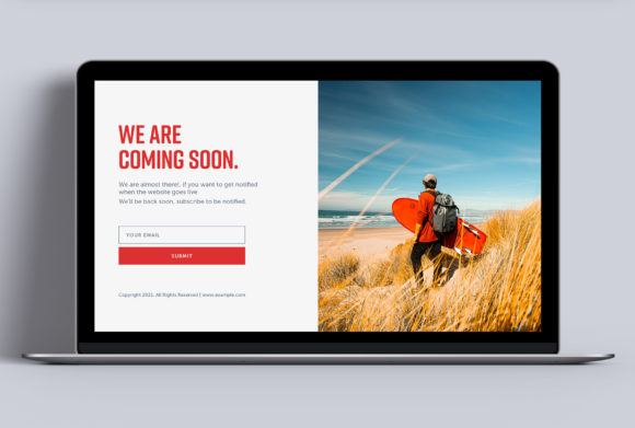
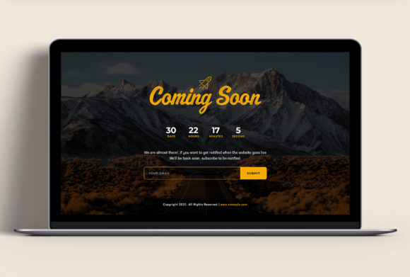
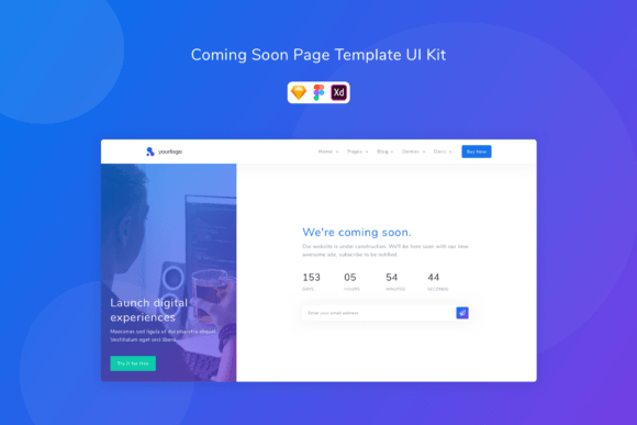
Coming soon pages (brand-first)
- Best for: new brand/site reveal, portfolio refresh, store relaunch.
- Key blocks: simple hero, countdown, email capture, socials.
- CTA: “Notify me”, “Get updates”.
Must-have sections (the launch-ready structure)
High-converting launch pages feel calm and obvious. Visitors should understand what’s coming and why they should join within the first 10 seconds – especially on mobile.
- Hero: what it is + outcome + one CTA.
- Value bullets: 3–6 benefits (results, not features).
- Proof: logos, testimonials, numbers, “as seen in” (if available).
- Urgency: countdown / limited bonus / early access window.
- FAQ: pricing, timing, delivery, “what happens next”.
- Final CTA: repeat the same action (no competing buttons).
Copy blocks you can reuse
Templates convert faster when the copy is specific. Use these “plug-and-play” blocks for most launch pages.
Hero headline formulas
- Introducing [Product]: [Outcome] for [Audience].
- Get [Outcome] in [Timeframe] (early access / waitlist).
- The [Audience] Toolkit for [Outcome] (coming soon).
- Be first: early access + launch bonus.
CTA button text that works
- Waitlist: “Join the waitlist”, “Get early access”.
- Pre-order: “Pre-order now”, “Reserve yours”.
- Notify: “Notify me”, “Get updates”.

Conversion frameworks (copy-paste outline)
Pick one framework and reuse it across launch assets (ads, emails, socials) so everything feels consistent.
- Promise → Benefits → Proof → Waitlist CTA (best for early interest)
- Offer → Bonus → Proof → Pre-order CTA → FAQ (best for revenue-first)
- Problem → Solution → How it works → CTA (best for SaaS/app)
- Reveal → Countdown → Updates → CTA (best for simple coming soon)
Launch checklist (quick wins)
- One primary CTA: don’t compete with multiple actions.
- Short form: email-only works great for waitlists.
- Urgency that’s real: countdown, limited bonus, early-bird window.
- Explain “what happens next”: timeline + when they’ll hear from you.
- Mobile-first: CTA visible early, big tap targets, calm spacing.
Recommended picks
Start with one launch system and keep it consistent: one promise, one CTA, one simple form. Then improve conversion by testing headline specificity and proof placement (faster than redesign).
Waitlist Landing Pages
Early-access pages with short forms and a clear “what’s coming” promise.
View options →App / SaaS Early Access Pages
Product-led pages with screenshots, use cases, and invite CTAs.
View options →
FAQ
Should I use a countdown timer?
Yes – if it’s real. Countdowns work best when they match a real launch date, early-bird bonus, or limited access window.
How many fields should a waitlist form have?
Use the minimum. Most waitlists convert best with email only (name optional). If you need qualification, add one dropdown – not five questions.
What increases conversions the fastest?
- Specific promise: what they get and when.
- Proof near CTA: testimonials/logos/numbers close to the form.
- Short form: reduce friction.
- Clear next step: what happens after signup.
Related landing page hubs
Landing Page Templates (Main Hub)
Browse all landing page categories and styles in one place.
Explore →SaaS Demo / Free Trial Landing Pages
Feature-first pages built for demos, trials, and signups.
Explore →Next step
Pick one CTA (waitlist, pre-order, or notify), write one specific promise, and keep the form short. Start by testing your hero headline and proof placement – those two changes usually move conversions the fastest.