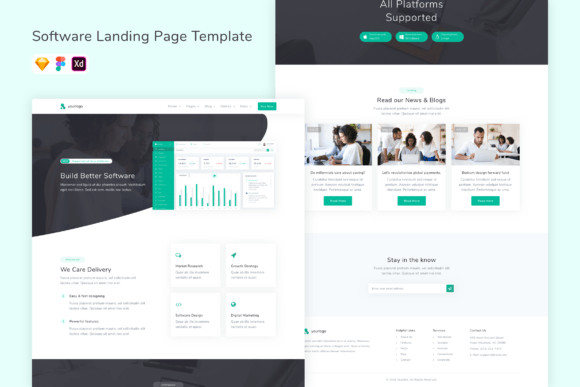
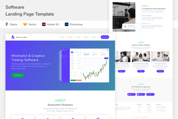
SaaS Demo / Free Trial Landing Pages: Templates Built to Convert Signups
SaaS demo and free trial landing pages turn clicks into signups with a proven flow: hero → value props → product proof → pricing cues → FAQ → CTA. Use this page to pick the right demo / trial landing page template type (request demo, free trial, product tour, app signup), follow a simple conversion checklist, and customize fast – copy, sections, trust blocks, and CTAs – without rebuilding from scratch.
Why SaaS demo / free trial landing pages work
SaaS pages convert when they reduce doubt fast: what it does, who it’s for, how it works, and why it’s worth trying. Most pages fail because the promise is generic, the CTA competes with other actions, pricing is unclear, or proof is missing. Templates solve structure so you can focus on one outcome and one CTA: request a demo or start a free trial.
- Clear value: outcome-first headline + 3–5 benefits.
- Trust faster: logos, testimonials, results near the CTA.
- Better qualification: demo forms that ask only what matters.
- Higher conversion: fewer distractions, one primary action.
SaaS landing page template types
Choose a template based on your funnel step. Keep one primary CTA across the page (Request demo / Start free trial / Get started).
Request-a-demo pages
- Best for: B2B SaaS, higher price points, longer sales cycles.
- Key blocks: outcome headline, proof, use cases, short form.
- CTA: “Request a demo”, “Book a call”.
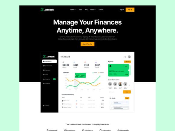
Free trial / signup pages
- Best for: self-serve products and fast onboarding.
- Key blocks: benefits, product screenshots, pricing cue, signup.
- CTA: “Start free trial”, “Create account”.
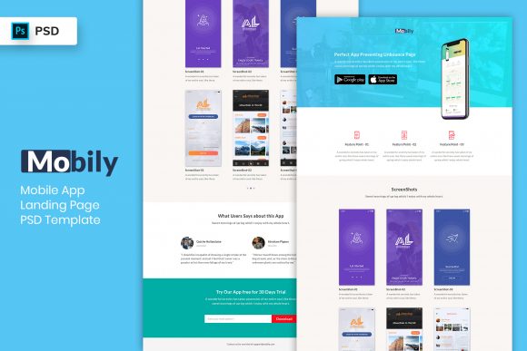
Product tour / features pages
- Best for: explaining how it works and reducing “not for me”.
- Key blocks: features grid, workflow steps, integrations, proof.
- CTA: “See it in action”, “Start trial”.
Pricing-first pages
- Best for: clear tiers and quick decision-making.
- Key blocks: pricing table, plan comparison, FAQ, CTA.
- CTA: “Choose plan”, “Start trial”.
Must-have sections (the signup-ready structure)
High-converting SaaS pages are calm and scannable. Visitors should understand the product and trust it within the first 10 seconds – especially on mobile.
- Hero: outcome + who it’s for + one CTA.
- Value props: 3–6 benefits (results, not features).
- Product proof: screenshots, short video, “how it works”.
- Trust: logos, testimonials, metrics, security/compliance (if relevant).
- Pricing cue: “Starting at…”, plan summary, or free-trial terms.
- FAQ: trial length, cancel anytime, what’s included, onboarding.
Copy blocks you can reuse
Use these “plug-and-play” blocks to make your SaaS landing page feel specific and credible.
Hero headline formulas
- Get [Outcome] without [Pain] (example: “Get more demos without manual follow-ups”).
- [Product] for [Audience] (example: “Analytics for product teams”).
- Automate [Workflow] in minutes (example: “Automate reporting in minutes”).
- Try it free: [Outcome] in [Timeframe] (example: “Try it free – launch in 7 days”).
CTA button text
- Demo: “Request a demo”, “Book a call”.
- Trial: “Start free trial”, “Get started”.
- Tour: “See it in action”, “Watch the demo”.
Conversion frameworks (copy-paste outline)
Pick one framework and reuse it across SaaS pages to keep your funnel consistent.
- Outcome → Benefits → Proof → How it works → CTA (best for trials)
- Problem → Solution → Proof → Demo form → CTA (best for request demo)
- Features → Use cases → Pricing cue → FAQ → CTA (best for product tours)
- Plans → Comparison → Proof → FAQ → CTA (best for pricing-first)
SaaS checklist (quick wins)
- One primary CTA: don’t compete with multiple actions.
- Show the product: 1–3 screenshots beat generic claims.
- Proof near CTA: logos/testimonials close to the form/button.
- Clarify trial terms: cancel anytime, trial length, what’s included.
- Mobile-first: CTA visible early, sections short, spacing calm.
Recommended picks
Start with one system: clear hero + product proof + one CTA. Then improve conversion by testing headline specificity and proof placement (faster than redesign).
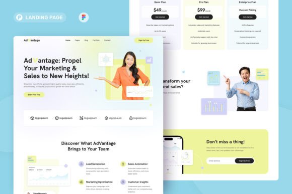
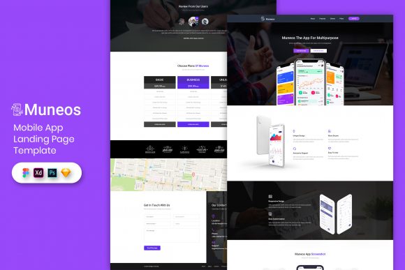
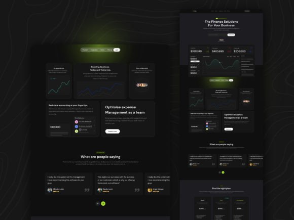
Free Trial / Signup Pages
Self-serve signup pages with clear benefits, screenshots, and one CTA.
View options →Product Tour / Features Pages
Feature grids and workflows built to reduce “not for me” objections.
View options →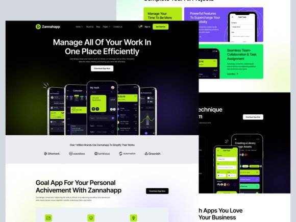
FAQ
Demo vs free trial: which converts better?
Free trials often convert best for simple, self-serve products. Demos convert better for higher pricing, complex setups, or B2B buying teams. Pick one primary CTA and match the page to that funnel.
How many form fields should a demo page have?
Use the minimum to qualify: typically 3–6 fields. Keep step-one easy; collect extra details after the booking if needed.
What builds trust fastest on SaaS pages?
- Specific outcomes: what improves and by how much.
- Proof near CTA: logos, testimonials, metrics.
- Product clarity: screenshots + short “how it works”.
- Transparent terms: cancel anytime, trial length, pricing cues.
Related landing page hubs
Landing Page Templates (Main Hub)
Browse all landing page categories and styles in one place.
Explore →Next step
Pick one CTA (demo or trial), write one specific promise, and show the product early (screenshots + short workflow). Start by testing the hero headline and proof placement – those two changes usually move conversion the fastest.