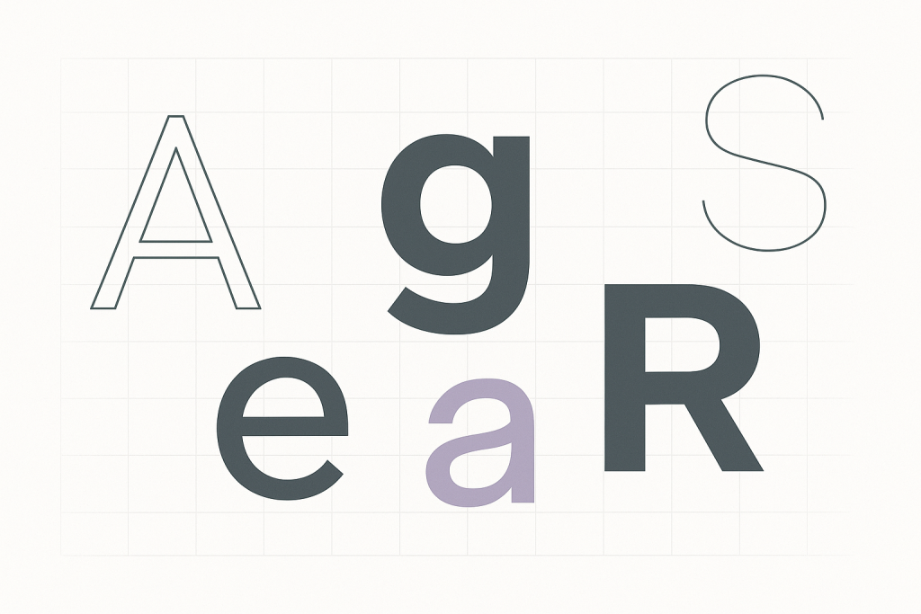
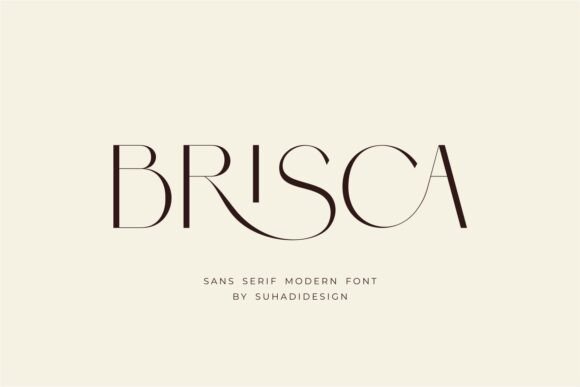
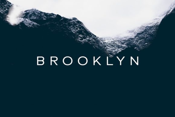
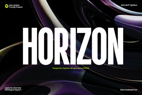
Sans serif fonts deliver clean UI, crisp decks and readable posters – and they pair beautifully with almost any display or script. Below you’ll find our curated picks by use (UI text, condensed headlines, rounded, mono, etc.), practical pairing tips, cut/engraving notes, and ready-to-run searches.
Best Sans Serif Fonts by Use
UI & Web Text
Neutral contrast, generous x-height and open forms for dashboards, apps and long reads.
Decks & Posters
Bold, high-impact sans families that stay readable in a split second on slides and banners.
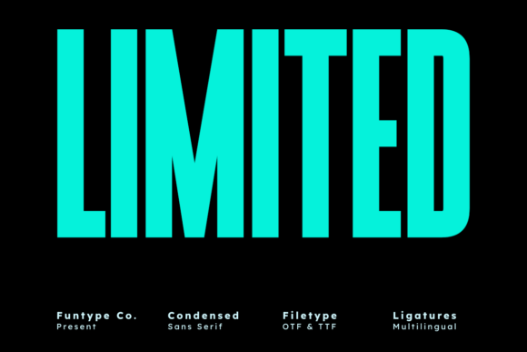
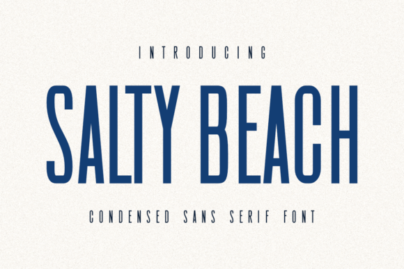
Condensed
Tight widths for price tags, thumbnails and mobile headers where space is limited.
Wide/Extended
Spacious titles for hero slides, movie-style covers and punchy brand headlines.
Rounded
Soft corners for friendly UI, kids worksheets, packaging and classroom visuals.
Humanist
Warm, calligraphic skeleton – great for body text with personality.
Grotesk / Neo-grotesk
Clear and versatile – a modern workhorse for brand systems and signage.
Geometric
Circles and straight lines for contemporary logos, tech decks and clean posters.
Monospace
Code-style proportions for diagrams, specs, tables and technical docs.
Variable Sans
One file – many axes (weight/width). Perfect for responsive decks and web projects.
Stencil-friendly
Bridges keep counters open for faster weeding and more durable decals.
Single-line / Engraving
Mono-line, plotter-friendly faces for engraving and pen plotter work.
Text tools
Font & Text Generators – Webfont Converter & Manager (style text, preview pairings, convert to webfonts in one place).
Try searches
- Geometric sans → sleek circles and straight stems for tech decks and logos.
- Grotesk/neo-grotesk → neutral workhorses for brand systems and UI.
- Humanist → warm, readable bodies for long articles and learning materials.
- Condensed → tight headers for price tags, labels and thumbnails.
- Rounded → friendly corners for kids’ printables and classroom boards.
- Extended/wide → cinematic titles and hero slides.
- Variable sans → one file, multiple weights/widths for responsive decks.
- Monospace → code-style for diagrams, specs and data tables.
- Stencil sans → bridges for paint templates and durable signage.
- Single-line → engraving and plotter-pen friendly sets.
Font pairing recipes
- Sans + Serif: modern headlines with classic body text. Keep body size 12–16px on web, tracking 0–5.
- Sans + Script: script for accents (names, CTA) and a neutral sans for readability.
- Two sans (contrast): condensed for headings + humanist for paragraphs; vary weight and size.
- Sans + Display: punchy display for posters; pair with a clean sans at 80–90% contrast.
Project ideas
- Pitch decks, infographics and course slides (condensed or grotesk for fast scanning).
- Brand systems and UI kits (neo-grotesk or humanist families with multiple weights).
- Labels, price tags and thumbnails (condensed/wide families; try all-caps for impact).
- Posters and event covers (geometric or variable sans with dramatic scale).
- Kids worksheets and classroom prints (rounded sans for friendly shapes).
Cut & engraving tips
For vinyl and laser work, prefer sturdy sans with open counters and avoid many tiny inner holes. If strokes are thin, add a slight outline/offset. Always run a small test cut to check weeding and tiny joins.
FAQ
What makes a sans serif readable on screens?
Open apertures, generous x-height, balanced stroke contrast and clear spacing at typical body sizes (12–16px).
Condensed vs wide – when to use which?
Use condensed when space is tight (tags, sidebars); use wide/extended for bold, cinematic titles and hero slides.
Can sans serif fonts work with scripts or display faces?
Yes – keep the sans neutral and let the script/display carry personality. Control contrast via size/weight.
Serif Fonts
Classic, readable text & elegant headlines for print and web.
Slab Serif Fonts
Blocky slabs for bold titles, badges and signage.
Handwritten Fonts
Casual notes for planners, labels and crafts.
Calligraphy Fonts
Flourished forms for invitations, cards and branding.
Signature Fonts
Stylish personal marks; sleek logos & watermarks.
Brush Fonts
Textured strokes for social posters and thumbnails.
Display Fonts
High-impact titles that read in a split second.
Retro / 70s / Groovy
Rounded, playful curves; poster-ready vibes.
Vintage Fonts
Aged textures & heritage serifs for badges & labels.
Outline Fonts
Hollow forms for stacked headlines and layered effects.
Typewriter Fonts
Mechanical charm for journals, menus & overlays.
Gothic & Blackletter
Dramatic heritage styles for certificates and logos.
Stencil (cut-friendly)
Bridges keep counters open – faster weeding for decals.
Bubble Fonts
Rounded, bubbly shapes for kids crafts & stickers.
Y2K Fonts
Glossy techno nostalgia for covers and thumbnails.
Cute Fonts
Soft, friendly forms for planners, tags & kawaii sets.
Graffiti Fonts
Street-style display for bold posters and tees.
Pixel Fonts
8-bit charm for retro games, badges and avatars.
Scary Fonts
Horror textures and jagged display for spooky sets.