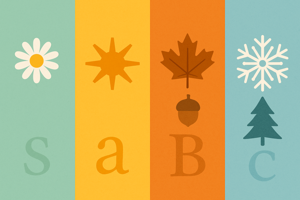
Seasonal Fonts is your hub for Spring, Summer, Autumn (Fall) and Winter typography. Discover fresh Spring scripts, beachy Summer displays, cozy Autumn lettering and elegant Winter serifs – plus pairing ideas, color tips and ready-to-use searches for print and cutting projects.
Text Tools for Faster Workflow
Preview fonts, style text and convert to webfonts in one place.
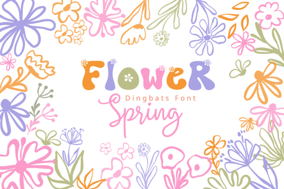
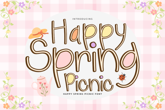
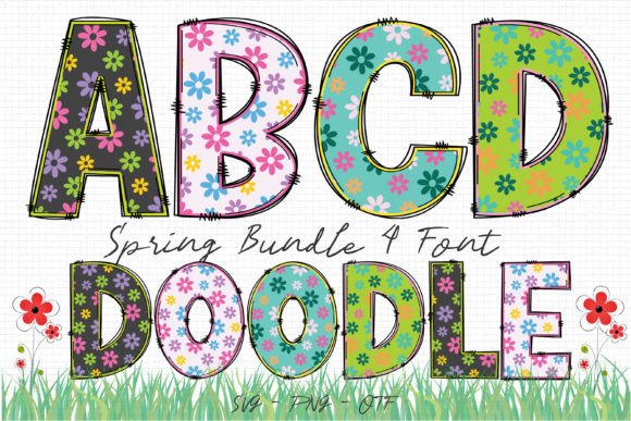
Spring Fonts
Fresh, floral and playful – perfect for garden weddings, baby showers, Easter printables and light social posts.
Palette: #A7F3D0 #FDE68A #FBCFE8
Ideas: invitations, tags, pastel banners.
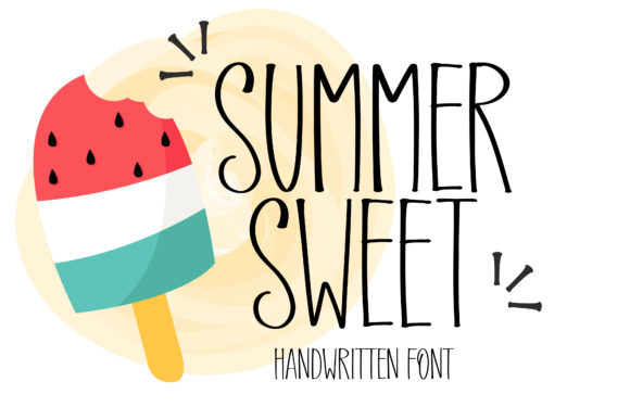
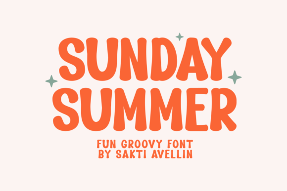
Summer Fonts
Beachy, bold and retro – great for pool parties, travel posters, tiki nights and sunny merch.
Palette: #FFB703 #219EBC #FB8500
Ideas: postcards, beach banners, tees.

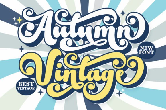
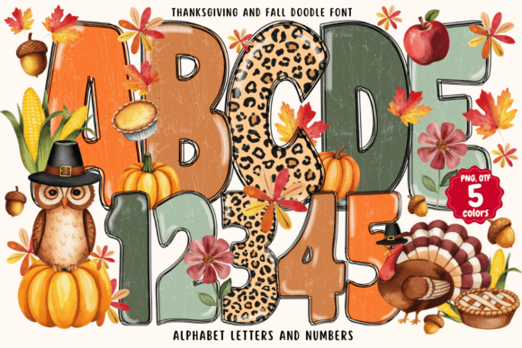
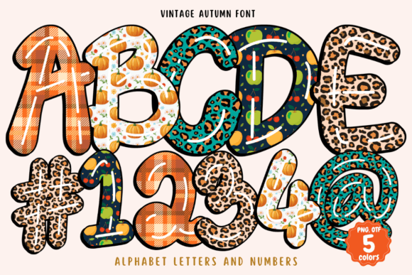
Autumn (Fall) Fonts
Cozy and rustic – think harvest scripts, wood-type serifs and plaid-friendly displays for menus and décor.
Palette: #D97706 #92400E #6B7280
Ideas: Thanksgiving menus, tags, signs.
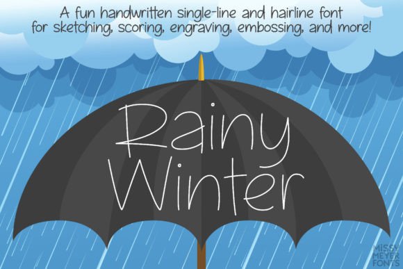
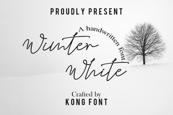
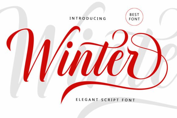
Winter Fonts
Frosty and elegant – serif titles, icy inlines and clean scripts for holiday invites and cool-toned printables.
Palette: #0EA5E9 #1E293B #E2E8F0
Ideas: programs, place cards, signage.
How to Use Seasonal Fonts
Seasonal Fonts help your designs feel timely and relevant without changing your whole visual identity. Keep one core body typeface for readability and swap seasonal display styles for headlines and accents. Use Spring for fresh launches and baby showers, Summer for beach events and travel posters, Autumn (Fall) for cozy menus and harvest markets, and Winter for elegant holiday materials. Limit yourself to two fonts per layout – a seasonal display for emphasis and a clean serif or sans for details – so the message stays clear.
- Hierarchy first: make the seasonal font the headline; keep details in a neutral serif/sans.
- Consistency: reuse sizes, spacing and color tokens so seasonal type still looks on-brand.
- Cutting machines: prefer solid fills and layered styles; avoid hairline inlines under ~1.5–2 mm.
Seasonal Typefaces: Color & Pairing Tips
Match seasonal typefaces with simple, high-contrast palettes. Spring leans pastel (mint, butter, blush) with soft scripts and rounded sans. Summer favors saturated warm/cool pairs and bold retro displays. Autumn pairs rustic serifs with warm browns and pumpkin orange. Winter looks refined with cool blues, navy and crisp serifs. For web and print, test small sizes: 10.5–12 pt for body, generous line-height, and tighter tracking for chunky displays. This hub links to Spring, Summer, Autumn and Winter guides so you can explore Seasonal Fonts in depth with examples, pairing recipes and project ideas.
Explore More Resources
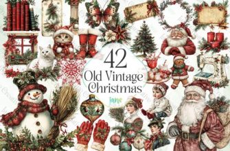
- Christmas Fonts – Festive, Elegant & Crafty Picks
- Halloween Fonts – Spooky, Cute & Retro Picks (Plus Bundles & Custom Lettering)
- Wedding Fonts – Elegant Scripts, Signature Looks & Modern Minimal
- Birthday Fonts – Fun, Script & Playful Picks
- Valentine’s Fonts – Romantic, Script & Stylish Picks
- Mother’s Day Fonts – Lovely, Script & Elegant Picks
- Easter Fonts – Playful, Elegant & Pastel Picks for Spring Projects
- Thanksgiving Fonts: Rustic, Warm & Festive Picks for Fall Projects
- New Year Fonts: Sparkling, Bold & Chinese New Year Picks
- St. Patrick’s Day Fonts: Celtic, Playful & Pub-Style Picks for March Designs