Serif fonts deliver classic, readable body text and elegant headlines for print and web. Explore oldstyle, transitional, Didone and slab serifs that stay legible at small sizes and shine in bold display.
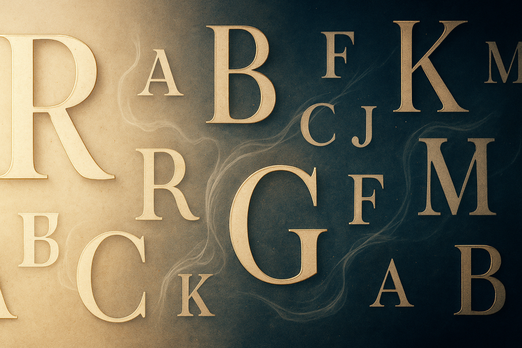
Editor’s top picks
Body text serifs
Book-ready oldstyle and transitional faces with sturdy x-height and soft contrast.
Elegant display (Didone)
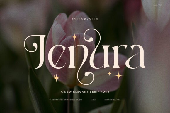
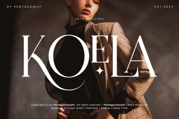
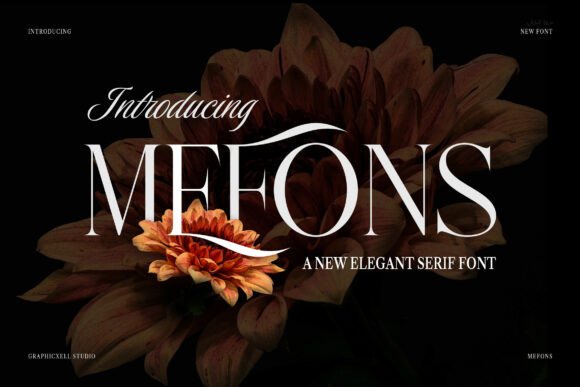
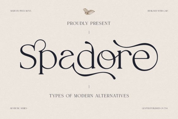
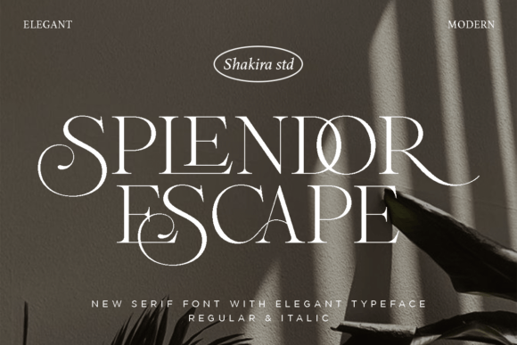
High-contrast Didones for luxurious headlines, packaging, fashion and editorials.
Slab serif
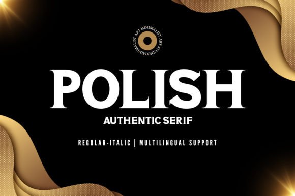
Chunky slabs for badges, posters and signage – impactful yet readable.
Oldstyle classics
Warm, bookish rhythm – great for long reads and heritage branding.
Transitional
Sharper serifs and clearer contrast – modern but friendly for UI and print.
Condensed serif
Tight columns and punchy titles where space is limited.
Modern serif
Crisp, contemporary families for branding systems and clean web UI.
Vintage & retro
Textured, timeworn charm for labels, menus and nostalgia projects.
Variable serif
One file, many weights – fine-tune optical size, weight and width on the fly.
Branding serifs
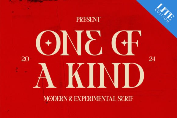
Distinctive caps and alternates for wordmarks, monograms and packaging.
High-contrast
Dramatic thicks/thins – pair with simple sans for editorial punch.
Stencil / cut-friendly
Bridged counters and fewer inner holes – better for cutting, laser marking.
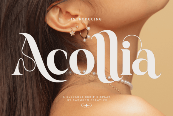
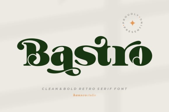
How to choose a serif (fast)
- Body text: look for modest contrast, generous x-height and open counters. Oldstyle/Transitional are safest.
- Headlines: high contrast (Didone) or Slab for impact; increase tracking slightly at large sizes.
- Web: pick a family with many weights, good hinting and italics; test 14–18px for paragraphs.
- Branding: choose distinctive terminals/alternates; keep a plain companion for small text.
- Small sizes: avoid hairlines; prefer sturdy serifs and lower contrast.
Font pairing recipes
- Didone display + geometric sans: luxe headlines with clean UI copy.
- Oldstyle text + grotesk sans: warm reading + straightforward navigation.
- Slab headlines + humanist sans: friendly product pages and signage.
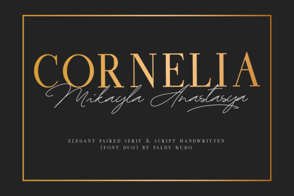
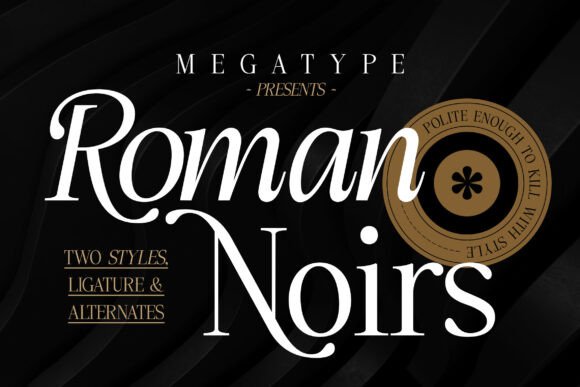
- Modern serif + script accent: elegant invites and packaging labels.
- Condensed serif + wide sans: compact titles balanced by airy subheads.
Project ideas
- Wedding suites, menus, place cards, monograms.
- Editorial layouts, long-form blog posts, magazines.
- Brand wordmarks, product labels, premium packaging.
- Course PDFs, workbooks, printable planners.
- Signage and posters with Slab or high-contrast display.
Cut & engraving tips
For cutting/engraving, favor sturdy serifs and avoid many tiny counters. If strokes are thin, add a slight outline/offset. Always run a small test cut to check weeding and tiny joins before committing.
Text tools
Font & Text Generators – Webfont Converter & Manager in one place. Need a quick tweak (outline to stencil, simplify nodes, resize SVG)? Get custom help.
Try searches
- Oldstyle serif → warm book faces for long reads and heritage brands.
- Didone serif → elegant, high-contrast display for fashion/editorial.
- Slab serif → bold signage, badges and thumbnails that pop.
- Condensed serif → tight spaces – catalog pages, labels, sidebars.
- Modern serif → crisp corporate decks and landing pages.
- Vintage serif → menu boards, craft packaging, retro posters.
- Stencil serif → cut-friendly lettering with bridged counters.
FAQ
What size works best for paragraphs?
On the web, start at 16–18px with 1.5 line-height; adjust per x-height and contrast. In print, 9–11pt is typical for books.
Are high-contrast serifs readable?
Yes for headlines; for body copy prefer moderate contrast to avoid fading hairlines on low-dpi screens.
How much tracking for display?
Large titles often benefit from +2 to +20 tracking (tight type can look crowded at size). Always proof at 100% scale.
What should I pair a serif with?
Use contrast: serif for headlines + simple sans for UI, or oldstyle text + neutral sans for captions and buttons.
Licensing?
Always check each product page. Many allow commercial use; terms vary by seller and marketplace.
Sans Serif Fonts
Clean UI, decks & posters; pairs well with any display face.
Slab Serif Fonts
Blocky slabs for bold titles, badges and signage.
Handwritten Fonts
Casual notes for planners, labels and crafts.
Calligraphy Fonts
Flourished forms for invitations, cards and branding.
Signature Fonts
Stylish personal marks; sleek logos & watermarks.
Brush Fonts
Textured strokes for social posters and thumbnails.
Display Fonts
High-impact titles that read in a split second.
Retro / 70s / Groovy
Rounded, playful curves; poster-ready vibes.
Vintage Fonts
Aged textures & heritage serifs for badges & labels.
Outline Fonts
Hollow forms for stacked headlines and layered effects.
Typewriter Fonts
Mechanical charm for journals, menus & overlays.
Gothic & Blackletter
Dramatic heritage styles for certificates and logos.
Stencil (cut-friendly)
Bridges keep counters open – faster weeding for decals.
Bubble Fonts
Rounded, bubbly shapes for kids crafts & stickers.
Y2K Fonts
Glossy techno nostalgia for covers and thumbnails.
Cute Fonts
Soft, friendly forms for planners, tags & kawaii sets.
Graffiti Fonts
Street-style display for bold posters and tees.
Pixel Fonts
8-bit charm for retro games, badges and avatars.
Scary Fonts
Horror textures and jagged display for spooky sets.
