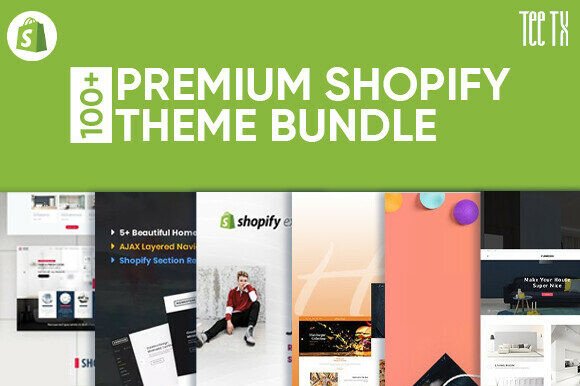
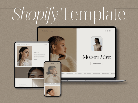
Shopify Templates: Store-Ready Layouts Built to Sell
Shopify website templates help you launch (or refresh) a store faster with proven ecommerce structure: homepage → collections → product pages → trust blocks → promo sections → checkout-ready CTAs. Use this page to pick the right template type, follow a simple conversion checklist, and customize quickly – fonts, colors, spacing, and sections – without designing from scratch.
Why Shopify templates work
Ecommerce stores don’t win by looking “busy” – they win by making it easy to browse, trust, and buy. Many Shopify stores lose sales because the homepage is cluttered, collections are hard to scan, product pages lack proof, or promotions are unclear. Templates solve the “what goes where” problem and give you a clean, conversion-ready structure you can adapt to your niche.
- Faster store launch: publish core pages in days, not weeks.
- Clearer shopping flow: navigation, collections, and CTAs stay consistent.
- More trust: reviews, shipping/returns, and guarantees are placed where buyers expect them.
- Better promotions: sale banners and product highlights don’t feel random.
Shopify template types
Pick one primary template direction based on how you sell: hero-first brand store, catalog-first store, or product-first store. Once the core pages look consistent, add supporting sections (FAQ, shipping, returns, size guides, bundle offers) to increase conversion.
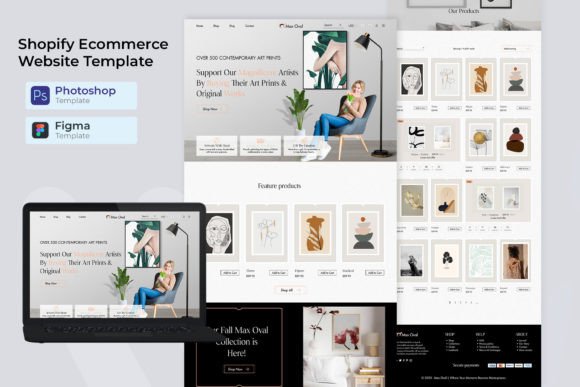
Homepage layout templates
- Best for: new stores, rebrands, seasonal refreshes.
- Use when: you need one clear promise + fast paths to best sellers and collections.
- Key blocks: hero, featured collections, best sellers, social proof, promo strip, footer trust.
Collection page templates
- Best for: stores with many products and categories.
- Use when: buyers need filters, quick scanning, and clear sorting.
- Key blocks: category header, filter/sort cues, product grid, badges (new/bestseller/sale), FAQ snippet.
Product page templates
- Best for: brands focused on conversion and AOV.
- Use when: you want fewer hesitations (shipping, returns, sizing, trust) and more add-to-cart.
- Key blocks: product gallery, value props, variant clarity, reviews, shipping/returns, upsell/cross-sell.
Promo & landing templates (sales, launches)
- Best for: Black Friday, product drops, seasonal campaigns.
- Use when: you want one page to sell one offer (bundle, bestseller, limited collection).
- Key blocks: offer, benefits, proof, FAQ, urgency, CTA, guarantee.
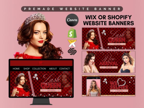
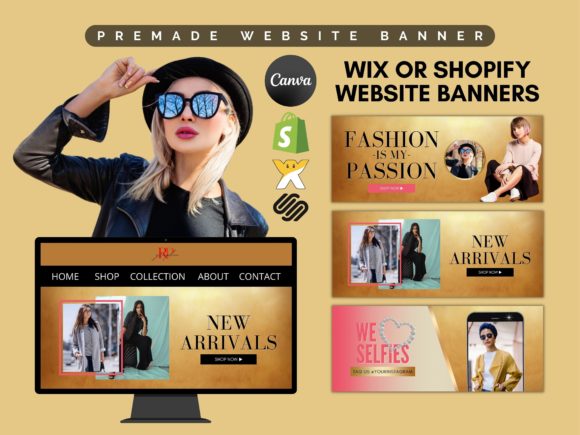
Banner + announcement strip templates
- Best for: quick wins without redesign.
- Use when: you need to highlight shipping, discounts, gifts, or deadlines.
- Key blocks: top bar, hero banner, collection banners, product badges.

Must-have sections (the sales-ready structure)
If you want higher conversion, build around clarity and confidence. Buyers should understand what makes your product worth it, how fast it arrives, and what happens if they don’t love it – before they hit “Add to cart”.
- Hero (homepage): category + value promise + one primary CTA (Shop best sellers / Shop collections).
- Featured collections: 3–6 clear paths (not 15 links).
- Product proof: reviews, UGC, ratings, press logos, before/after (if relevant).
- Shipping & returns: visible, short, reassuring.
- Guarantee / trust: secure checkout, warranty, support availability.
- Upsell/cross-sell: bundles, “pairs well with”, frequently bought together.
Copy blocks you can reuse (headline + bullets)
Shopify templates convert faster when your copy is specific. Use these clean, “plug-and-play” blocks for banners, homepage sections, and product pages.
Homepage hero formulas
- [Product Category], made for [Audience] (example: “Skincare made for sensitive skin”).
- Get [Outcome] without [Pain] (example: “Get organized without messy cables”).
- Meet the [Product] that [Big Benefit] (example: “Meet the bag that fits your whole day”).
- Limited drop: [Collection] is live (best for launches).
Value prop bullets (premium, not generic)
- What it solves: one clear pain → one clear result.
- Why it’s different: materials, process, design, performance, comfort, durability.
- What you get: exactly what’s included (and sizes/variants).
- Risk reversal: returns, warranty, guarantee, support.
Promo strip ideas (top bar)
- Shipping: “Free shipping over $X • Ships in 24–48h”.
- Trust: “30-day returns • Secure checkout”.
- Offer: “Buy 2, save 15% • Auto-applied at checkout”.
Conversion frameworks (copy-paste outline)
Pick one framework and repeat it across your product and promo pages. Consistency makes your store feel intentional, trustworthy, and easier to buy from.
- Value → Proof → Details → Risk Reversal → CTA (best for product pages)
- Problem → Solution → Benefits → Reviews → Offer → CTA (best for best-seller landing pages)
- Collection Story → Filters → Badges → “Why us” → CTA (best for category/collection pages)
- Drop/Launch → Scarcity → Proof → FAQ → CTA (best for limited collections)
Readability checklist (Shopify-friendly)
- One primary CTA per section: don’t compete with multiple buttons.
- Collections are scannable: 3–6 featured categories + clear naming.
- Badges are meaningful: “Bestseller”, “New”, “Limited”, “Bundle”, not decoration.
- Proof is visible: star rating, review count, UGC, guarantees.
- Shipping/returns aren’t hidden: remove hesitation before checkout.
- Mobile spacing feels calm: whitespace + short blocks = premium.
Recommended picks
Start with one consistent store system: homepage + collection + product page. Then add promo assets (banners, announcement bars) and trust blocks. Customize your hero message and product value props first – those changes move conversion faster than “more design”.
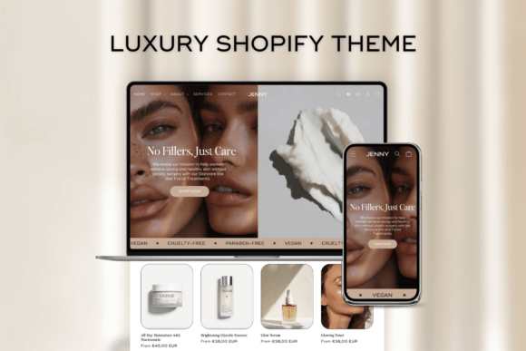
Shopify Homepage Layouts
Clean storefront hero + featured collections + best sellers + trust blocks.
View options →Shopify Product Page Templates
Layouts focused on clarity: benefits, specs, reviews, shipping/returns, CTA.
View options →Collection & Category Banners
Header banners and collection promos to make browsing feel premium.
View options →Sales & Promo Landing Pages
Offer-first pages for launches, drops, and seasonal promotions.
View options →FAQ
Are Shopify templates the same as Shopify themes?
Not exactly. Themes control your store’s overall structure and settings. Templates are ready-made layouts and assets you can adapt – homepage sections, product page layouts, banners, and promo blocks – so your store looks consistent and converts better.
What should I customize first to improve conversion?
Start with clarity and trust. You don’t need a full redesign – tighten the message and remove buying hesitation.
- Homepage hero: who it’s for + main benefit + one CTA.
- Product page value props: 3–5 benefits + proof.
- Shipping/returns: visible and reassuring.
- Reviews/UGC: add before the CTA (or close to it).
- Bundles/upsells: simple “pairs well with” and bundle savings.
Should I use a landing page for sales or send traffic to collections?
If your campaign has one clear offer (bundle, bestseller, limited drop), a landing page often converts better. If you’re promoting a broad category, a clean collection page with strong filters and banners is usually the best path.
What makes a Shopify store feel “premium” instantly?
Premium stores feel calm and intentional: consistent typography, generous spacing, scannable product grids, and visible trust blocks (reviews + shipping/returns + guarantee).
Related template hubs
Website Templates (Main Hub)
Browse all website template categories and styles in one place.
Explore →Best use cases for Shopify templates
- New Shopify stores that need a clean, trustworthy structure fast
- Catalog-heavy stores that need scannable collections and better navigation
- Product-first brands improving product page clarity and add-to-cart rate
- Seasonal promotions (Black Friday, holiday drops, limited collections)
- Quick refreshes using banners, announcement bars, and trust blocks
Next step
Pick one Shopify template system, define a mini brand kit (fonts + 2–3 colors), and keep pages consistent. Start with homepage + collections + product page. Then add trust (reviews, shipping/returns, guarantee) and one clear CTA per section. When browsing feels simple and trust is visible, conversion goes up.