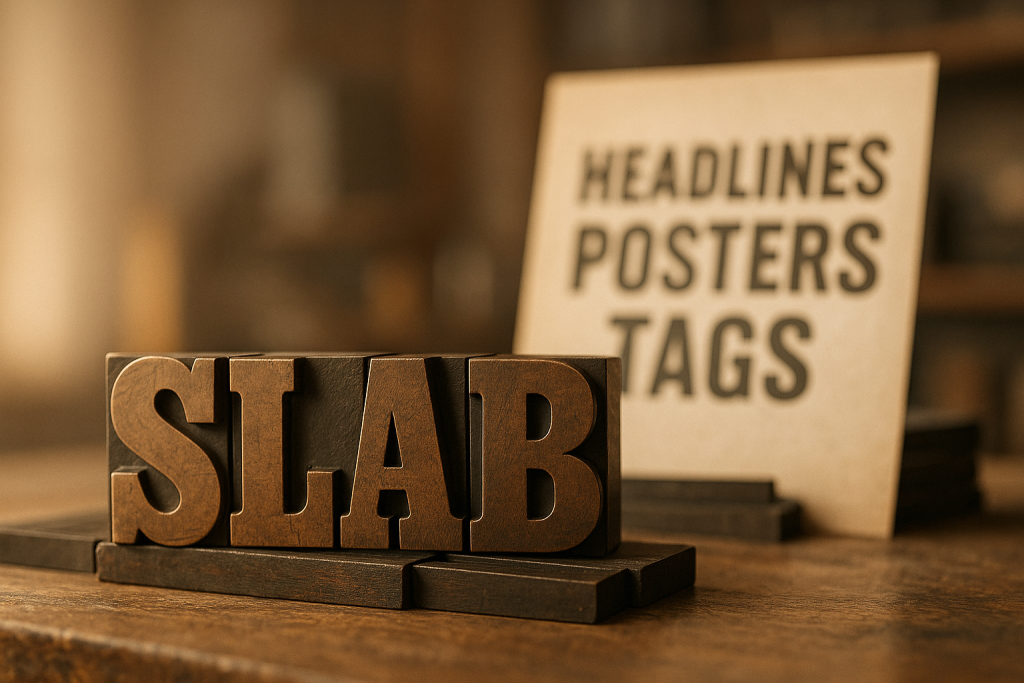
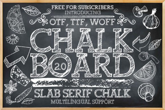
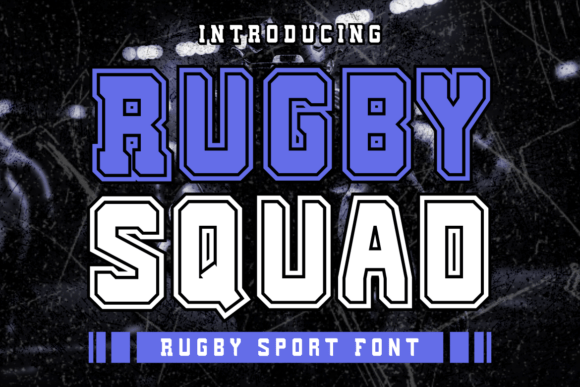
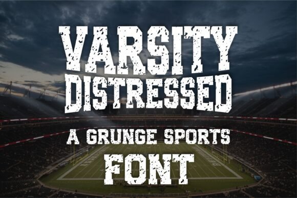
Slab serif fonts are blocky, high-impact serifs perfect for bold titles, badges, signage and sports branding. Expect sturdy stems, square terminals and confident rhythm that reads fast on posters, thumbnails and labels.
Editor’s top picks – Slab Serif Fonts
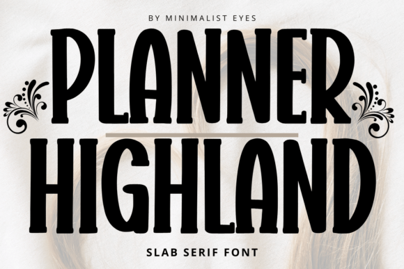
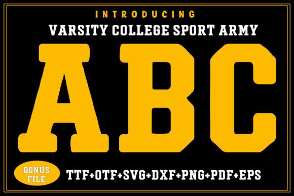
Classic Slab (Egyptian)
Square serifs, sturdy stems – timeless for posters, tags and retail signage.
Rounded Slab
Friendly corners with a solid voice – great for kids, food and lifestyle brands.
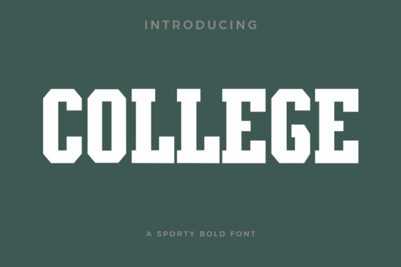
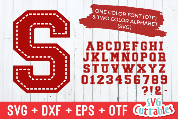
Condensed Slab
Narrow proportions fit price tags and thumbnails without losing impact.
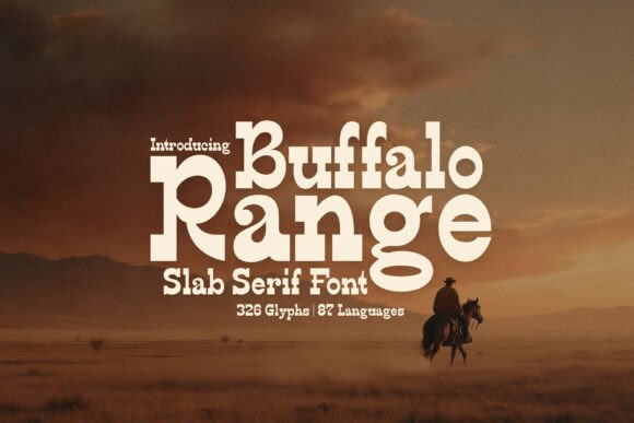
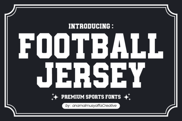
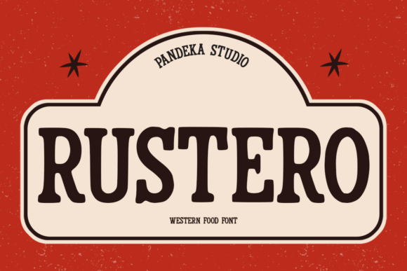
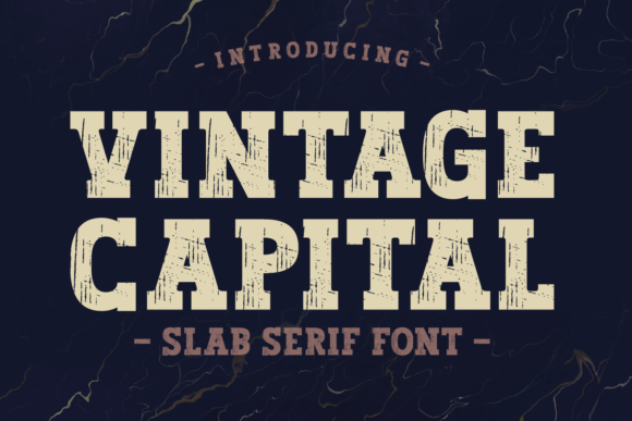
Vintage / Western
Old-school posters, badges and labels – use sparingly, test at small sizes.
Tech / Geometric Slab
Clean geometry with square slabs – modern UI headings and dashboards.
Editorial Slab
Refined contrasts and optical sizes for magazine-style headlines.
Mono-Slab
Mechanical feel with monospaced rhythm – tech posters and coding events.
Text tools for faster slab workflow
- Custom wordmark typesetting – balance slab weights, adjust tracking and optical kerning.
- Vectorize a sketch – convert pencil mockups to clean outlines with consistent serifs.
- Font modification & alternates – build small caps, tighten counters, add stylistic sets.
How to choose a slab serif font
- Serif thickness. For small thumbnails use medium slabs; ultra-heavy serifs can clog at 24–32 px.
- X-height & apertures. Bigger x-height and open counters keep words readable in quick scans.
- Condensed vs regular. Condensed helps fit long headlines, but increase tracking slightly.
- Rounded vs sharp. Rounded = friendly; sharp = industrial/editorial. Pick for tone, not trend.
- Optical sizes. Prefer display cuts for headlines; text cuts for long captions and price details.
- License. Confirm commercial use and, if embedding on web/app, add the proper web/app license.
Try searches (slab-ready sets)
- Classic/Egyptian → Egyptian slabs
- Rounded slabs → Soft corners
- Condensed slabs → Narrow options
- Vintage/Western → Retro posters
- Tech/Geometric → Geometric slabs
- Editorial slabs → Magazine style
- Mono-slab → Mechanical feel
Font pairing recipes
- Slab Serif + Grotesk Sans – slab for headlines, neutral sans for body. Slabs · Grotesks
- Rounded Slab + Script Accent – friendly headlines with a small script for submarks. Rounded slabs · Scripts
- Condensed Slab + Narrow Sans – compact posters/thumbnails with clear price details. Condensed slabs · Narrow sans
- Tech Slab + Mono – modern dashboards and dev events. Tech slabs · Monospace
Projects you can ship today
- Retail price tags and shelf talkers (condensed slabs).
- Event posters and thumbnails with quick-scan keywords.
- Packaging badges with vintage/western slabs.
- Dashboard/UI headings with tech/geometric slabs.
Small-size readability: quick checks
- Preview at 24–32 px: if serifs merge, step down weight or increase tracking.
- Watch counters in A, R, e, a – open shapes read faster on mobile.
- Prefer straight stems over decorative spurs for tiny labels.
Licensing tips
- Commercial use: verify allowed for products and client work.
- Web/App: page views/app seats usually require separate licenses.
- Logo usage: static logos are typically permitted; always check EULA.
Curated quick picks
- Classic/Egyptian: Browse
- Rounded slab: Browse
- Condensed slab: Browse
- Western/Vintage: Browse
- Tech/Geometric: Browse
FAQ
What is a slab serif?
A serif typeface with thick, block-like serifs. It delivers impact and stability in headings, badges and signage.
Egyptian vs Clarendon – what’s the difference?
Egyptians are square and rigid; Clarendons use bracketed, warmer transitions and feel friendlier on packaging.
Are slabs readable in body text?
Some modern slabs with moderate contrast can work for short paragraphs, but they shine in display roles.
Which slabs are best for Cricut/laser?
Stencil slabs and bold Egyptians with larger counters; avoid thin hairlines and micro details.
Serif Fonts
Classic, readable text & elegant headlines for print and web.
Sans Serif Fonts
Clean UI, decks & posters; pairs well with any display face.
Handwritten Fonts
Casual notes for planners, labels and crafts.
Calligraphy Fonts
Flourished forms for invitations, cards and branding.
Signature Fonts
Stylish personal marks; sleek logos & watermarks.
Brush Fonts
Textured strokes for social posters and thumbnails.
Display Fonts
High-impact titles that read in a split second.
Retro / 70s / Groovy
Rounded, playful curves; poster-ready vibes.
Vintage Fonts
Aged textures & heritage serifs for badges & labels.
Outline Fonts
Hollow forms for stacked headlines and layered effects.
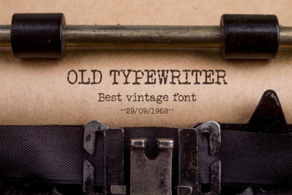
Typewriter Fonts
Mechanical charm for journals, menus & overlays.
Gothic & Blackletter
Dramatic heritage styles for certificates and logos.
Stencil (cut-friendly)
Bridges keep counters open – faster weeding for decals.
Bubble Fonts
Rounded, bubbly shapes for kids crafts & stickers.
Y2K Fonts
Glossy techno nostalgia for covers and thumbnails.
Cute Fonts
Soft, friendly forms for planners, tags & kawaii sets.
Graffiti Fonts
Street-style display for bold posters and tees.
Pixel Fonts
8-bit charm for retro games, badges and avatars.
Scary Fonts
Horror textures and jagged display for spooky sets.