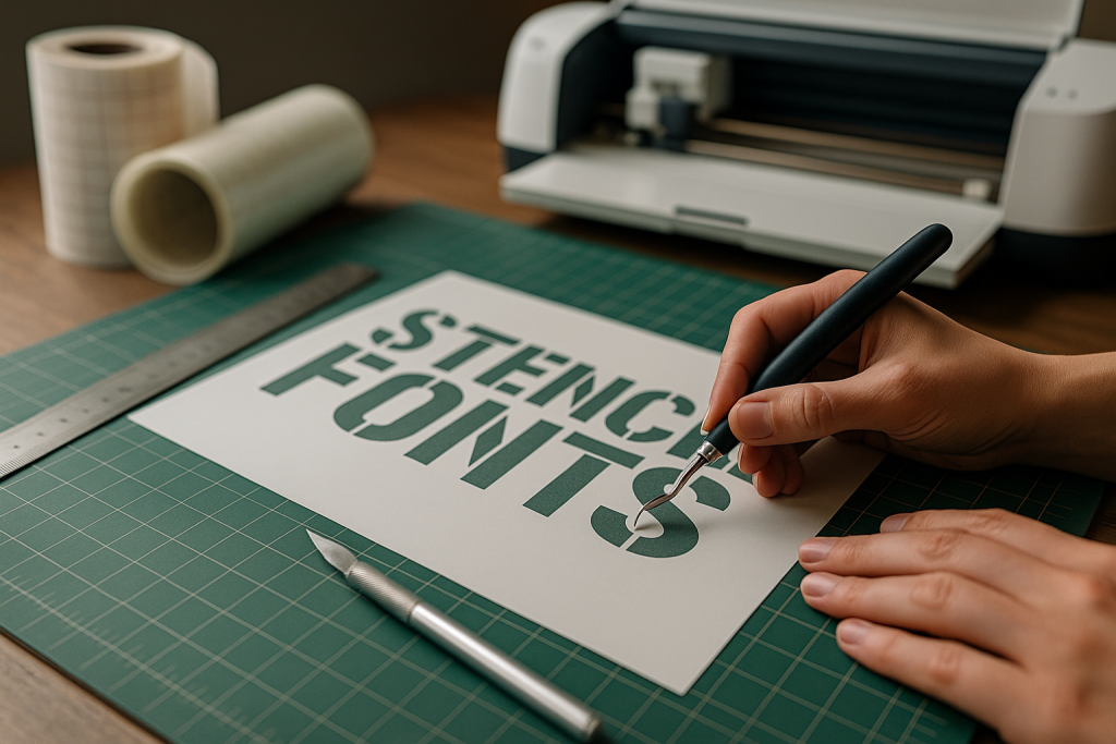
This guide to stencil (cut-friendly) fonts shows how to pick faces with bridges that keep counters open for clean cuts and faster weeding – plus quick sizing rules and material tips for Cricut, Silhouette and laser projects.
Editor’s top picks – Stencil (Cut-Friendly) Fonts
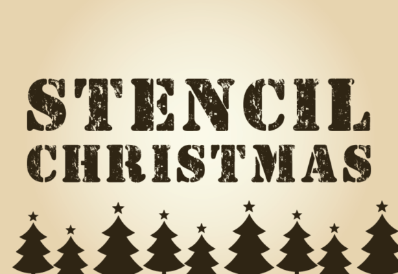
Basic Stencil Sans
Classic bridges for cartons, crates and labels – clean islands, predictable cuts.
Rounded Stencil
Softer corners for vinyl and small decals – fewer snags while weeding.
Slab Stencil
Chunky stems and wide bridges; great for signage, crates and rustic props.
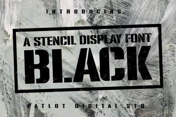
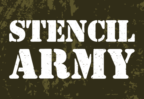
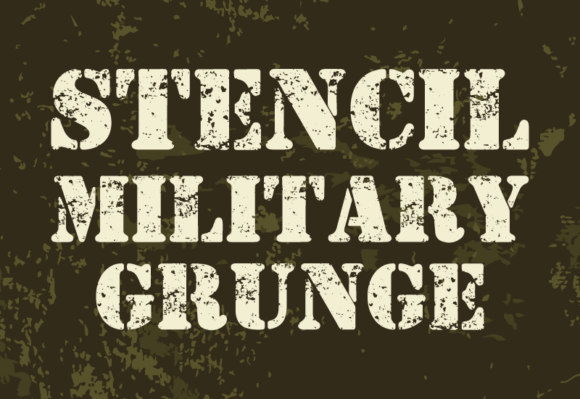
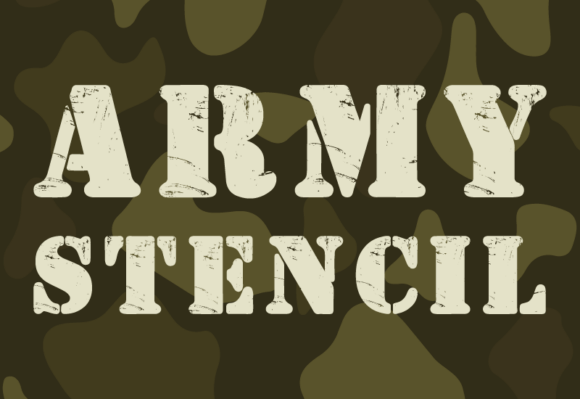
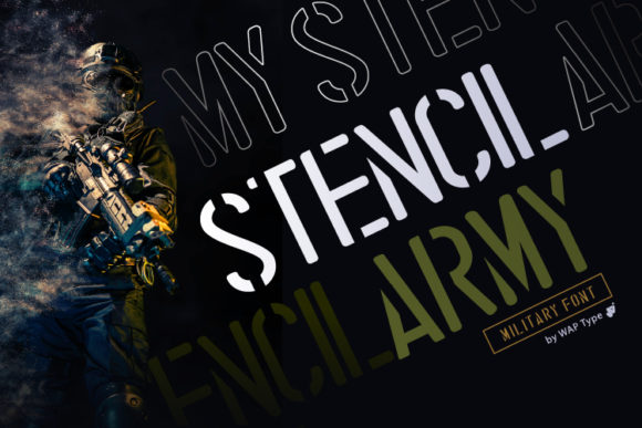
Military / Industrial
Utility look for gear labels, toolboxes and rugged branding.
Display Stencil
High-impact titles with dramatic cuts; test small sizes before production.
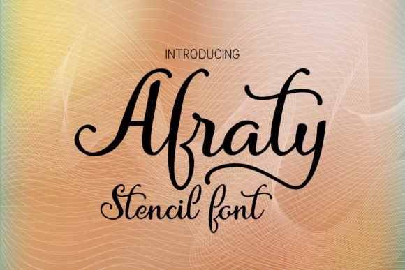
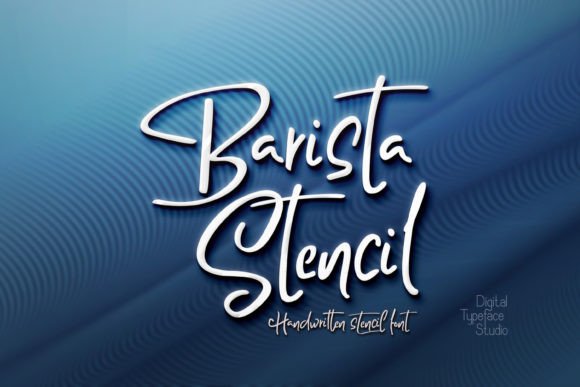
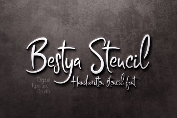
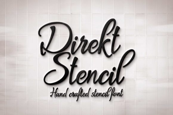
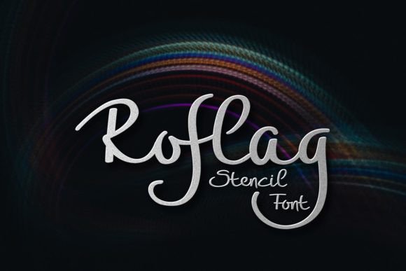
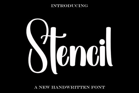
Script (Monoline)
Single-weight strokes with bridged loops for paint stencils and gifts.
Outline Stencil
Hollow styles for layered paint jobs and stacked headlines.
Text tools for faster prep
- Add bridges to a font or logo – keep counters from falling out.
- SVG cleanup for laser/vinyl – weld, remove overlaps, simplify nodes.
- Vectorize bitmap to SVG/DXF – turn PNG/JPG sketches into cut-ready files.
How to choose cut-friendly stencil fonts
- Bridges & islands: Letters like A, B, D, O, P, R need bridges so the inner shapes don’t drop. Prefer families with clear, sturdy bridges.
- Minimum thickness: Keep thin strokes and bridges sturdy (≈1–1.5 mm for small decals; thicker for paint stencils). Tiny hairlines snap and snag.
- Rounded inner corners: Slight radii reduce tearing in vinyl and scorch in laser corners.
- Simple counters: Larger holes weed faster; ultra-condensed forms are harder to clean.
- Test size first: Print/cut a word at your smallest planned size (name, number) before committing.
Quick material tips
- Vinyl decals (Cricut/Silhouette): Aim for bridges ≥1 mm; prefer rounded stencil faces; avoid micro-serifs. Weed while warm if your vinyl allows.
- Paint stencils (mylar/card): Bridges 2–3 mm for repeat use. Keep cap height ≥25 mm for crisp results.
- Laser (wood/acrylic): Avoid tiny islands; keep minimal strokes around 0.8–1.2 mm and watch heat on tight corners. Sand/flush kerf if needed.
Try searches (cut-ready sets)
- Classic Stencil → Browse basics
- Rounded Stencil → Softer corners
- Military / Industrial → Utility styles
- Script (Monoline) → Bridged loops
- Slab Stencil → Chunky options
- Outline Stencil → Hollow forms
Font pairing recipes
- Stencil Sans + Clean Grotesk – Stencil for the title; clean sans for labels and captions.
- Slab Stencil + Narrow Sans – Rugged headline with compact secondary text on crates and tags.
- Script Stencil + Sans – Hand-made paint vibe with a readable helper face.
Project ideas
- Storage bins & toolbox labels (vinyl, quick-weed).
- Spray-paint signs and wall art (mylar stencils).
- Tumbler, mug and bottle decals (rounded stencil faces weed easier).
- Wood/acrylic laser signs with sturdy bridges for counters.
FAQ
How thick should bridges be?
For small decals, ~1–1.5 mm bridges are a practical starting point; increase for paint stencils or rough surfaces. Always test your smallest size first.
Can I turn any font into a stencil?
Yes, by adding bridges and removing floating islands. You can do it yourself in a vector app or hire a pro to add clean, consistent bridges.
Why do parts of letters fall out?
Closed counters (A, O, D, P, R, B, e, a) need bridges; without them, inner shapes become islands and detach.
Best file format for cutting machines?
SVG (or DXF) for cut paths. PNG is for print-then-cut/mockups.
Curated quick picks
Serif Fonts
Classic, readable text & elegant headlines for print and web.
Sans Serif Fonts
Clean UI, decks & posters; pairs well with any display face.
Slab Serif Fonts
Blocky slabs for bold titles, badges and signage.
Handwritten Fonts
Casual notes for planners, labels and crafts.
Calligraphy Fonts
Flourished forms for invitations, cards and branding.
Signature Fonts
Stylish personal marks; sleek logos & watermarks.
Brush Fonts
Textured strokes for social posters and thumbnails.
Display Fonts
High-impact titles that read in a split second.
Retro / 70s / Groovy
Rounded, playful curves; poster-ready vibes.
Vintage Fonts
Aged textures & heritage serifs for badges & labels.
Outline Fonts
Hollow forms for stacked headlines and layered effects.
Typewriter Fonts
Mechanical charm for journals, menus & overlays.
Gothic & Blackletter
Dramatic heritage styles for certificates and logos.
Bubble Fonts
Rounded, bubbly shapes for kids crafts & stickers.
Y2K Fonts
Glossy techno nostalgia for covers and thumbnails.
Cute Fonts
Soft, friendly forms for planners, tags & kawaii sets.
Graffiti Fonts
Street-style display for bold posters and tees.
Pixel Fonts
8-bit charm for retro games, badges and avatars.
Scary Fonts
Horror textures and jagged display for spooky sets.