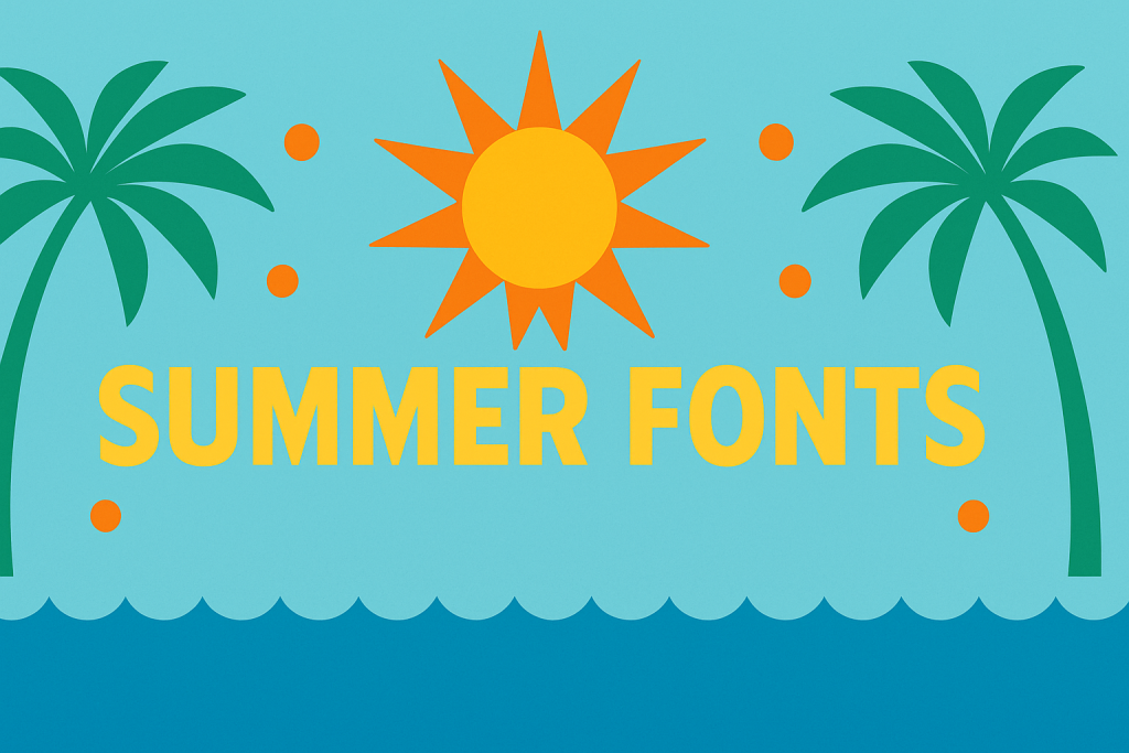
Summer Fonts bring warm, energetic vibes to pool parties, beach events, travel posters and sunny merch. Below you’ll find pairing ideas, tropical color recipes, cutting-friendly picks and quick searches to grab exactly the look you need for invitations, banners and Cricut/Silhouette projects.
What Makes a Great Summer Font?
- Bold display energy: chunky letters, retro curves, playful alternates and drop-shadow layers.
- Beach & travel flavor: surf-poster geometry, tiki cues, postcard serifs and sun-washed textures.
- High contrast color play: titles built for bright palettes and layered inlines.
- Cutting-machine friendly: clean paths, solid fills, layered/offset versions for cardstock and vinyl.
Try Searches (fast shortcuts)
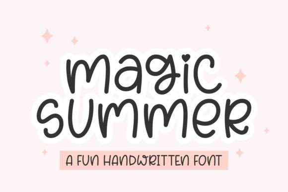
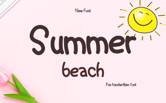
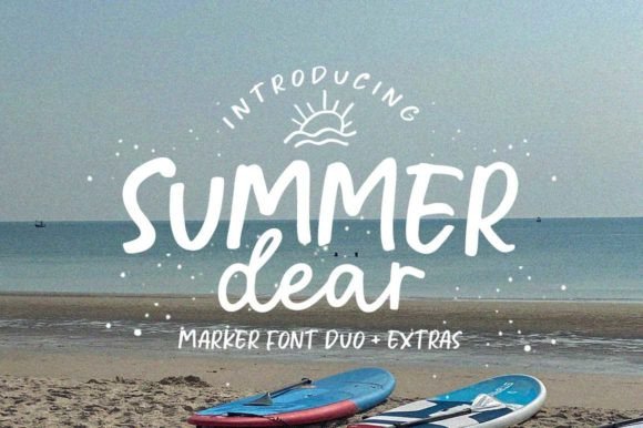
- Beach script fonts → casual, breezy scripts for invites, tees and drink menus.
- Retro summer displays → warm 70s/80s curves with friendly shadows for posters and banners.
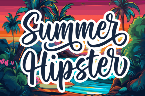
- Tropical display → palm-leaf attitude for pool parties and resort printables.
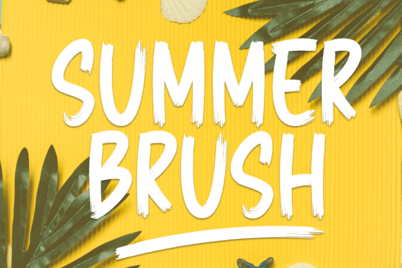
- Surf poster fonts → condensed, high-impact titles that read from afar.
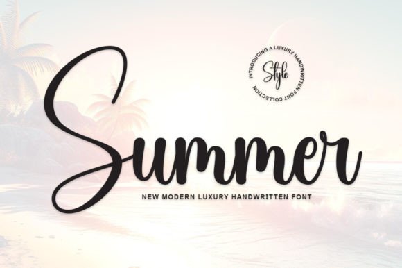
- Sunshine serifs → bright, friendly serifs for menus, captions and quotes.
- Tiki & island fonts → carved, festive shapes for signage and party décor.
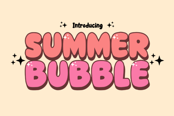
- Layered shadow fonts → 2–4 layers (base/inline/shadow/highlight) for color stacking.
- Postcard serifs → travel-card nostalgia with crisp small-size legibility.
Font Pairing Recipes
Pool Party Invite
Headline: Retro summer display (with shadow layer)
Details: Humanist sans (small caps for time/date)
Accent: Wavy underline or sunburst icon
Why: Bold, friendly headline + clean details keep it fun and readable.
Tiki Night Poster
Title: Tiki/island display
Subhead: Condensed sans
Body: Neutral sans/serif at 10.5–12 pt
Why: Carved personality up top; condensed support packs info tightly.
Travel Postcard Series
City name: Postcard serif (all caps)
Caption: Grotesque sans
Stamp/Tag: Monospace small
Why: Nostalgic title paired with modern, tidy captions.
Merch & Tees
Main: Surf poster display (tight tracking)
Secondary: Rounded sans
Extras: Offset shadow 2–3 mm
Why: Compact impact for prints while staying weed-friendly.
Summer Color & Layout Tips
- Bright palette:
#FFB703golden,#FB8500orange,#219EBCocean,#F94144coral. Neutral anchor:#0F172A. - Make layers pop: use a dark base + mid shadow + light highlight; keep stroke widths ≥1.5–2 mm for cutting.
- Tight display spacing: slightly negative tracking (-2% to -8%) and generous leading for stacked titles.
- Texture: halftones, sunbursts and wave dividers; leave clear zones for small text.
Project Ideas (Print & Cutting)
- Party invitations: retro display + clean sans; add layered shadows for depth.
- Beach banners & garlands: stacked letters on bright cardstock; offset 2–3 mm.
- Drink menus & table tents: sunshine serif titles; body at 11–12 pt for legibility.
- Travel posters: condensed surf titles with high-contrast color blocks.
- Stickers & decals: solid fills, simple shapes; test at 22–28 mm minimum height.
Cutting-Friendly Settings
- Prefer solid fills and clean paths; expand appearance before exporting SVG.
- Use offset/outline (0.8–1.8 mm) to reinforce delicate strokes and script joins.
- Layered fonts: keep base dark, shadow mid, highlight light; avoid hairline inlines below ~1.5–2 mm.
Related Guides
Spring Fonts · Autumn (Fall) Fonts · Graduation Fonts · Birthday Fonts · Seasonal Fonts (hub)
Summer Fonts FAQ
Use the display for headlines and a neutral sans/serif for details. Keep body at 10.5–12 pt with generous line-height.
Retro displays with soft curves, beach scripts, surf-poster condensed titles, tiki/island displays and friendly postcard serifs.
Golden #FFB703 + Ocean #219EBC + Coral #F94144; or Orange #FB8500 + Navy #0F172A + White.
Solid, layered displays and simple scripts with clean paths. Avoid ultra-thin inlines or distressed textures at small sizes.
Check each license for commercial permissions, end-product limits and multi-seat terms before selling.
Explore More Resources
- Seasonal Fonts – Spring, Summer, Autumn & Winter
- Christmas Fonts – Festive, Elegant & Crafty Picks
- Halloween Fonts – Spooky, Cute & Retro Picks (Plus Bundles & Custom Lettering)
- Wedding Fonts – Elegant Scripts, Signature Looks & Modern Minimal
- Birthday Fonts – Fun, Script & Playful Picks
- Valentine’s Fonts – Romantic, Script & Stylish Picks