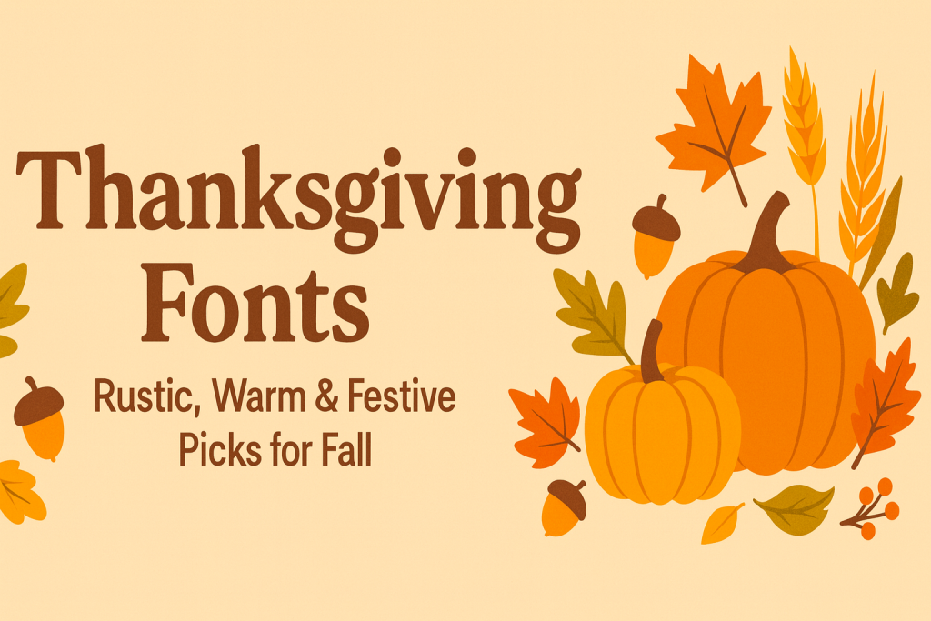
Thanksgiving fonts bring cozy, harvest-season vibes to cards, menus, signage, shirts, and gift tags. From rustic scripts to vintage serifs and bold display styles, the right type can make your fall design feel warm, inviting, and perfectly on theme.
Text Tools for Faster Workflow
Preview fonts, style text and convert to webfonts in one place.
Best Thanksgiving Font Styles (What Works & Why)
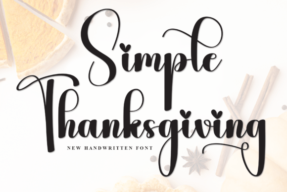
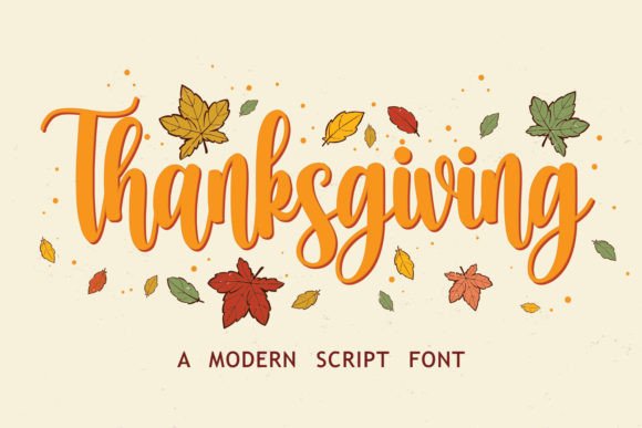
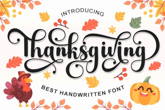
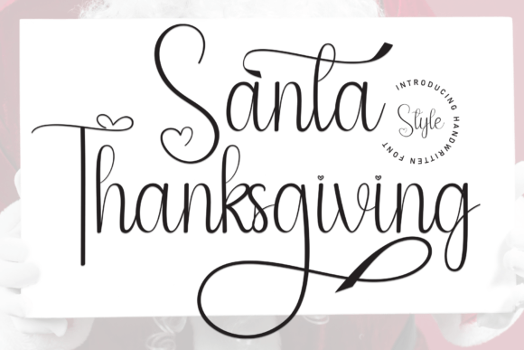
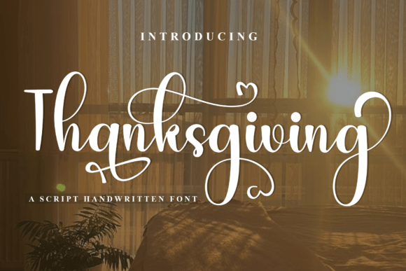
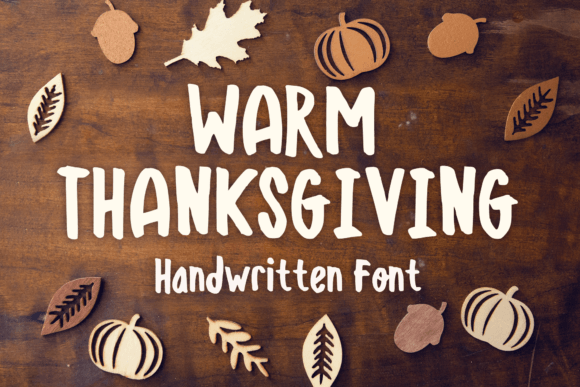
Handwritten / Script
For warm greetings and quotes. Flowing lines feel cozy and festive without looking formal.
Try searches:
- Thanksgiving script – friendly, flowing handwriting
- Harvest calligraphy – graceful pen-stroke styles
- Fall cursive – soft cursive for names & headers
- Autumn swash – decorative alternates & swashes
Serif & Classic Harvest
Timeless and readable – perfect for menus, labels, and invitations. Vintage details pair well with pumpkins, wheat, and foliage.
Try searches:
- Harvest serif – classic, sturdy letterforms
- Vintage fall serif – retro headings & body copy
- Engraved serif – engraved look for menus & tags
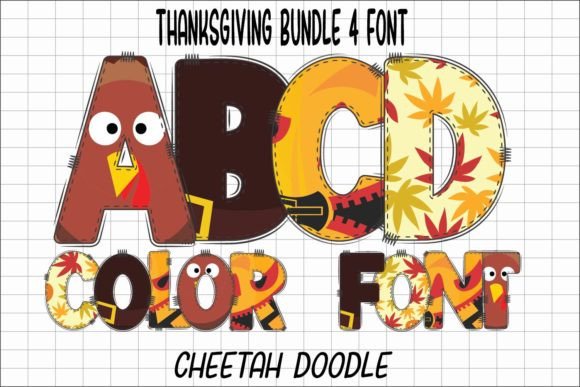
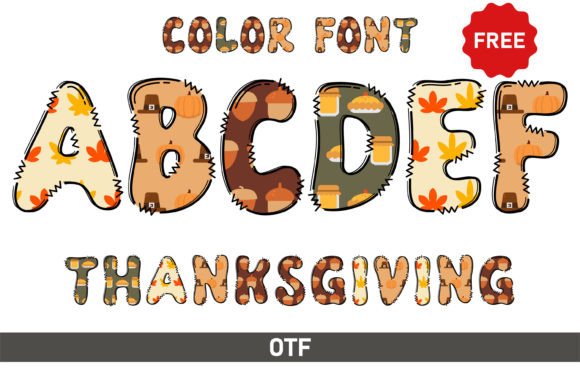
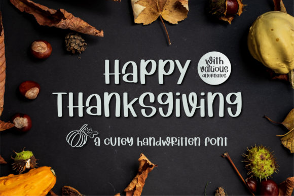
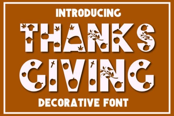
Playful / Family-Friendly
Add charm to kids’ crafts, pie-sale flyers, or party signage with rounded shapes and seasonal icons.
Try searches:
- Playful Thanksgiving fonts – bubbly display styles
- Kids Thanksgiving fonts – cute and easy to read
- Turkey & pumpkin fonts – icons mixed into letters
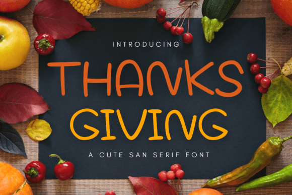
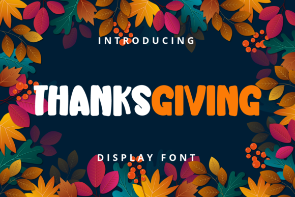
Modern / Minimal Autumn
Clean typography with subtle seasonal cues – great for brands, menus, and Pinterest graphics.
Try searches:
- Minimal fall – understated & chic
- Scandinavian autumn – natural shapes, balanced forms
- Autumn sans – clean sans for lists & body text
Browse Thanksgiving fonts • Hire a lettering designer
Font Pairing Recipes (Copy & Paste)
- Rustic script (H1) + Classic serif (body) – warm header, readable paragraphs
- Playful display (H1) + Neutral sans (body) – kid-friendly and clean
- Vintage serif (H1) + Tabular numbers – perfect for dates, prices, & menus
- Modern sans (H1) + Subtle swashes (accents) – minimal with seasonal detail
Fall Project Ideas
- Printable menus and place cards
- Pie labels, jar tags, and bakery stickers
- Party invitations & table signage
- Thank-you cards and gift tags
- T-shirts, aprons, tote bags, and mugs
- Classroom worksheets & coloring pages
- Social posts, story covers, and Pinterest graphics
Color & Styling Tips
- Palette: burnt orange, rust, cinnamon, pumpkin, mustard, olive, warm neutrals
- Textures: kraft paper, subtle grain, vintage print effects
- Type accents: small leaf, acorn, wheat, or pumpkin icons as dividers
- Hierarchy: one expressive headline + one simple helper – let contrast work
Licensing & Quick Guidelines
- Commercial use: always review each font’s license before selling products
- Print: convert to outlines (or embed if permitted)
- Web: use WOFF2 + font-display: swap; subset to Basic Latin + numerals
- OpenType: enable alternates, ligatures, swashes where supported
Custom Thanksgiving Lettering
Need a unique “Give Thanks,” “Gather,” or a branded harvest wordmark? Commission a lettering specialist and provide:
- Preferred style (rustic, elegant, playful, minimal)
- Sizes and use cases (print, web, apparel, signage)
- Deliverables (AI, SVG, PNG, WOFF2)
- Timeline, licensing, and alternates/ligatures if needed
FAQ
Rustic script for section headers + classic serif for body copy gives warmth and legibility.
Yes – if the license permits commercial use. Always check each font’s terms.
Yes. Convert to WOFF2, subset to required characters, and use font-display: swap.
Vintage serif for the title + tabular numbers for weights/prices; add a small wheat divider.
Use one expressive display font and one simple helper; limit color palette to 2–3 warm tones.
Explore More Resources
- Seasonal Fonts – Spring, Summer, Autumn & Winter
- Christmas Fonts – Festive, Elegant & Crafty Picks
- Halloween Fonts – Spooky, Cute & Retro Picks (Plus Bundles & Custom Lettering)
- Wedding Fonts – Elegant Scripts, Signature Looks & Modern Minimal
- Birthday Fonts – Fun, Script & Playful Picks
- Valentine’s Fonts – Romantic, Script & Stylish Picks