This guide to vintage fonts curates heritage serifs, western slabs, typewriter and stamp styles for badges, labels and packaging — plus pairing ideas and quick print checks so rough textures stay readable.

Editor’s top picks — Vintage Fonts
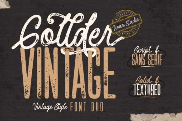
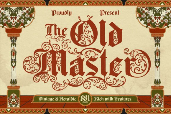
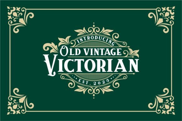
Heritage Serif
Old-style & transitional serifs with warm contrast — classic badges and menus.
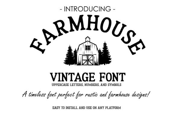
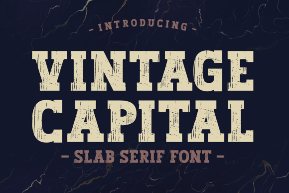
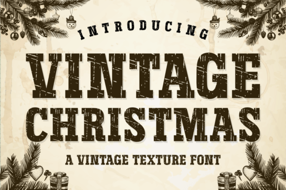
Western / Slab
Blocky slabs and spur serifs for ranch, brewery and outdoor branding.
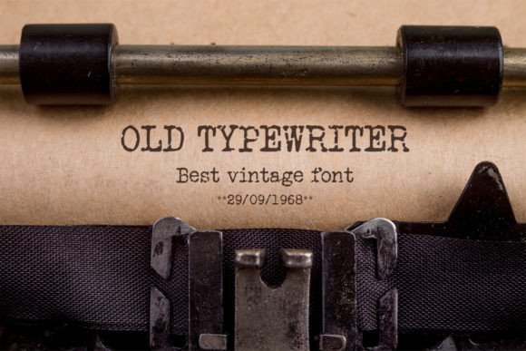
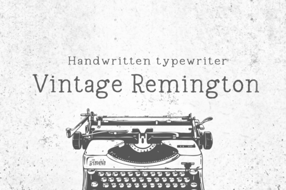
Typewriter
Mono-ish, uneven ink for apothecary labels, coffee bags and tickets.
Art Deco
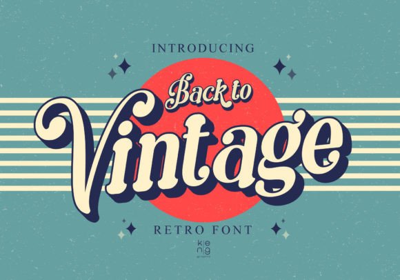
Elegant caps and geometric ornaments — cocktail bars, posters, invites.
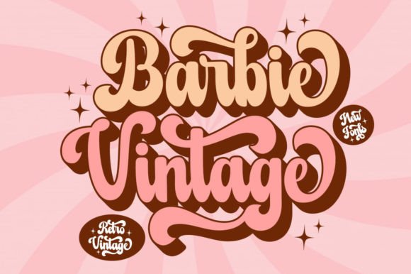
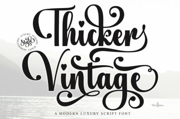
Monoline Script
Sign-painter vibes for badges and retro wordmarks; keep strokes bold.
Stamp / Stencil
Cut-through bridges and ink-dropouts that survive small sizes on print.
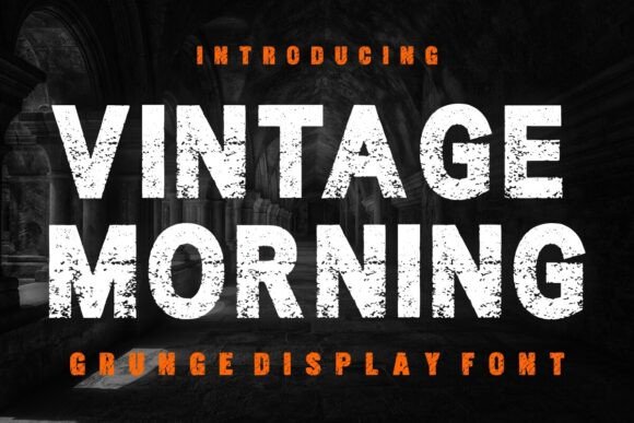
Rough / Grunge
Pre-distressed outlines for instant texture; test legibility at 12–16 pt.
Badge Sets
All-in-one packs with alternates, ornaments and ready-made arch text.
Text tools for faster vintage workflow
- Custom vintage badge lettering — sign-painter monoline, arches, swashes.
- Vectorize & cleanup — rebuild rough scans into crisp SVG/EPS.
- Letterpress / stamp texture — subtle grain tuned for small labels.
How to choose a vintage font
- Match the era. Old-style serif for heritage food, Art Deco for cocktails, slab for outdoors & merch.
- Texture with restraint. Use one distressed layer; too much grain kills legibility in print.
- Open counters. Letters like A, R, e should keep interior space after distress.
- Alternates & ornaments. Look for swashes, small caps, underlines and badge shapes.
- License & formats. Prefer OTF/TTF + vector logos; bitmap textures should be hi-res.
Try searches (vintage staples)
- Heritage Serif → Browse heritage serifs
- Western / Slab → Western & slabs
- Typewriter → Typewriter sets
- Monoline Script → Sign-painter scripts
- Art Deco → Deco titles
- Stamp / Stencil → Stamp & stencils
- Rough / Grunge → Distressed options
- Badge Packs → Badge fonts
Font pairing recipes
- Heritage Serif + Monoline Script — serif for brand name, small script for “since 1987”.
- Western Slab + Condensed Sans — bold headline with tidy secondary copy on labels.
- Typewriter + Grotesk — receipt or menu vibe with modern captions.
- Art Deco Display + Simple Sans — luxe titles plus quiet body text.
Brand assets you can ship today
- Round badge with arch text and year; add subtle stamp texture.
- Product label (coffee, candles, sauces) with small caps and divider ornaments.
- Menu / poster using serif display for sections, typewriter for notes.
- Apparel print — one-color vintage slab; expand strokes for screenprint.
Small-size readability: quick checks
- Test at 12–16 pt on paper; reduce grain by 20–40% for tiny ingredients text.
- Keep minimum stroke ≥ 0.35–0.4 mm (≈1 pt) for stamps and kraft labels.
- Outline the final logo and manually tune tight pairs (Ta, To, Yo, RA).
Licensing: what matters for logos
- Logo usage: most commercial font EULAs allow static logo creation — confirm “logo usage”.
- Seats: typically one user/device per license unless stated otherwise.
- Web/App: websites/apps need separate web/app licenses; static PNG/SVG logos do not.
FAQ
How do I keep distressed fonts readable in print?
Use lighter grain for small text, increase tracking slightly, and don’t stack multiple texture layers.
Bitmap or vector textures?
For logos, convert to outlines and add vector grain or use high-res (300–600 dpi) bitmap only at final size.
Are all-caps okay?
Yes for badges, but mix small caps or initial caps for longer words to avoid a “brick” shape.
Can I trademark a logo made with a vintage font?
Usually yes — you trademark the artwork, not the font. Check your jurisdiction and the font EULA.
Curated quick picks
- Heritage Serif: Browse
- Western / Slab: Browse
- Typewriter: Browse
- Art Deco: Browse
- Monoline Script: Browse
- Stamp / Stencil: Browse
- Rough / Grunge: Browse
- Badge Packs: Browse
Serif Fonts
Classic, readable text & elegant headlines for print and web.
Sans Serif Fonts
Clean UI, decks & posters; pairs well with any display face.
Slab Serif Fonts
Blocky slabs for bold titles, badges and signage.
Handwritten Fonts
Casual notes for planners, labels and crafts.
Calligraphy Fonts
Flourished forms for invitations, cards and branding.
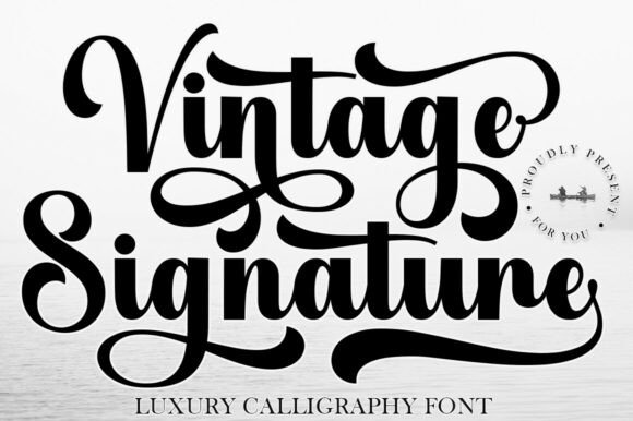
Signature Fonts
Stylish personal marks; sleek logos & watermarks.
Brush Fonts
Textured strokes for social posters and thumbnails.
Display Fonts
High-impact titles that read in a split second.
Retro / 70s / Groovy
Rounded, playful curves; poster-ready vibes.
Outline Fonts
Hollow forms for stacked headlines and layered effects.
Typewriter Fonts
Mechanical charm for journals, menus & overlays.
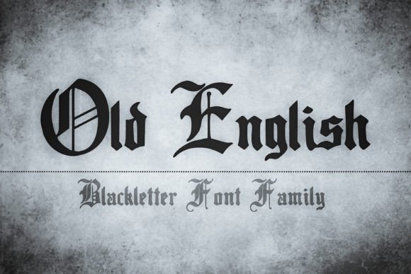
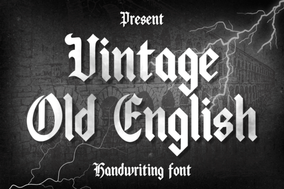
Gothic & Blackletter
Dramatic heritage styles for certificates and logos.
Stencil (cut-friendly)
Bridges keep counters open — faster weeding for decals.
Bubble Fonts
Rounded, bubbly shapes for kids crafts & stickers.
Y2K Fonts
Glossy techno nostalgia for covers and thumbnails.
Cute Fonts
Soft, friendly forms for planners, tags & kawaii sets.
Graffiti Fonts
Street-style display for bold posters and tees.
Pixel Fonts
8-bit charm for retro games, badges and avatars.
Scary Fonts
Horror textures and jagged display for spooky sets.