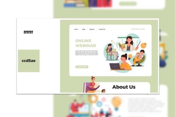
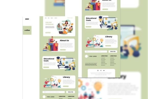
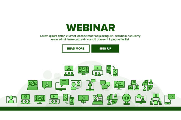
Webinar Landing Pages: Registration Templates Built to Fill Your Room
Webinar landing pages help you turn traffic into registrations with a proven flow: hero → topic + outcome → speaker trust → agenda → registration CTA → reminders. Use this page to choose the right webinar registration template type (live training, workshop, masterclass, virtual event), follow a simple conversion checklist, and customize fast – copy, sections, countdown, and form – without rebuilding from scratch.
Why webinar landing pages work
Webinar pages convert when they remove doubt and make registration feel “easy”. Most pages fail because the topic is vague, the outcome isn’t clear, the CTA is buried, or there’s no trust (speaker credibility, proof, agenda). Templates solve structure so you can focus on one message and one action: register.
- Clear promise: what they’ll learn + who it’s for.
- Less friction: shorter form + stronger CTA placement.
- More trust: speaker bio, logos, testimonials, past attendee numbers.
- Higher attendance: reminder blocks and calendar/save options.
Webinar landing page template types
Choose a template based on your format. Keep one primary CTA across the page: register / save my seat / join live.
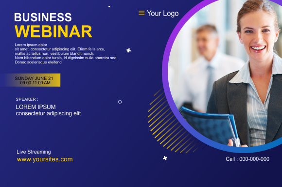
Webinar registration pages (classic)
- Best for: lead gen webinars with one speaker.
- Key blocks: headline + outcome, speaker, agenda, registration form.
- CTA: “Register now”, “Save my seat”.
Workshops / masterclasses
- Best for: deeper training with worksheets, homework, or a replay.
- Key blocks: what you’ll build, deliverables, agenda, proof, CTA.
- CTA: “Join the workshop”, “Get access”.
Panel / virtual summit pages
- Best for: multiple speakers and schedules.
- Key blocks: speaker lineup, schedule, topics, registration CTA.
- CTA: “Reserve your pass”.
Evergreen webinar pages (on-demand)
- Best for: automated funnels and always-on signups.
- Key blocks: outcome, preview, proof, “watch now” CTA.
- CTA: “Watch instantly”, “Get the replay”.
Must-have sections (the signup-ready structure)
High-converting webinar pages are calm and obvious. Visitors should understand the topic and trust the speaker within the first 10 seconds – especially on mobile.
- Hero: topic + outcome + date/time + one CTA.
- Who it’s for: 3–5 bullets that qualify the right attendees.
- Agenda: 3–6 short sections (what they’ll learn).
- Speaker trust: bio + credentials + logos + results.
- Registration: short form + privacy note + what happens next.
- FAQ: replay, cost, timing, timezone, “is this for me?”.
Copy blocks you can reuse (headline + bullets)
Templates convert faster when your copy is specific. Use these “plug-and-play” blocks for webinar registration pages.
Hero headline formulas
- How to [Outcome] without [Pain] (example: “How to Get More Leads without Burning Your Budget”).
- [Number] Steps to [Result] (Live Training)
- Live Workshop: Build a [Thing] in [Timeframe]
- The [Audience] Playbook for [Outcome]
CTA button text that works
- Standard: “Register now”, “Save my seat”.
- Workshop: “Join the workshop”, “Get access”.
- On-demand: “Watch instantly”, “Get the replay”.
- Summit: “Reserve your pass”, “Get your ticket”.


Conversion frameworks (copy-paste outline)
Pick one framework and repeat it across your webinar pages. Consistency builds trust and increases registrations.
- Promise → Who it’s for → Agenda → Speaker → Register (best for live webinars)
- Problem → Solution → Proof → Agenda → Register (best for lead gen webinars)
- Outcome → Deliverables → Agenda → FAQ → Register (best for workshops)
- Topics → Speakers → Schedule → Pass Options → Register (best for summits)
Webinar checklist (quick wins)
- One CTA: don’t compete with extra buttons.
- Time clarity: include timezone + calendar cue.
- Short form: name + email (add more fields only if needed).
- Proof near CTA: logos/testimonials close to the form.
- Replay note: say if replay is included (big conversion lever).
Recommended picks
Start with one webinar system: clear promise + agenda + short registration. Test headline and CTA placement before redesigning anything – those changes usually move signups the fastest.
Webinar Registration Pages
Classic sign-up layouts with agenda blocks, speaker bio, and a short form.
View options →Workshop / Masterclass Pages
Outcome-first pages with deliverables, modules, and strong proof blocks.
View options →Virtual Event / Summit Pages
Speaker lineup + schedule + pass CTA pages built to drive registrations.
View options →Evergreen / On-Demand Pages
Watch-now pages for automated funnels, replays, and lead capture.
View options →
FAQ
How long should a webinar landing page be?
Long enough to create trust. For simple webinars, keep it short: hero → agenda → speaker → form. For expensive offers, add more proof, FAQ, and outcomes.
Should I add a countdown timer?
Yes, if it’s real. Timers help urgency for live events. For evergreen webinars, use “next session starts in…” style timing.
What increases attendance (not just signups)?
- Replay clarity: say if replay is included.
- Calendar prompt: remind users to save the date.
- Expectation: what they’ll leave with (deliverables).
- Short confirmation: tell them what happens after signup.
Related landing page hubs
Landing Page Templates (Main Hub)
Browse all landing page categories and styles in one place.
Explore →Lead Generation Landing Pages
Templates built to capture leads with short forms and trust blocks.
Explore →SaaS Demo / Free Trial Landing Pages
Feature-first pages built for demos, trials, and signups.
Explore →Next step
Pick one webinar template type, write one specific promise, and keep the signup form short. Test the hero headline and CTA placement first – those changes usually move registrations the fastest.