Webinar Slide Templates: Clean Slides for Live Trainings & Workshops
Webinar slide templates help you teach clearly and keep attention with a simple flow: hook → agenda → key points → proof → CTA → Q&A. Use this page to choose the right webinar presentation template type (training, workshop, masterclass, demo), follow a clean slide structure, and present with confidence – without building a deck from scratch.
Why webinar slide templates work
Webinar slides perform best when they support your speaking flow, not compete with it. A template keeps typography consistent, limits clutter, and makes every slide easy to scan. As a result, viewers understand faster and stay engaged longer – especially on smaller screens.
- Stronger attention: fewer words, clearer hierarchy, better pacing.
- Higher trust: clean charts, proof slides, and consistent spacing.
- Faster editing: swap copy, images, and icons without redesigning.
- Better outcomes: CTAs feel natural when the deck builds momentum.
Webinar slide template types
Choose a template based on your webinar goal. Then keep one “main outcome” through the whole deck, so each section feels connected.
Live training / educational webinar
- Best for: teaching a topic step-by-step.
- Focus: clarity, examples, recap slides, Q&A.
Workshop / masterclass slides
- Best for: interactive sessions with exercises and deliverables.
- Focus: modules, worksheets, “do this now” prompts.
Sales webinar / offer reveal
- Best for: converting viewers into calls, demos, or purchases.
- Focus: proof, case studies, pricing cues, and clear CTA slides.
Product demo / walkthrough deck
- Best for: showing “how it works” with screenshots and workflow.
- Focus: steps, features-to-benefits mapping, next step.
Best webinar slide structure
This order keeps attention and reduces drop-off. However, you can compress it for shorter sessions and expand it for workshops.
- Title + promise: what they’ll leave with.
- Credibility: who you are and why trust you (short).
- Agenda: 3–6 sections with outcomes.
- Main teaching blocks: concept → example → takeaway.
- Proof: results, case study, screenshots, testimonials.
- CTA: the next step (download / book / demo / enroll).
- Q&A: answers + final CTA reminder.
Must-have slides for high-retention webinars
- Agenda slide: sets expectations and reduces drop-off.
- Section divider slides: pacing and “where we are” clarity.
- Example slides: screenshots, mini case studies, before/after.
- Recap slide: 3–5 takeaways, then CTA.
- CTA slide: one action, one link, one sentence.
Copy formulas that work on webinar slides
- Promise: “By the end, you’ll be able to [Outcome].”
- Teach: “If you remember one thing, remember this: [Principle].”
- Proof: “We achieved [Result] in [Timeframe] by [Method].”
- CTA: “Next step: [Action] (takes 2 minutes).”

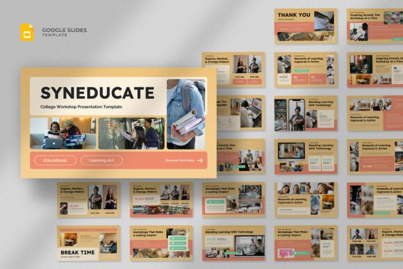
Quick checklist (before you go live)
- One idea per slide: remove extra paragraphs.
- Readable from afar: big headings, short bullets.
- Visual support: show screenshots and examples early.
- Consistent layout: same grid and spacing across sections.
- One CTA: repeat it in recap and final slide.
Recommended picks
Start with a clean style and a repeatable slide grid. Next, build your agenda + section dividers first. Then add teaching slides and finish with a recap and a strong CTA.
Webinar Slide Templates
Clean decks with agenda, section dividers, and strong readability.
View options →Presentation Section Slides
Dividers, timelines, process slides, and clean diagram layouts.
View options →

FAQ
How many slides should a webinar have?
Enough to support your speaking flow without becoming a script. For most webinars, 15–30 slides works well (including dividers and recap). If you teach fast, use more divider slides instead of long paragraphs.
What makes webinar slides feel “professional”?
Consistent spacing, big headings, short bullets, and proof that matches your claims. Also, a strong agenda and recap slide makes the session feel structured.
Related presentation hubs
Business Presentation Templates
Meeting-ready decks for strategy, proposals, and reporting.
Explore →Education Presentation Templates
Lesson slides built for teaching, recap, and classroom clarity.
Explore →Next step
Pick a template type, write a clear “end result” promise, and build your agenda first. Then create dividers and recap slides before you design details. Finally, add proof and place your CTA right after the recap.
