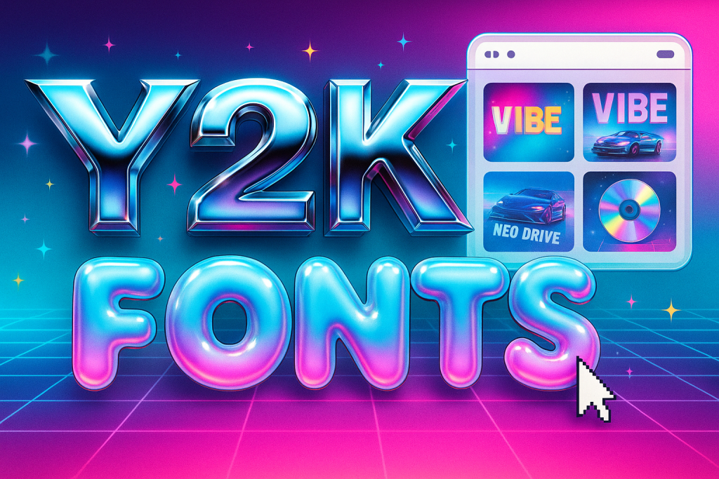
This guide to Y2K fonts rounds up chrome, bubble and techno styles with vaporwave/neon flavors – perfect for covers, thumbnails and bold UI labels. Inside: quick sizing rules, pairing tips and ready-to-run searches.
Editor’s top picks – Y2K Fonts
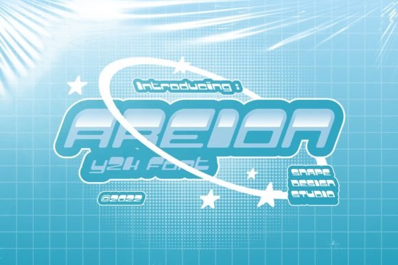
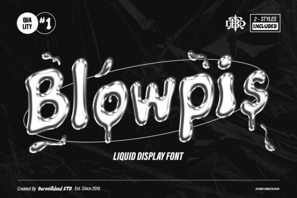
Chrome / Metallic
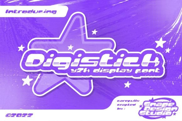
Polished letterforms that love gradients and specular highlights for instant 2000s sheen.
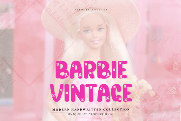
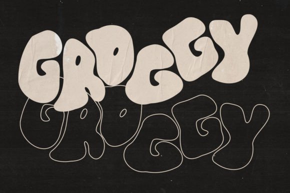
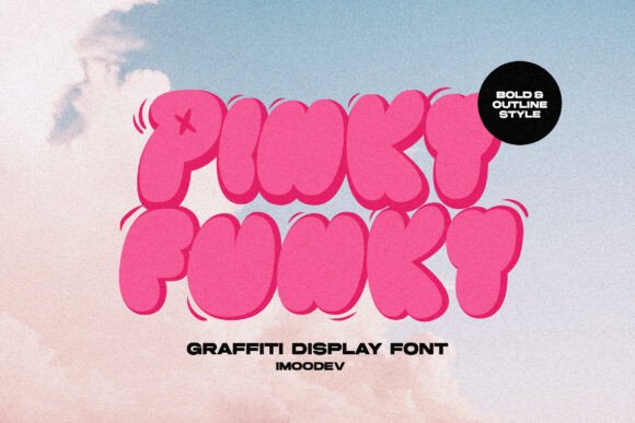
Bubble / Blobject
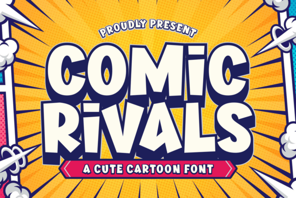
Rounded, inflatable shapes for playful thumbnails, avatars and stickers.
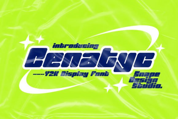
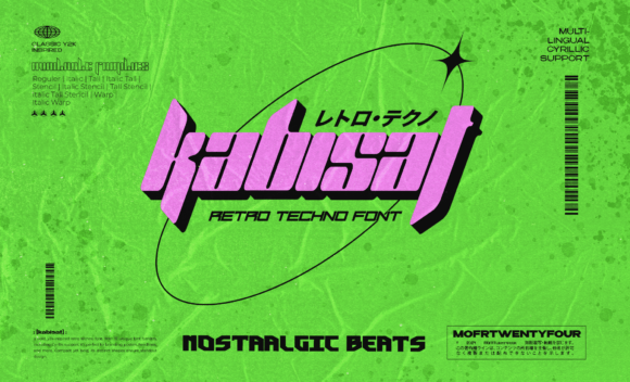
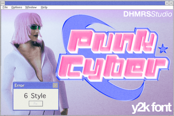
Techno / Cyber
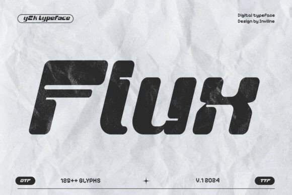
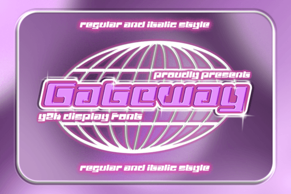
Angular, futuristic forms that read clean on HUDs, overlays and hero stats.
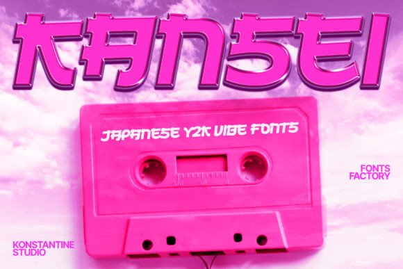
Vaporwave / Neon
Dreamy retro-futurism – pair with magenta/cyan gradients and scanline textures.
Pixel / Bitmap
8–12 px grid charm for tiny captions, badges and UI counters.
Holographic
Rainbow iridescence – use as a layer style over sturdy sans for crisp edges.
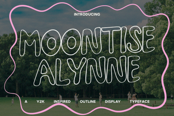
Outline
Hollow forms for stacked headlines and layered glow effects.
Condensed / Stretched
Space-saving wordmarks for mobile thumbnails and price tags.
How to choose a Y2K font
- Readability at small sizes. Test your title at 24–40 px; keep counters open and stems solid.
- One loud feature. Chrome, bubble or neon – pick one hero effect and keep the rest simple.
- Weight & tracking. Outline/iridescent styles like a touch more letter-spacing to avoid glow bleed.
- Family depth. A family with outline/inline/solid saves time when building layered looks.
- Language support. Check accents (é ñ ç) and numerals for your overlay stats.
Try searches (Y2K-ready sets)
- Chrome / Metallic → Browse chrome
- Bubble / Blobject → Bubble picks
- Techno / Cyber → Techno sets
- Vaporwave / Neon → Vaporwave
- Pixel / Bitmap → Pixel sets
- Holographic styles → Holo textures
- Outline / Inline → Outline picks
- Condensed / Stretched → Space-savers
Font pairing recipes
- Techno Display + Humanist Sans – Futuristic title with friendly body copy.
- Bubble Title + Grotesk Caption – Playful headline with clean labels and buttons.
- Chrome Inline + Solid Companion – Use the solid cut for tiny sizes; chrome for hero text.
Quick Y2K effects (30–60 sec)
- Chrome: solid white → inner shadow (soft) → gradient overlay (silver) → small specular highlight.
- Holographic: duplicate text → top layer “overlay” → rainbow gradient; add subtle noise (2–3%).
- Bubble: thick stroke + inner shadow; lift with a soft drop shadow at 120°.
FAQ
Are Y2K fonts readable on small thumbnails?
Yes – choose sturdy weights, avoid ultra-thin inlines and test at 24–40 px.
Do I need a special license?
For static graphics, a standard commercial license usually works; check the seller’s EULA for “logo usage”.
Font or effect – what matters more?
The base font must be clear first; chrome/holo is the garnish. Keep spacing slightly open for glow effects.
Serif Fonts
Classic, readable text & elegant headlines for print and web.
Sans Serif Fonts
Clean UI, decks & posters; pairs well with any display face.
Slab Serif Fonts
Blocky slabs for bold titles, badges and signage.
Handwritten Fonts
Casual notes for planners, labels and crafts.
Calligraphy Fonts
Flourished forms for invitations, cards and branding.
Signature Fonts
Stylish personal marks; sleek logos & watermarks.
Brush Fonts
Textured strokes for social posters and thumbnails.
Display Fonts
High-impact titles that read in a split second.
Retro / 70s / Groovy
Rounded, playful curves; poster-ready vibes.
Vintage Fonts
Aged textures & heritage serifs for badges & labels.
Outline Fonts
Hollow forms for stacked headlines and layered effects.
Typewriter Fonts
Mechanical charm for journals, menus & overlays.
Gothic & Blackletter
Dramatic heritage styles for certificates and logos.
Stencil (cut-friendly)
Bridges keep counters open – faster weeding for decals.
Bubble Fonts
Rounded, bubbly shapes for kids crafts & stickers.
Cute Fonts
Soft, friendly forms for planners, tags & kawaii sets.
Graffiti Fonts
Street-style display for bold posters and tees.
Pixel Fonts
8-bit charm for retro games, badges and avatars.
Scary Fonts
Horror textures and jagged display for spooky sets.
